UI Sketch
 jkraccoon299 downloads
Render mid-fi web UI wireframes in notes from YAML (44 components, inline errors, typo hints) for ai co work(like claude code, codex ).
- Overview
- Scorecard
- Updates15
Language: English · 한국어 · 📖 Full docs · 한국어 문서
Sketch web UI wireframes from human-readable YAML — rendered inline in your Obsidian notes. 45 components. AI-friendly structure. Theme-adaptive.
사람이 읽기 쉽고 AI가 다루기 좋은 YAML로 웹 UI 와이어프레임을 그려서 Obsidian 노트 안에 바로 렌더링합니다. 컴포넌트 45개. AI 친화 구조. 테마 자동 적응.
Why this exists
Product specs, design briefs, RFCs, kickoff docs — when planners and UI/UX designers describe a screen in markdown, they reach for ASCII boxes:
+---------+------------------+
| Header  | Actions          |
+---------+------------------+
| Sidebar | Body             |
|         |                  |
+---------+------------------+
Slow to draw. Painful to edit. Easy to misalign. And worst of all, the structure is gone the moment you type it out. To your eyes it's a header with a sidebar; to anything trying to read it — a teammate skimming, a script parsing, an LLM rewriting — it's just String.split('|').
That last reader matters more than ever. A growing share of product writing now happens with an AI in the loop: co-drafting the spec, asking the model to revise a layout, generating screen variants from a brief. AI is excellent at reasoning over structured data and miserable at decoding ASCII rectangles. Your spec ends up being two things at once — a picture humans can almost read, and a string the model can't understand. Neither audience is well served.
UI Sketch is one simple trade. Stop drawing the UI in text. Describe it in YAML instead:
screen:
  - navbar: { brand: "DocHub" }
  - row:
      items:
        - col: { flex: 1, items: [ { sidebar: { items: ["Home", "Docs"] } } ] }
        - col: { flex: 3, items: [ { card: { title: "Welcome" } } ] }
One source. Three audiences:
- Humans skim it in seconds. YAML reads like an outline, not a maze of pipes and dashes. You can see the layout without rendering it.
- AI consumes it as data. Every screen, component, and prop is addressable. Models can mutate, validate, diff, generate variants — no decoding step.
- Readers see a real wireframe. Flip to reading view and the same YAML renders as a mid-fi frame, in your Obsidian theme. No mental reconstruction.
That's the whole pitch. Anywhere you'd otherwise reach for an ASCII sketch — spec docs, design briefs, RFCs, AI-assisted product threads — you get a single artifact that you, your reviewers, and your tools can all edit.
English
See it in action
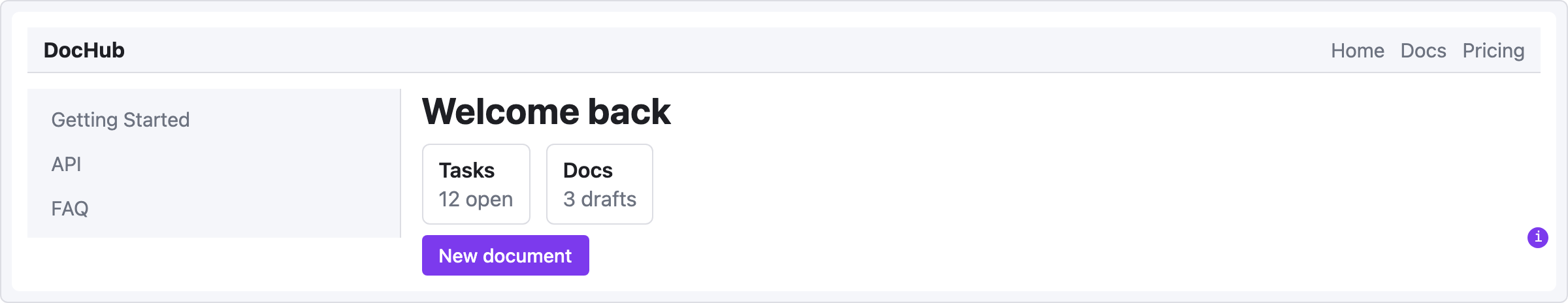
Drop this in a ```ui-sketch fenced block, switch to Reading view, and the wireframe appears inline.
viewport: desktop
screen:
  - navbar: { brand: "DocHub", items: ["Home", "Docs", "Pricing"] }
  - row:
      gap: 16
      items:
        - col:
            flex: 1
            items:
              - sidebar: { items: ["Getting Started", "API", "FAQ"] }
        - col:
            flex: 3
            items:
              - heading: { level: 1, text: "Welcome back" }
              - row:
                  gap: 12
                  items:
                    - card: { title: "Tasks", body: "12 open" }
                    - card: { title: "Docs",  body: "3 drafts" }
              - button:
                  label: "New document"
                  variant: primary
                  note: "Navigates to /documents/new"
A single viewport: key flips between desktop, tablet, and mobile:
|
|
|
What you trade ASCII for
| Pain | Before (ASCII) | After (UI Sketch) |
|---|---|---|
| Aligning columns | │ Header │ Actions │ gymnastics |
- row: { items: [...] } |
| Tweaking layout | Retype the entire diagram | Edit one line of YAML |
| Reading someone else's sketch | Decode what the boxes meant | Render it and see |
| Keeping vault consistent with theme | Manual color adjustments | Uses Obsidian CSS variables automatically |
| Asking an LLM to revise the layout | Paste an ambiguous picture | Paste structured YAML |
- Mid-fi by design. Not a Figma replacement — a fast sketching tool that lives in your notes.
- Theme-adaptive. Light, dark, and community themes inherit via
var(--interactive-accent)and friends. - Friendly errors. YAML typo? Red box with the exact line. Unknown component? Levenshtein-based suggestion.
- Safe. Depth and node-count caps prevent runaway blocks. The
raw:escape hatch runs throughsanitize-html— no XSS surface. - Zero runtime state. Every render is a pure function from YAML to DOM. No surprises in Live Preview.
Quick start
1. Install
One-click from Obsidian Community (recommended):
- Open the plugin page: community.obsidian.md/plugins/ui-sketch.
- Click the Add button — Obsidian opens and installs UI Sketch automatically.
- Enable UI Sketch under Settings → Community plugins.
From inside Obsidian — Settings → Community plugins → Browse → search UI Sketch → Install → enable.
Pre-release / dev build (BRAT):
- Install the BRAT community plugin.
- BRAT → "Add Beta plugin" →
jkRaccoon/obsidian-ui-sketch. - Enable UI Sketch in Community plugins.
Manual install:
- Download
main.js,manifest.json, andstyles.cssfrom the latest release. Release assets are signed with GitHub artifact attestations; verify withgh attestation verify main.js --repo jkRaccoon/obsidian-ui-sketch. - Copy them into
<your-vault>/.obsidian/plugins/ui-sketch/. - Enable the plugin in Settings.
2. Write your first sketch
In any note, add a fenced code block tagged ui-sketch:
```ui-sketch
screen:
  - navbar: { brand: "MyApp" }
  - button: { label: "Sign in", variant: primary }
```
Switch to Reading view (Ctrl/Cmd+E). You'll see a rendered wireframe.
3. Go deeper
Full documentation lives in docs/:
- Getting Started — a 5-minute tutorial
- YAML Reference — complete syntax
- Component Reference — prop tables and examples for all 45 components
- Recipes — copy-paste templates for common screens
- Troubleshooting — error levels and common fixes
Component catalog
45 components in 8 categories, plus one escape hatch. Every component accepts the base props (id, w, h, align, pad, note, mark, markText, muted) on top of its type-specific props. Detailed prop tables live in the Component Reference.
| Category | Components |
|---|---|
| Layout structure | container · card · panel · divider · spacer |
| Navigation | navbar · sidebar · tabs · breadcrumb · pagination · stepper |
| Basic input | button · input · textarea · select · checkbox · radio |
| Advanced input | toggle · slider · date-picker · file-upload · search |
| Display | heading · text · image · icon · avatar · badge · tag · marker · kbd |
| Feedback | alert · progress · toast · modal · skeleton |
| Data | table · list · tree · kv-list |
| Placeholder | chart · map · video · placeholder |
| Escape hatch | raw (sanitized HTML) |
A few examples:
alert:
  severity: warn
  title: "Heads up"
  message: "Review before committing."

table:
  columns: ["Name", "Role", "Status"]
  rows:
    - ["Ada",  "PM",  "✓"]
    - ["Ben",  "ENG", "…"]

tree:
  items:
    - label: "src"
      children:
        - { label: "main.ts" }
        - { label: "types.ts" }
    - { label: "docs" }

kbd:
  keys: ["Ctrl", "K"]

marker:
  num: 1
  text: "Numbered annotation — hover to read; describe by number outside the sketch"
YAML structure
See the YAML Reference for complete syntax. Quick overview:
viewport: desktop | tablet | mobile | custom   # default: desktop (1200px)
width: 375                                      # custom only
height: 640                                     # custom only
theme: adaptive                                 # only "adaptive" is supported
background: default | muted | transparent
fit: width | none                               # default: width (auto-shrink to fit note width)
screen:                                         # required: array OR grid
  - ...
Two layout models, mutually exclusive at the root:
Flex (row/col nesting) — primary model, fits 99% of web UIs:
screen:
  - row:
      gap: 12
      items:
        - col: { flex: 1, items: [ { sidebar: {...} } ] }
        - col: { flex: 3, items: [ ... ] }
Named-area grid — for dashboard layouts:
screen:
  grid:
    areas:
      - "nav  nav  nav"
      - "side main main"
      - "side foot foot"
    cols: "180px 1fr 1fr"
    rows: "56px 1fr 48px"
    map:
      nav:  { navbar: { brand: "MyApp" } }
      side: { sidebar: { items: ["Home", "Docs"] } }
      main: { card:    { title: "Welcome" } }
      foot: { text:    { value: "© 2026" } }
Error handling
UI Sketch never fails silently. Every problem gets surfaced with something actionable.
| Level | When | Result |
|---|---|---|
| L1 YAML parse error | Malformed YAML | Full-block error box with line/col |
| L2 Structure error | Missing screen, unknown viewport, etc. |
Full-block error box with path |
| L3 Component error | Unknown component type or invalid props | Inline error box at that component's position — rest of the wireframe still renders |
| L4 Empty block | No content | Friendly placeholder with a starter example |
Typo suggestions (Levenshtein distance ≤ 2):
⚠
butn: unknown component type · Did you mean "button"?
Safety caps:
- Max tree depth: 32
- Max node count: 5000 per block
raw:HTML always runs throughsanitize-html— no<script>, no inline event handlers.
Common causes and fixes are in Troubleshooting.
Settings
Open Settings → Community plugins → UI Sketch:
| Setting | Default | Notes |
|---|---|---|
| Default viewport | desktop |
Applied to any block that omits viewport: |
| Default theme | adaptive |
Adaptive only |
| Compact mode | Off | Scales spacing and fonts by ×0.875 — useful when stacking several blocks in one note |
Development
# Requires Node 18+
npm install

npm run dev        # esbuild watch mode
npm test           # vitest (happy-dom)
npm run lint       # eslint with obsidianmd/recommended ruleset
npm run typecheck  # tsc --noEmit
npm run build      # production bundle → main.js
Plugin files at repo root:
main.js— bundled pluginmanifest.json— plugin metadata for Obsidianstyles.css— theme-adaptive styling
Source organized by responsibility:
src/
├── main.ts                Plugin lifecycle, code-block processor
├── settings.ts            Settings tab + data model
├── types.ts               Shared AST types
├── parser/                YAML → document (+ location info)
├── schema/                Structural validation + per-component zod
├── components/            45 builtin components, each a single file
├── renderer/              Dispatches layout tree → DOM
├── styler/                Viewport frame, theme hooks
└── errors/                L1/L2/L3 error rendering
Roadmap
- v0.1 (released) — Foundation: 10 components, L1/L2/L4 errors, viewport frames.
- v0.2 — 44 components, L3 inline errors + typo suggestions, safety caps,
raw:+ sanitize-html, zod schemas per component, auto-generated component docs, recipe screenshots, signed release workflow (GitHub artifact attestation), Obsidian Community directory submission. - v0.3 — Adoption of the official
eslint-plugin-obsidianmdruleset (createDiv/createSpan helpers,activeDocumentfor popout windows, stricter style/DOM hygiene). - v0.4 (current) —
markerdescription badge: a numbered annotation with a hover tooltip, plusmark/markTextbase props to pin one onto any block. 45 components. - Future ideas — PNG/SVG export, multi-screen storyboards with connectors, reusable component definitions (partials), brand-color theme presets, an LLM-friendly OpenAPI schema for the YAML.
Design specs in docs/superpowers/specs/; implementation plans in docs/superpowers/plans/.
Sponsor
If UI Sketch saves you time on your wireframes, consider sponsoring on GitHub. Sponsorships fund time spent on this plugin and future Obsidian tools.
Contributing
Issues and PRs welcome. For a bigger change, please open an issue first so we can talk through the design. Small fixes can go straight to a PR.
- Found a bug? Include the YAML block that reproduces it, the expected render, and what you actually got.
- Want a new component? Check the catalog first. If it's genuinely missing, open an issue with a minimal YAML example.
- Styling tweaks? Keep color/radius/spacing values as Obsidian CSS variables — no hard-coded colors.
한국어
왜 만들었나
기획서, 디자인 브리프, RFC, 킥오프 문서 — 기획자나 UI/UX 디자이너가 마크다운으로 화면을 설명할 때, 결국 ASCII 박스를 찾게 됩니다:
+---------+------------------+
| 헤더    | 액션              |
+---------+------------------+
| 사이드바 | 본문              |
|         |                  |
+---------+------------------+
그리기 느립니다. 수정 고통스럽습니다. 정렬 어긋나기 일쑤입니다. 그리고 무엇보다도 타이핑하는 순간 구조가 사라집니다. 당신 눈에는 헤더와 사이드바지만, 그걸 읽는 무엇이든 — 훑어보는 동료, 파싱하는 스크립트, 다시 쓰는 LLM — 보기에는 그냥 String.split('|')일 뿐이죠.
이 마지막 독자가 요즘 점점 더 중요해지고 있습니다. 기획 글쓰기의 상당 부분이 이제 AI와 함께 이뤄집니다 — 모델과 스펙을 함께 다듬고, 레이아웃을 수정해달라고 하고, 브리프로부터 새 화면 안을 만들어내죠. AI는 구조화된 데이터를 다루는 데 뛰어나지만 ASCII 사각형을 해독하는 건 못합니다. 결과적으로 스펙은 두 가지가 동시에 됩니다 — 사람이 거의 읽을 수 있는 그림이자, 모델이 이해 못 하는 문자열. 두 독자 모두 제대로 대접받지 못하는 거죠.
UI Sketch는 한 가지 단순한 거래입니다. UI를 텍스트로 그리지 마세요. 대신 YAML로 설명하세요:
screen:
  - navbar: { brand: "DocHub" }
  - row:
      items:
        - col: { flex: 1, items: [ { sidebar: { items: ["Home", "Docs"] } } ] }
        - col: { flex: 3, items: [ { card: { title: "Welcome" } } ] }
하나의 소스, 세 명의 독자:
- 사람은 몇 초 만에 파악합니다. YAML은 파이프와 대시의 미로가 아니라 개요(outline)처럼 읽힙니다. 렌더링 없이도 레이아웃이 보입니다.
- AI는 데이터로 소비합니다. 화면, 컴포넌트, 프롭 하나하나가 주소 지정 가능합니다. 모델이 변형/검증/diff/생성 — 모두 해독 단계 없이 가능합니다.
- 독자는 진짜 와이어프레임을 봅니다. 읽기 뷰로 전환하면 같은 YAML이 Obsidian 테마에 맞춰 mid-fi 프레임으로 렌더링됩니다. 머릿속 재구성 작업 없음.
이게 전부입니다. ASCII 스케치가 등장할 자리라면 어디든 — 기획서, 디자인 브리프, RFC, AI 협업 제품 스레드 — 당신과 리뷰어와 도구가 모두 함께 편집할 수 있는 단일 산출물이 됩니다.
직접 보기
아래 YAML을 ```ui-sketch 코드 블록 안에 넣고 읽기 뷰로 전환하면, 노트 안에서 와이어프레임이 바로 렌더링됩니다.
viewport: desktop
screen:
  - navbar: { brand: "DocHub", items: ["Home", "Docs", "Pricing"] }
  - row:
      gap: 16
      items:
        - col:
            flex: 1
            items:
              - sidebar: { items: ["Getting Started", "API", "FAQ"] }
        - col:
            flex: 3
            items:
              - heading: { level: 1, text: "Welcome back" }
              - row:
                  gap: 12
                  items:
                    - card: { title: "Tasks", body: "12 open" }
                    - card: { title: "Docs",  body: "3 drafts" }
              - button:
                  label: "New document"
                  variant: primary
                  note: "Navigates to /documents/new"
viewport: 한 줄로 데스크톱부터 모바일까지 전환됩니다:
|
|
|
ASCII와 맞바꾸는 것
| 고통 | 이전 (ASCII) | 이후 (UI Sketch) |
|---|---|---|
| 열 맞추기 | │ Header │ Actions │ 체조 |
- row: { items: [...] } |
| 레이아웃 조정 | 다이어그램 전체 재작성 | YAML 한 줄 수정 |
| 다른 사람 스케치 읽기 | 박스가 뭘 의미하는지 해독 | 렌더링해서 그대로 봄 |
| 테마 일관성 유지 | 수동 색상 조정 | Obsidian CSS 변수로 자동 |
| AI에게 레이아웃 수정 요청 | 모호한 그림 붙여넣기 | 구조화된 YAML 붙여넣기 |
- 중간 충실도가 기본. Figma 대체재가 아니라, 노트 안에서 쓰는 빠른 스케치 도구입니다.
- 테마 자동 적용. 라이트, 다크, 커뮤니티 테마 모두
var(--interactive-accent)같은 변수로 자동 상속합니다. - 친절한 에러. YAML 오타? 줄 번호와 함께 빨간 박스를 띄웁니다. 컴포넌트 이름 틀림? Levenshtein 기반으로 가장 가까운 이름을 제안합니다.
- 안전함. 깊이/노드 수 제한으로 폭주 방지.
raw:탈출구는sanitize-html을 거치므로 XSS 우려 없음. - 런타임 상태 없음. 매 렌더링은 YAML → DOM 순수 함수. 라이브 프리뷰에서 놀랄 일 없습니다.
빠른 시작
1. 설치
Obsidian Community 페이지에서 한 번에 설치 (권장):
- 플러그인 페이지 열기: community.obsidian.md/plugins/ui-sketch.
- 추가(Add) 버튼 클릭 — Obsidian이 열리고 UI Sketch가 자동으로 설치됩니다.
- 설정 → 커뮤니티 플러그인에서 UI Sketch 활성화.
Obsidian 안에서 직접 — 설정 → 커뮤니티 플러그인 → 둘러보기 → UI Sketch 검색 → 설치 → 활성화.
프리릴리스 / 개발 빌드 (BRAT):
- BRAT 커뮤니티 플러그인 설치.
- BRAT → "Add Beta plugin" →
jkRaccoon/obsidian-ui-sketch. - 커뮤니티 플러그인에서 UI Sketch 활성화.
수동 설치:
- 최신 릴리스에서
main.js,manifest.json,styles.css다운로드. 릴리스 자산은 GitHub artifact attestation으로 서명되어 있어,gh attestation verify main.js --repo jkRaccoon/obsidian-ui-sketch명령으로 출처 검증이 가능합니다. <your-vault>/.obsidian/plugins/ui-sketch/에 복사.- 설정에서 플러그인 활성화.
2. 첫 스케치 작성
아무 노트에 ui-sketch 태그 코드 블록을 추가:
```ui-sketch
screen:
  - navbar: { brand: "MyApp" }
  - button: { label: "Sign in", variant: primary }
```
읽기 뷰로 전환 (Ctrl/Cmd+E). 와이어프레임이 보입니다.
3. 더 들어가기
전체 한국어 문서는 docs/ko/에 있습니다:
- 시작하기 — 5분 튜토리얼
- YAML 레퍼런스 — 전체 문법
- 컴포넌트 레퍼런스 — 45개 컴포넌트의 프롭 표와 예제
- 레시피 — 자주 쓰는 화면 템플릿
- 문제 해결 — 에러 레벨과 대응법
컴포넌트 카탈로그
8개 카테고리 45개 컴포넌트 + 탈출구 하나. 모든 컴포넌트는 타입별 프롭 위에 공통 프롭(id, w, h, align, pad, note, mark, markText, muted)을 받습니다. 상세 프롭 표는 컴포넌트 레퍼런스 참고.
| 카테고리 | 컴포넌트 |
|---|---|
| 레이아웃 | container · card · panel · divider · spacer |
| 내비게이션 | navbar · sidebar · tabs · breadcrumb · pagination · stepper |
| 기본 입력 | button · input · textarea · select · checkbox · radio |
| 고급 입력 | toggle · slider · date-picker · file-upload · search |
| 표시 | heading · text · image · icon · avatar · badge · tag · marker · kbd |
| 피드백 | alert · progress · toast · modal · skeleton |
| 데이터 | table · list · tree · kv-list |
| 플레이스홀더 | chart · map · video · placeholder |
| 탈출구 | raw (sanitize된 HTML) |
예시 몇 가지:
alert:
  severity: warn
  title: "Heads up"
  message: "Review before committing."

table:
  columns: ["Name", "Role", "Status"]
  rows:
    - ["Ada",  "PM",  "✓"]
    - ["Ben",  "ENG", "…"]

tree:
  items:
    - label: "src"
      children:
        - { label: "main.ts" }
        - { label: "types.ts" }
    - { label: "docs" }

kbd:
  keys: ["Ctrl", "K"]

marker:
  num: 1
  text: "번호 주석 — 호버하면 설명이 뜨고, 번호로 스케치 바깥에서 설명"
YAML 구조
전체 문법은 YAML 레퍼런스 참고. 간단 개요:
viewport: desktop | tablet | mobile | custom   # 기본값: desktop (1200px)
width: 375                                      # custom일 때만
height: 640                                     # custom일 때만
theme: adaptive                                 # "adaptive"만 지원
background: default | muted | transparent
fit: width | none                               # 기본값: width (노트 폭에 맞춰 자동 축소)
screen:                                         # 필수: 배열 OR grid
  - ...
두 가지 레이아웃 모델 (최상위에서 상호 배타):
Flex (row/col 중첩) — 기본 모델, 웹 UI 99% 커버:
screen:
  - row:
      gap: 12
      items:
        - col: { flex: 1, items: [ { sidebar: {...} } ] }
        - col: { flex: 3, items: [ ... ] }
Named-area grid — 대시보드 레이아웃용:
screen:
  grid:
    areas:
      - "nav  nav  nav"
      - "side main main"
      - "side foot foot"
    cols: "180px 1fr 1fr"
    rows: "56px 1fr 48px"
    map:
      nav:  { navbar: { brand: "MyApp" } }
      side: { sidebar: { items: ["Home", "Docs"] } }
      main: { card:    { title: "Welcome" } }
      foot: { text:    { value: "© 2026" } }
에러 처리
UI Sketch는 조용히 실패하지 않습니다. 항상 대응 가능한 메시지를 보여줍니다.
| 레벨 | 상황 | 결과 |
|---|---|---|
| L1 YAML 파싱 에러 | 문법 오류 | 블록 전체 에러 박스 + 줄/열 |
| L2 구조 에러 | screen 누락, 알 수 없는 viewport 등 |
블록 전체 에러 박스 + 경로 |
| L3 컴포넌트 에러 | 알 수 없는 컴포넌트 타입 또는 잘못된 프롭 | 해당 위치에 인라인 에러 박스 — 나머지는 정상 렌더링 |
| L4 빈 블록 | 내용 없음 | 친절한 플레이스홀더 + 예시 코드 |
오타 제안 (Levenshtein 거리 ≤ 2):
⚠
butn: unknown component type · Did you mean "button"?
안전 제한:
- 최대 트리 깊이: 32
- 최대 노드 수: 블록당 5000
raw:HTML은 항상sanitize-html을 통과 —<script>불가, 인라인 이벤트 핸들러 불가.
자주 마주치는 문제와 해결법은 문제 해결 참고.
설정
설정 → 커뮤니티 플러그인 → UI Sketch:
| 항목 | 기본값 | 비고 |
|---|---|---|
| 기본 viewport | desktop |
viewport: 생략한 블록에 적용 |
| 기본 theme | adaptive |
adaptive 전용 |
| Compact 모드 | 꺼짐 | 간격과 폰트를 ×0.875로 축소 — 한 노트에 블록 여러 개 쌓을 때 유용 |
개발
# Node 18+ 필요
npm install

npm run dev        # esbuild watch 모드
npm test           # vitest (happy-dom)
npm run lint       # obsidianmd/recommended 룰셋으로 eslint
npm run typecheck  # tsc --noEmit
npm run build      # 프로덕션 번들 → main.js
저장소 루트 플러그인 파일:
main.js— 번들된 플러그인manifest.json— Obsidian 플러그인 메타데이터styles.css— 테마 적응형 스타일
책임별로 구성된 소스:
src/
├── main.ts                플러그인 생명주기, 코드 블록 프로세서
├── settings.ts            설정 탭 + 데이터 모델
├── types.ts               공용 AST 타입
├── parser/                YAML → document (+ 위치 정보)
├── schema/                구조 검증 + 컴포넌트별 zod
├── components/            내장 컴포넌트 45개, 각각 파일 하나
├── renderer/              레이아웃 트리 → DOM 디스패치
├── styler/                viewport 프레임, 테마 훅
└── errors/                L1/L2/L3 에러 렌더링
로드맵
- v0.1 (릴리스됨) — 기반: 10개 컴포넌트, L1/L2/L4 에러, viewport 프레임.
- v0.2 — 컴포넌트 총 44개, L3 인라인 에러 + 오타 제안, 안전 제한,
raw:+ sanitize-html, 컴포넌트별 zod 스키마, 자동 생성 컴포넌트 문서, 레시피 스크린샷, 서명된 릴리스 워크플로우(GitHub artifact attestation), Obsidian Community 디렉토리 등록. - v0.3 — 공식
eslint-plugin-obsidianmd룰셋 적용 (createDiv/createSpan 헬퍼, 팝아웃 창 호환을 위한activeDocument, 더 엄격한 스타일/DOM 규칙). - v0.4 (현재) —
marker설명 뱃지: 호버 툴팁이 있는 번호 주석, 그리고 아무 블록에 핀으로 다는mark/markText공통 프롭. 컴포넌트 45개. - 이후 아이디어 — PNG/SVG 내보내기, 커넥터가 있는 다중 화면 스토리보드, 재사용 가능한 컴포넌트 정의 (partial), 브랜드 컬러 테마 프리셋, LLM 친화 OpenAPI 스키마.
설계 스펙은 docs/superpowers/specs/, 구현 플랜은 docs/superpowers/plans/ 참고.
후원
UI Sketch가 와이어프레임 시간을 아껴준다면 **GitHub 후원**을 고려해주세요. 후원은 이 플러그인과 향후 Obsidian 도구 개발 시간으로 쓰입니다.
기여
이슈와 PR 환영합니다. 큰 변경은 디자인을 논의할 수 있도록 먼저 이슈를 열어주세요. 작은 수정은 바로 PR 주셔도 됩니다.
- 버그 발견? 재현 가능한 YAML 블록, 기대한 결과, 실제 결과를 함께 올려주세요.
- 새 컴포넌트 제안? 먼저 카탈로그를 확인하세요. 정말 없다면 최소 YAML 예시와 함께 이슈 열어주세요.
- 스타일 수정? 모든 색상/반경/간격은 Obsidian CSS 변수로 유지 — 하드코딩된 색 금지.
License
MIT © 2026 jikwangkim
Built with TypeScript, esbuild, zod, js-yaml, sanitize-html, and Vitest · happy-dom. Linted with eslint-plugin-obsidianmd.