Hearth
 ondreu6k downloads
A beautiful, heavily customizable home screen — dashboard, launchpad, mission control, homescreen, search - all in one. As simple or complex as you need.
- Overview
- Scorecard
- Updates124
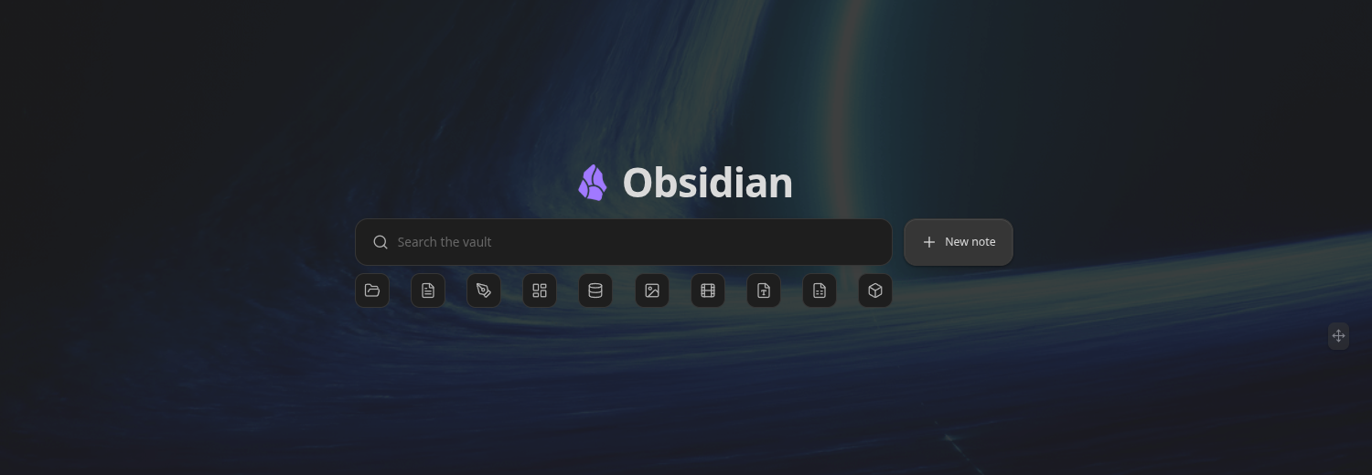
A beautiful, customizable home screen for Obsidian — search, dashboard, and launcher in one. Hearth turns your vault into a welcoming front page with a fast fuzzy search, quick file-type filters, and a fully arrangeable grid of live cards: embeds, web pages, tasks, calendars, stats, clocks, launchpads and more.
Screenshots
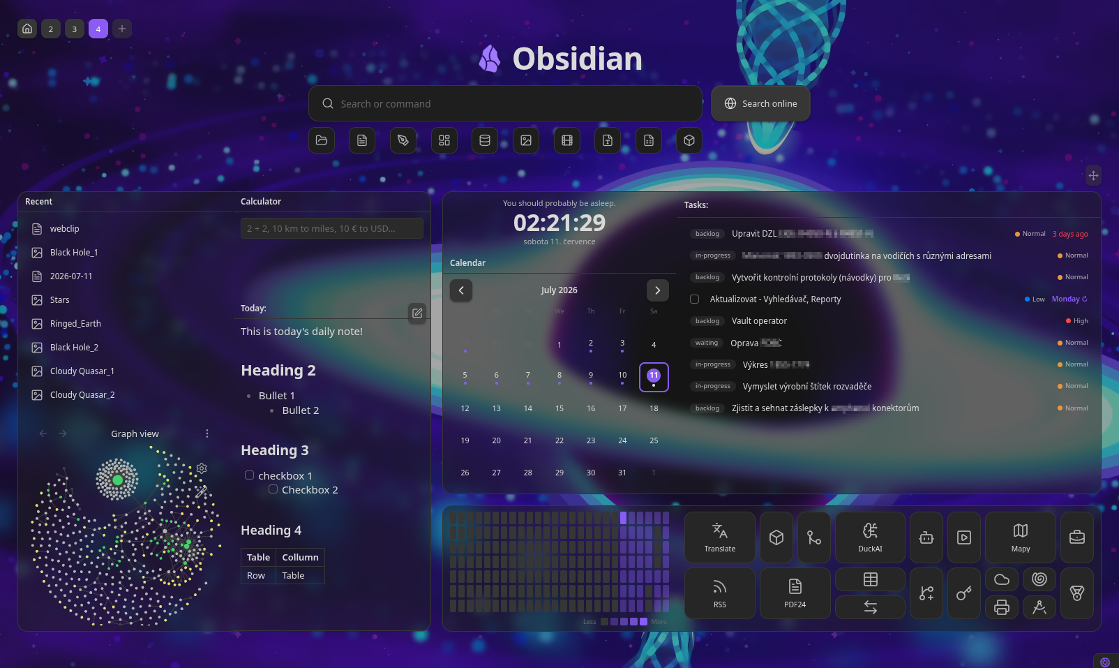
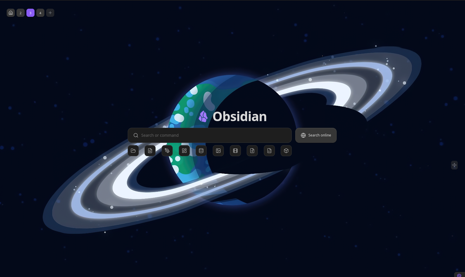
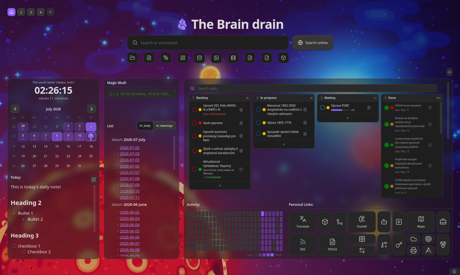
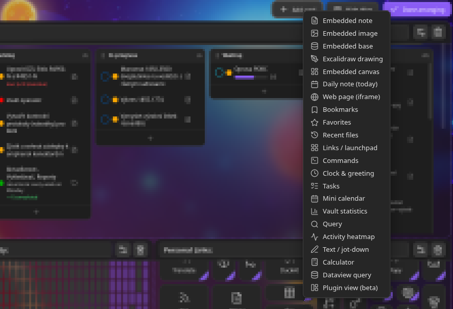
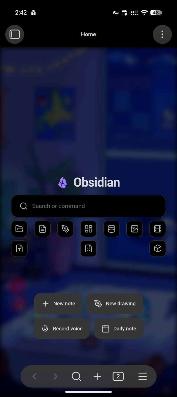
Table of contents
- Quick start
- Search & filters
- Dashboard cards
- Multiple dashboards
- Arranging the dashboard
- Appearance
- Mobile
- Settings
- Keyboard shortcuts
- Development
- Contributing
- Support
- Roadmap
- License
Quick start
- Install Hearth from Obsidian's community plugin browser (or drop
main.js,manifest.jsonandstyles.cssinto<vault>/.obsidian/plugins/hearth/and enable it). - Hearth opens automatically on startup and replaces empty new tabs — both toggleable in Settings → Hearth.
- Open it any time from the ribbon home icon or the “Open home dashboard” command.
- Hit Arrange (top-right) to add, move, resize and configure cards directly on the board.
Search & filters
The search field at the top is your vault's command centre — keyboard-first, with three transparent modes:
| Prefix | Mode | What it matches |
|---|---|---|
| (none) | Fuzzy search | File names, tags, properties, and (optionally) note bodies |
# |
Tag search | Vault tags, showing which tag matched |
key:value or key: |
Frontmatter search | Notes whose property matches |
> |
Command mode | Any registered command, run by name |
- Full-text matching is on by default — plain queries also match note bodies and show a snippet of what matched. Matched characters are highlighted throughout.
- Recent files — a focused, empty search field quietly offers your recently opened files.
- Auto-detected filters — file-type chips generated from what actually lives in your vault (Notes, Images, Videos, Sheets, Slides, Documents, Folders, Canvas, Bases, Excalidraw…), each with a fitting icon. Click a filter to drop down its matching items; hide any you don't want in settings.
- New note button — creates a note in your configured default location.
- Omnisearch engine (optional) — the search bar uses Hearth's built-in
engine by default, but you can switch it to
Omnisearch in
Settings → Appearance → Search engine. When selected, plain queries are
routed through the installed Omnisearch plugin (its results, ranking and
snippets), while
>command mode and the file-type filters keep working. If Omnisearch isn't installed or enabled, Hearth prompts you to install it and stays on the built-in engine.
Dashboard cards
Cards are the building blocks of the dashboard. Add them from the Arrange toolbar; configure each one from the card itself (title, content, colors, size).
- Embed — embed a note (
.md), image, canvas, or.basefile, rendered through Obsidian's own renderer. A per-card zoom control scales content to fit. Markdown notes can be made editable — rendered by default, switch to a raw editor on double-click, saving straight back to the vault. Give a card a second view (a second file to embed, with its own zoom and editable options) and it grows a switcher to flip between the two — shown in the card header when the card has a title, or as a floating, hover-only control in the top-right corner when it's untitled (headerless). Embedding a.basefile? A Hide base header toggle strips the Bases view's own toolbar (view switcher + filter/property controls) so the card shows only the results. - Excalidraw & canvas — dedicated templates for an Excalidraw drawing or a
.canvasfile, filling the card edge-to-edge so native pan/zoom (and Excalidraw's in-place edit toggle) work like they do in a regular note. Includes a friendly prompt when the required plugin isn't enabled. - Daily note — always shows today's daily note (resolved from the core Daily notes plugin's date format and folder), with a one-click prompt to create it when missing and a hideable button to open it in the editor. Optionally editable in place.
- Web page — embed any
http(s)URL in a sandboxed iframe, with an optional auto-refresh interval and an "open in browser" fallback for sites that refuse to be framed. - Tasks — scans Markdown checkboxes (with 📅 due-date parsing,
click-to-toggle, click-to-open at the line), reads TaskNotes task notes via
frontmatter, or reads a Kanban
plugin board note. Folder whitelist/blacklist for scope. Click + (top-right,
TaskNotes source) to create a new task via TaskNotes' own command. Tasks are
sorted by due → scheduled → priority → created, with a minimalistic
sort control — pick Smart (that default chain), Due date,
Priority, Date created or Alphabetical, and optionally reverse
it. A list has one control in its header; a Kanban board puts one on each
column so every column sorts independently. The choice is remembered, and
incomplete tasks always sort ahead of completed ones. For finer control, the
list sort control also offers Custom sort… — a modal to build an ordered
list of rules (each a field + direction) applied in sequence, so the first
rule is the primary sort and each next one breaks ties (e.g. Priority
descending, then Due date ascending). Fields include due date, scheduled
date, priority, date created, alphabetical and status. A custom sort
supersedes the single-key choice and, on a Kanban board, is the fallback for
any column without its own override — mirroring how the list filter works. Due dates show as short
relative labels (Today, Tomorrow, Yesterday, the weekday for the
rest of the week, Next Friday / Last Friday for the week after, then
a compact "15 Jul"). They also accept natural-language input: write
📅 tomorrow,📅 next friday,📅 in 3 days,📅 end of month(or the same wording in a TaskNotesduefield) and Hearth resolves it to a date. Plain checkboxes also read the full obsidian-tasks marks — priority (🔺⏫🔼🔽⏬), a repeat (🔁), and the start/scheduled/due/done dates — showing them as indicators and letting you edit them (right-click a checkbox → Edit dates & priority, in either the list or the Kanban board). This is a per-card Dates & priorities toggle (on by default, the same switch the Kanban source has); turn it off to read checkboxes as plain text, leaving any emoji untouched in the visible text. Empty checkboxes (- [ ]) are ignored. - Recurring tasks — TaskNotes tasks with a
recurrenceRRULE show a ↻ badge next to the next-occurrence date (read fromscheduled), tinted with the accent color so recurring items stand out at a glance. Hovering the date reveals a plain-English schedule (e.g. "Repeats every week"). Overdue recurring tasks are tinted just like one-offs. - Kanban tasks — the Tasks card can render as a Kanban board grouped by
status. Drag cards between columns to change checkbox state or TaskNotes
status, drag column headers to reorder, and hide columns you don't need.
TaskNotes tasks show a priority indicator read from a configurable
frontmatter field, and a drop outline previews where a dragged card will
land. For the Markdown-checkbox source you can define your own task
states — one per line as
[symbol] Label(add(done)to mark a state complete), e.g.[ ] To do,[/] In progress,[x] Done (done)— and each becomes a board column; dragging a card writes that checkbox symbol. A default set (To do / In progress / Done) is used until you customise it. - Kanban plugin board — point the Tasks card at a
Kanban board note
(or let Hearth auto-detect one by its
kanban-pluginfrontmatter). Each##heading becomes a column and the checkbox items beneath it become cards. Read it either as a list or as Hearth's own Kanban board: drag cards between the board's real columns (Hearth rewrites the note, moving the item under the target heading), tick a card to complete it in place, and add new cards straight into a column. Card text renders[[wikilinks]]and Markdown links as clickable links, and a card can carry a plain-text description shown as sub-bullets. Double-click a column title to rename it. Right-click a card (on the board or in the list) to edit its dates & priority, convert it into its own note (like the Kanban plugin — the card becomes a link), or delete it. Convert-to-note moves the card's description into the new note (as bullet points), can seed the note from a template (with{{title}}/{{date}}/{{time}}substitution), and can optionally scrape the card's metadata into the note's frontmatter instead of leaving the emoji markers on the board link — all set per card in its settings. Prefer notes over checkboxes? Turn on New tasks as notes and every card you add is created as its own note (a link on the board) straight away, applying the same template and metadata options. The add-card form also carries a per-add Create as note toggle, and when a template is set it previews the template body right in the form so you can edit it before the note is created. A converted card keeps showing its dates & priority on the board (read back from the linked note's frontmatter), and both its metadata and description stay editable straight from the card — the quick view writes the metadata to the note's frontmatter and the description to the note body. A column's check icon marks it a done column, so cards complete automatically when dragged or added there (and the ones already in it complete at once). Turn on Dates & priorities to read the marks each card carries (compatible with obsidian-tasks): a five-level priority (🔺⏫🔼🔽⏬, each a distinct colour), a repeat (🔁), and the start (🛫), scheduled (⏳), due (📅) and done (✅) dates — shown as compact indicators (priority as a coloured dot on board cards, a labelled chip in the list) and used for sorting. The add-card form and the right-click Edit dates & priority dialog both provide fields: a priority menu, a deterministic repeat picker (daily/weekly/monthly/yearly × an interval), start/scheduled/due date pickers, and a description — where a repeat is mutually exclusive with fixed start/due dates (a recurring card is anchored by its scheduled date). Checking a one-off card off stamps its ✅ done date (unchecking removes it). A recurring card (one with a 🔁) completes per-occurrence instead — like TaskNotes: checking it stamps today's ✅ and rolls its date to the next occurrence, so it reads as done today and resets to open on its next date rather than retiring. The list layout gains a minimalistic header with the task count and a quick-add. Leave the mode off to read the board as plain text. Everything is written back in Kanban's own format, so the board stays fully editable in the Kanban plugin. - Task quick view — clicking a checkbox task or Kanban card opens a compact popover with its metadata and description, editable in place, plus buttons to open the full note or delete the task — instead of jumping straight into the note. It's a per-card Quick view on click toggle (on by default); turn it off to open the note on click. (TaskNotes tasks always open in their own editor.)
- Mini calendar — a month grid resolved from the core Daily notes plugin's format/folder, with a dot on days that already have a note. Optional ISO week numbers and an edit-count heatmap tint; click an empty day to create that day's note. Switch it to an agenda layout to list upcoming days as a scrollable timeline instead. It can also subscribe to external calendars via ICS/iCal URLs (Google, iCloud, Fastmail, Nextcloud…): events show as coloured dots on the grid and are listed under each day in the agenda, auto-refreshed on a configurable interval and honouring the "disable external calls" privacy setting. Clicking an event opens a details modal (name, date, time, location, description, calendar, link) from which you can create a note from the event — pick a template, a folder and filename pattern, and route each value how you like (date/time into custom frontmatter, description into the body, or ignored). The note is linked back to the event by its ID so it's reopened rather than duplicated.
- Vault statistics — notes, attachments, folders, unique tags and your daily-note streak, read entirely from the in-memory vault index.
- Saved search — runs a stored query (the same syntax as the search bar) and lists the matching files, refreshed live.
- Activity heatmap — a GitHub-style contribution grid tinted by how many notes were edited (or created) each day.
- Bookmarks — pulls from Obsidian's core Bookmarks plugin, with site favicons next to URL bookmarks.
- Favorites — a grid of curated note cards.
- Recent files — your recently opened files (configurable count, with an optional file-type filter — pick any combination of types to list).
- Links / launchpad — a grid of tiles opening notes, URLs or commands. Tiles live on a CSS grid with independent column and row spans, so a tile can be 2×2, 4×1, or any proportion. In arrange mode, drag a tile to drop it anywhere on the card — it pins to that spot instead of being forced into a top-to-bottom, left-to-right flow (double-click a pinned tile to release it back to auto-flow), and resize each tile independently via a corner grip.
- Commands — tiles that run any command-palette command, on the same grid with adjustable per-tile size.
- Clock & greeting — digital or analogue face, several date formats (including a custom moment.js format), and a live greeting with an optional playful (cheeky, randomised) mode.
- Text / jot-down — a quick scratch field saved with the card, rendered as Markdown (double-click to edit).
- Calculator — a Wolfram-Alpha-style input box that evaluates as you type:
arithmetic and math functions (
sqrt,sin,log,5!,2^10…), unit conversions across length, mass, temperature, time, volume, area, speed and data (10 km to miles,100 f in c,1 gb to mb), currency conversions using live ECB rates (10 € to USD,$5 in czk), and plain-language queries (20% of 150,5 squared,3 x 4). An optional on-screen keypad (basic or scientific, chosen in card settings) is handy on mobile. Everything except currency is computed locally; exchange rates are fetched once and cached, and currency degrades gracefully offline. The currency lookup uses the free, key-less Frankfurter API (ECB rates) and is the only outbound network request Hearth makes — it can be turned off under Settings → Hearth → Behaviour → Privacy & network → Disable external calls. - Dataview query (requires the Dataview
plugin) — a card that runs a Dataview query and renders the results through
Dataview's own renderers, so tables, lists and task lists look exactly as they
do inside a note and refresh live as the vault changes. The card only appears
in the Add card menu when Dataview is installed and enabled. Paste a
DQL query (
TABLE/LIST/TASK) in the card's settings — the same text you'd put in a```dataviewblock — or switch the query type to **DataviewJS** for a```dataviewjsscript (dvAPI in scope; runs arbitrary JavaScript, so only use code you trust). Links in the results are clickable. Table results auto-fit their columns to content and scroll horizontally when wider than the card; drag a column header's right edge to set a manual width (remembered per card, and re-applied when Dataview refreshes). The card runs with no "current note", so global queries (e.g.FROM #tag) work fully; a query relying onthis.filehas no file to resolve to on the dashboard. - Plugin view (beta) — host another plugin's — or a core — registered side-panel view (calendar, outline, tag pane, a Kanban board view…) right inside a dashboard card. Pick from the views your enabled plugins and Obsidian's core panes provide, and optionally point the card at a specific file to show — an Excalidraw drawing, a canvas, a note — instead of the view's empty "new file" screen, and optionally hide the view's own header (breadcrumbs, nav arrows, kebab menu) for a clean single-file card. The card hosts a detached workspace leaf, so it never shows up in your saved layout or disturbs your other panes, and it cleans itself up when the card redraws or the dashboard closes. To keep memory in check it only runs the hosted view while the card is on screen — it's torn down when scrolled out of view or when you switch to another tab, and rebuilt when you come back. It honours the card's opacity and blur (frosted glass) like every other card, and shows a friendly prompt when the chosen view's plugin is disabled. Hosting a live view costs more than an ordinary card and some views expect a real sidebar and may size oddly on a wide card — hence beta; use a few at most.
Live content
- Embed and daily cards refresh from vault events the moment their file changes (created, edited, deleted); editable notes sync without ever losing the cursor.
- Web cards can auto-refresh on an interval.
- Data-driven cards (tasks, stats, calendar, search, heatmap) redraw on vault and metadata changes.
- Dataview cards refresh through Dataview's own live-updating renderer whenever its index changes.
Multiple dashboards
- Switcher — a
[1] [2] [+]row in the top-left switches between boards and adds new ones. Give a board an emoji/icon to label its button instead of a number. Right-click a button for dashboard settings (name, icon, overrides) or to delete it. Drag the buttons to reorder boards. - Per-dashboard overrides — each board can override the global content width, fit-to-page, columns, row height and background, falling back to the defaults when unset.
- Pinned cards — pin any card to show it on every dashboard, sharing one definition and position across boards.
Arranging the dashboard
- Free-form drag & resize — hit Arrange (top-right) to move cards (drag anywhere) and resize them from any edge or corner. Placement is fully free-form: cards sit and size anywhere, with magnetic alignment — edges and centres snap to neighbouring cards and the board, showing guide lines.
- Edge-merging cards — when two cards are snapped together (touching edges), their shared border drops out and the touching corners sharpen so the pair reads as one continuous tile — like grouped Android notifications. The merge follows the live layout, so it updates as you drag cards together.
- On-board management — in arrange mode each card header is editable: rename inline, swap the embedded file via a fuzzy picker, or remove the card. Add card (toolbar) drops in a new card from the library. A Hide header toggle in the toolbar hides the dashboard header so the full board is visible end-to-end while you arrange.
- Per-card colors & background — give any card an accent and a background tint.
- Per-card opacity — a global Card opacity slider tints card surfaces so the dashboard background shows through without dimming content. Opacity cascades: global → per-dashboard → per-card override.
- Card blur (frosted glass) — a backdrop blur behind translucent cards, set at the same three levels as opacity: a global Card blur default (Settings → Dashboard), a per-dashboard override, and a per-card slider in the card's Colors section. It blurs only the dashboard behind the card, leaving the card's content sharp. Cards snapped together blur on one shared layer, so a merged group reads as a single seamless sheet of glass with no seam at the join. Frosted-glass cards are the default look for fresh installs (card opacity 0.50, card blur 7, over a lighter background blur); existing vaults keep their settings until a slider is reset (↺).
- Ambient default background — out of the box Hearth ships with a soft ambient background (low opacity + blur) that sits behind cards without competing with content. Replace it with a solid color, a vault image, or an image URL — per-board overrides supported.
- Independent tile sizing — tiles live on a fine CSS grid (44 px cells, 4 px snap), each with its own column and row span. Drag the corner grip to resize; drag the tile body to drop it anywhere on the card (it pins to that spot; double-click to release it back to auto-flow). The default tile is a 2×2 cell block.
- Granular card sizing — numeric width/height per card, plus a configurable row height for fine vertical control.
- Fit to page — lock the dashboard to one screen (no scroll) or let it scroll. Available globally and per-board. On by default for new installs; stuck cards are auto-recovered back onto the board on render.
- Import / export — back up or share the active board's layout as JSON.
Appearance
- Title & logo — set any title text and an emoji/short logo.
- Background — solid color, a vault image, or an image URL, with opacity and blur controls. Per-board overrides supported. Ships with an ambient default so the dashboard looks good out of the box.
- Compact spacing — tighten card padding and the top margin to enlarge the usable area.
- Card opacity — make card surfaces translucent so the dashboard background shows through; content stays fully legible.
- Card blur (frosted glass) — blur the dashboard behind translucent cards for a frosted-glass look, at global, per-dashboard and per-card levels. On by default for fresh installs; merged cards blur as one seamless surface.
- Card corner radius — a Card corner radius slider controls how rounded card corners are, from the default 14 px down to sharp 0 px corners, at global (Settings → Dashboard) and per-dashboard levels. Merged-together cards still flatten their touching corners as usual, and the frosted-glass layer follows the same radius.
Mobile
- Mobile mode — an optional search-only launcher: on phones and tablets the dashboard collapses to just the search field (desktop is unaffected).
- Mobile action bar — in Mobile mode, the “New note” button moves out from beside the search bar into a row of buttons under the search field and filters, pinned to the bottom quarter of the screen. Ships with New note, New drawing (Excalidraw), Record voice (core Audio recorder) and Open daily note, but every button can be swapped for any command from the same picker used by the Commands card.
- Keyboard-aware — when the on-screen keyboard opens, the visible area is tracked so nothing hides behind it.
Settings
Everything lives under Settings → Hearth, organised into a category ribbon pinned at the top — click a tab to see just that group's sections instead of scrolling one long list. Every setting carries a description, and many fields have a reset (↺) button back to their default.
- Appearance — title, logo, background (none/color/image/URL, opacity, blur), compact spacing.
- Search — search placeholder, full-text search, new-note button, search engine (built-in / Omnisearch), file-type filters.
- Dashboard — fit to page, columns, row height, max width, card opacity, card blur (frosted glass).
- Behaviour — open on startup, replace empty new tabs, mobile search-only, mobile action bar, and a Privacy & network toggle to disable external calls (the calculator's currency-rate lookup — the only outbound request Hearth makes).
- Integrations — Tasks / TaskNotes frontmatter field names and the status value(s) that count as "done".
- Backup — import / export the current dashboard's layout as JSON.
- About — links to the GitHub repository and issue tracker, a Ko-fi tip button, and the running version.
Per-card settings (type, title, content, colors, opacity, blur, size) are edited from the card itself in arrange mode — not from the settings tab.
Keyboard shortcuts
Hearth registers commands you can bind under Settings → Hotkeys:
- Open home dashboard
- Switch to dashboard 1…9
- Switch to next / previous dashboard
In the search field: ↑/↓ to move, Enter to open, Esc to dismiss.
Development
npm install      # install dependencies
npm run dev      # watch build -> main.js
npm run build    # typecheck + production build
npm run typecheck
To test in a vault, symlink or copy main.js, manifest.json and styles.css
into <vault>/.obsidian/plugins/hearth/.
Translations
User-facing strings live in src/locales/. English
(en.ts) is the source of truth and Hearth follows Obsidian's UI language at
load. Adding a language is a matter of copying en.ts, translating the values
(the keys are type-checked against English), and registering the file — see
src/locales/README.md for the walkthrough.
Contributing
Hearth is moving fast, so right now the most valuable contributions are bug reports, feature ideas and translations rather than large pull requests — a big PR against a fast-moving codebase tends to go stale or collide with work in flight. Small, obvious fixes are always welcome; for anything larger, please open an issue first. As development slows down I'll be able to take PRs far more readily. See CONTRIBUTING.md for the full story.
Support
Hearth is free and open source. If it's earned a place on your vault's front page and you'd like to support its development, you can buy me a coffee — it's genuinely appreciated and helps keep the updates coming.
Changelog
Release history lives in CHANGELOG.md.
License
MIT © ondreu