Docgen
 Maxim Stepanov123 downloads
Docgen — a warm near-black Obsidian theme with honey-amber accents, set in Geist.
- Overview
- Scorecard
- Updates3
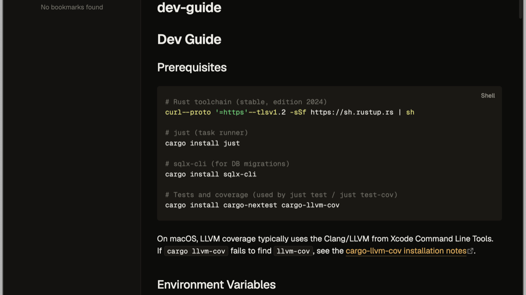
A warm, near-black documentation theme for Obsidian, modeled after the aesthetic of the docgen documentation generator (docgen-rs). Honey-amber accents on a warm near-black surface, set in Geist. Dark is the primary mode; a light mode ships alongside it.
Features
- Warm near-black palette with a honey-amber accent — easy on the eyes for long documentation sessions.
- Geist + Geist Mono, embedded directly in
theme.cssas base64 so the fonts render regardless of how Obsidian injects the stylesheet (no external font requests, works fully offline). - Dark and light modes, both tuned from the same token set.
- Bullet journal checkboxes — 23 task markers, styled in the docgen palette. See Task markers.
Task markers
Write any of these inside the brackets of a task item — - [>] Move to Friday.
Obsidian exposes the character as data-task, and the theme styles it.
The four state markers keep the checkbox, because they answer is this done:
| Marker | Meaning | |
|---|---|---|
| ☐ | [ ] |
To do |
| ☑ | [x] |
Done |
| ◧ | [/] |
In progress — box with its left half filled |
| ⊟ | [-] |
Cancelled — struck through, like done |
Everything else is an annotation: no box, just an icon, because it answers what kind of thing is this:
| Marker | Meaning | Marker | Meaning | |
|---|---|---|---|---|
[>] |
Forwarded | [b] |
Bookmark | |
[<] |
Scheduled | [l] |
Location | |
[!] |
Important | [n] |
Note | |
[?] |
Question | [k] |
Key | |
[*] |
Star | [p] |
Pro | |
[I] |
Idea | [c] |
Con | |
[f] |
Fire / urgent | [u] |
Trend up | |
[w] |
Win | [d] |
Trend down | |
["] |
Quote | [S] |
Savings | |
[i] |
Info |
Icons are Lucide, the set Obsidian itself ships. They
size themselves from --checkbox-size, which core derives from your text-size
setting — so checkboxes scale with your font and the theme overrides neither.
The marker set is compatible with the Things and Minimal themes, so notes written for those render correctly here.
Installation
From the community themes directory (once published)
- Open Settings → Appearance → Themes → Manage.
- Search for Docgen and select Install and use.
Manual installation
- Download
manifest.jsonandtheme.cssfrom the latest release. - In your vault, create the folder
.obsidian/themes/Docgen/and place both files inside it. - Open Settings → Appearance → Themes and select Docgen.
Development
theme.css is the single source of truth and is self-contained — the Geist
fonts are inlined, so no build step is required to use it. The original
.woff2 sources live in fonts/ for reference and re-embedding.
Credits & license
- Theme CSS: MIT © Maxim Stepanov.
- Geist and Geist Mono fonts: © Vercel, Inc., licensed under the SIL Open Font License 1.1.