
- Overview
- Scorecard
- Updates7
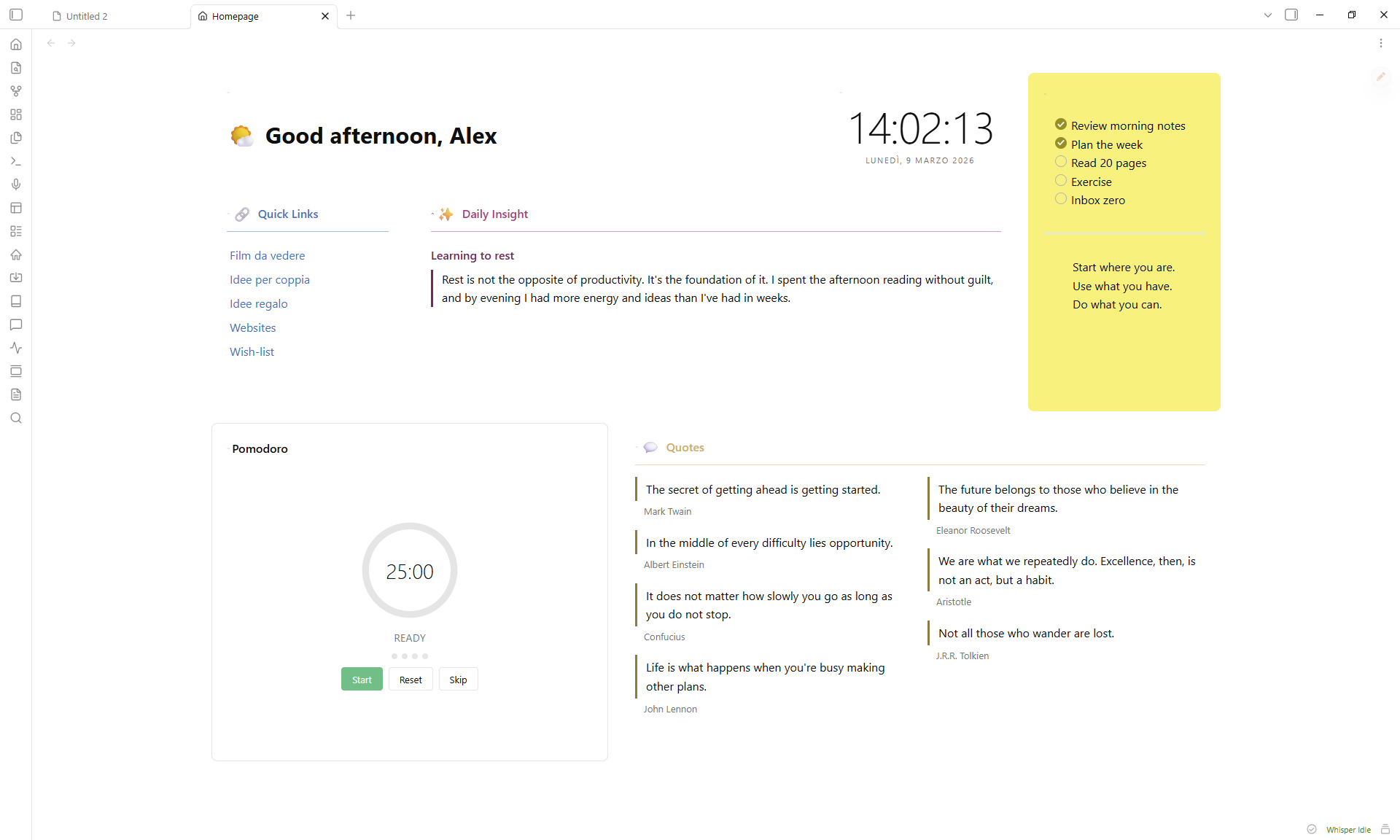
A composable, drag-and-drop homepage for Obsidian.
Features
- 17 block types -- greeting, clock, quotes, quick links, button grid, image gallery, video embed, embedded note, static text, HTML, bookmarks, recent files, pomodoro timer, spacer, random note, voice notes, vault search
- Drag-and-drop layout with 2D resize (column span + row height)
- Accent colors with adjustable intensity (5--100%) that tint the entire card, including interactive controls
- Per-block styling -- title, emoji, divider, padding, elevation, border, opacity, backdrop blur, gradients
- Responsive layout -- blocks reflow in narrow panes via CSS container queries
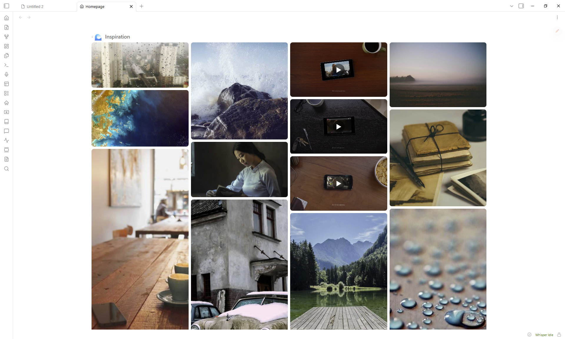
- Full-screen lightbox for gallery images with keyboard and swipe navigation
- Collapsible blocks -- click any header to collapse or expand it
- 50 language presets for greeting salutations
- Zero runtime dependencies beyond GridStack
Installation
From Community Plugins
- Open Settings > Community plugins > Browse
- Search for Homepage Blocks
- Click Install, then Enable
Manual
- Download
main.js,manifest.json, andstyles.cssfrom the latest release - Create
<vault>/.obsidian/plugins/homepage-blocks/ - Copy the three files into that folder
- Enable the plugin in Settings > Community plugins
Getting started
- Click the house icon in the ribbon, or run
Open Homepagefrom the command palette. - Click the pencil FAB to enter edit mode.
- Add Block inserts new blocks. The gear icon opens settings, the grip handle reorders, and the corner grip resizes.
- Click Done to exit edit mode.
Block types
| Block | Description |
|---|---|
| Greeting | Time-aware salutation with 50 language presets and custom emoji per time slot or random pool |
| Clock | Live clock with optional seconds and date display |
| Quotes | Multi-column quotes pulled from tagged notes or entered manually |
| Quick Links | Auto-generated list from a folder (with optional glob patterns like Projects/*.md or **/*-draft.md), plus manual links |
| Button Grid | Emoji-labeled buttons that open notes |
| Image Gallery | Grid or masonry layout from a vault folder, with lightbox |
| Video Embed | YouTube, Vimeo, Dailymotion -- supports playlists with shuffle |
| Embedded Note | Renders a vault note inline |
| Static Text | Freeform markdown with a quick-edit button |
| HTML | Custom HTML (sanitized for security) |
| Bookmarks | Web links and vault bookmarks in a grid |
| Recent Files | Your most recently modified notes |
| Pomodoro | Configurable work/break timer |
| Spacer | Empty space for layout gaps |
| Random Note | Surfaces a random note from a tag filter, with excerpt preview |
| Voice Notes | Tap-to-record voice transcription via OpenAI Whisper or Google Gemini -- see Voice Notes & privacy below |
| Vault Search | In-block search over the vault's markdown files |
Voice Notes & privacy
The Voice Notes block records audio in your browser and uploads it to a third-party transcription service. Before you record for the first time, the plugin asks you to confirm the upload per provider.
What is sent and where:
| Provider | Endpoint | Data sent | Authentication |
|---|---|---|---|
| OpenAI Whisper | api.openai.com/v1/audio/transcriptions |
Raw audio blob + model + optional language hint | Your OpenAI API key in the Authorization: Bearer ... header |
| Google Gemini | generativelanguage.googleapis.com/v1beta/models/...:generateContent |
Base64-encoded audio + a transcription prompt + optional language hint | Your Google AI API key in the x-goog-api-key header |
API key storage: the key is encrypted at rest (AES-GCM-256) in <vault>/.obsidian/plugins/homepage-blocks/data.json using a non-extractable, per-device key held in the browser's IndexedDB. Because the key never leaves the device that created it, a synced data.json (Obsidian Sync, iCloud, Dropbox, git, ...) carries only ciphertext that cannot be decrypted on another device -- you re-enter the API key per device. On the rare platform without WebCrypto, the plugin falls back to plaintext (with a refuse-to-downgrade guard that never overwrites existing ciphertext). Treat the key like any secret regardless, since the ciphertext still travels with your synced vault. When you Export layout the key is stripped from the exported JSON.
Revoking access: delete the key from the provider's dashboard (OpenAI, Google AI Studio) and clear the API key field in block settings.
Mobile: voice recording requires the platform's MediaRecorder + navigator.mediaDevices APIs. On platforms that don't expose them, the block is automatically disabled with an "Not available on this platform" message.
If you do not want the Voice Notes feature, simply don't add a Voice Notes block -- no code runs and no network calls happen.
Card styling
Every block shares these settings (open them with the gear icon):
- Title -- custom label, emoji (picker), size (h1--h6), show/hide, divider
- Accent color -- preset swatches or custom picker, intensity slider (5--100%)
- Card -- hide border, hide background, padding, elevation (shadow), border radius/width/style
- Advanced -- background opacity, backdrop blur, two-color gradient with angle
An accent color tints the header, background, border, divider, and all interactive controls (checkboxes, toggles, radio buttons) in one step.
Settings
Open Settings > Homepage Blocks:
| Setting | Description |
|---|---|
| Open on startup | Opens the homepage automatically when Obsidian launches |
| Startup open mode | Controls how the homepage opens on startup -- replace active tab, new tab, or sidebar |
| Open when empty | Opens the homepage when no other tabs are open |
| Manual open mode | Controls how the homepage opens from ribbon/command -- replace, new tab, or sidebar |
| Pin homepage tab | Prevents the homepage tab from being closed |
| Separate startup for mobile | Use independent startup settings on mobile (open-on-startup, open mode, pin, ...) instead of mirroring desktop |
| Default columns | Grid column count (2, 3, 4, or 5) |
| Responsive mode | Unified (one adaptive layout) or Separate (independent desktop + mobile layouts, with copy-to-mobile) |
| Compact layout | Removes vertical gaps between blocks in view mode (off preserves intentional gaps) |
| Hover highlight | Subtly lifts blocks on hover and reveals the collapse toggle |
| Show scroll bar | Shows or hides the homepage scroll bar |
| Reset to default layout | Restores demo blocks (cannot be undone) |
| Export layout | Exports your layout as JSON |
| Import layout | Imports a layout from JSON |
| Layout presets | Applies a preset layout (Minimal, Dashboard, Focus) |
Commands
| Command | Action |
|---|---|
Open Homepage |
Opens or focuses the homepage tab |
Toggle edit mode |
Switches between edit and view mode |
Add block |
Opens the add-block modal |
CSS customization
You can override layout variables in a CSS snippet:
:root {
  --hp-gap: 16px;
  --hp-padding: 24px;
  --hp-card-padding: 16px;
  --hp-content-max-width: 1400px;
  --hp-row-unit: 200px;
}
Using theme colors in HTML blocks
HTML that contains a <style> block is rendered inside a sandboxed iframe (no scripts, no network) for full CSS support with style isolation. HTML without a <style> block is sanitized and rendered inline, where <style>/<script>/<iframe> and other active tags are stripped. For inline fragments, match your theme by using inline style attributes with Obsidian's CSS variables -- these update automatically when you switch themes, so your HTML stays consistent.
Common theme variables
The table below lists the most useful variables. Use them as var(--variable-name) inside any inline style.
| Category | Variable | Description |
|---|---|---|
| Background | --background-primary |
Main app background |
--background-secondary |
Card / panel background | |
--background-modifier-border |
Standard border color | |
| Text | --text-normal |
Primary text |
--text-muted |
Secondary / dimmed text | |
--text-faint |
Even lighter text | |
--text-accent |
Accent-colored text | |
| Accent | --color-accent |
Theme accent (links, focus rings) |
--interactive-accent |
Active control background | |
--interactive-accent-hover |
Hovered control background | |
| Radius | --radius-s / --radius-m / --radius-l |
Border radius presets |
A themed card
This example builds a card that adapts to any theme:
<div style="
  background: var(--background-secondary);
  color: var(--text-normal);
  padding: 16px;
  border-radius: var(--radius-m);
  border: 1px solid var(--background-modifier-border);
">
  <h3 style="color: var(--color-accent); margin-top: 0;">Dashboard</h3>
  <p style="color: var(--text-muted);">This card follows the active theme.</p>
</div>
You can blend colors with color-mix() to create transparent or tinted variants:
<div style="background: color-mix(in srgb, var(--color-accent) 10%, transparent);">
  Subtle accent tint
</div>
Finding more variables
Open DevTools (Ctrl+Shift+I), inspect the <body> element, and filter the Computed tab for --. You will see every CSS variable the current theme defines.
Support
Bug reports and feature requests: GitHub Issues