VitePress Theme
 weizwz31 downloads
VitePress-style theme with custom containers, enhanced code blocks, and modern typography.
- Overview
- Scorecard
- Updates2
A VitePress-style theme plugin for Obsidian, bringing the modern documentation aesthetic and syntax to your notes.
Features
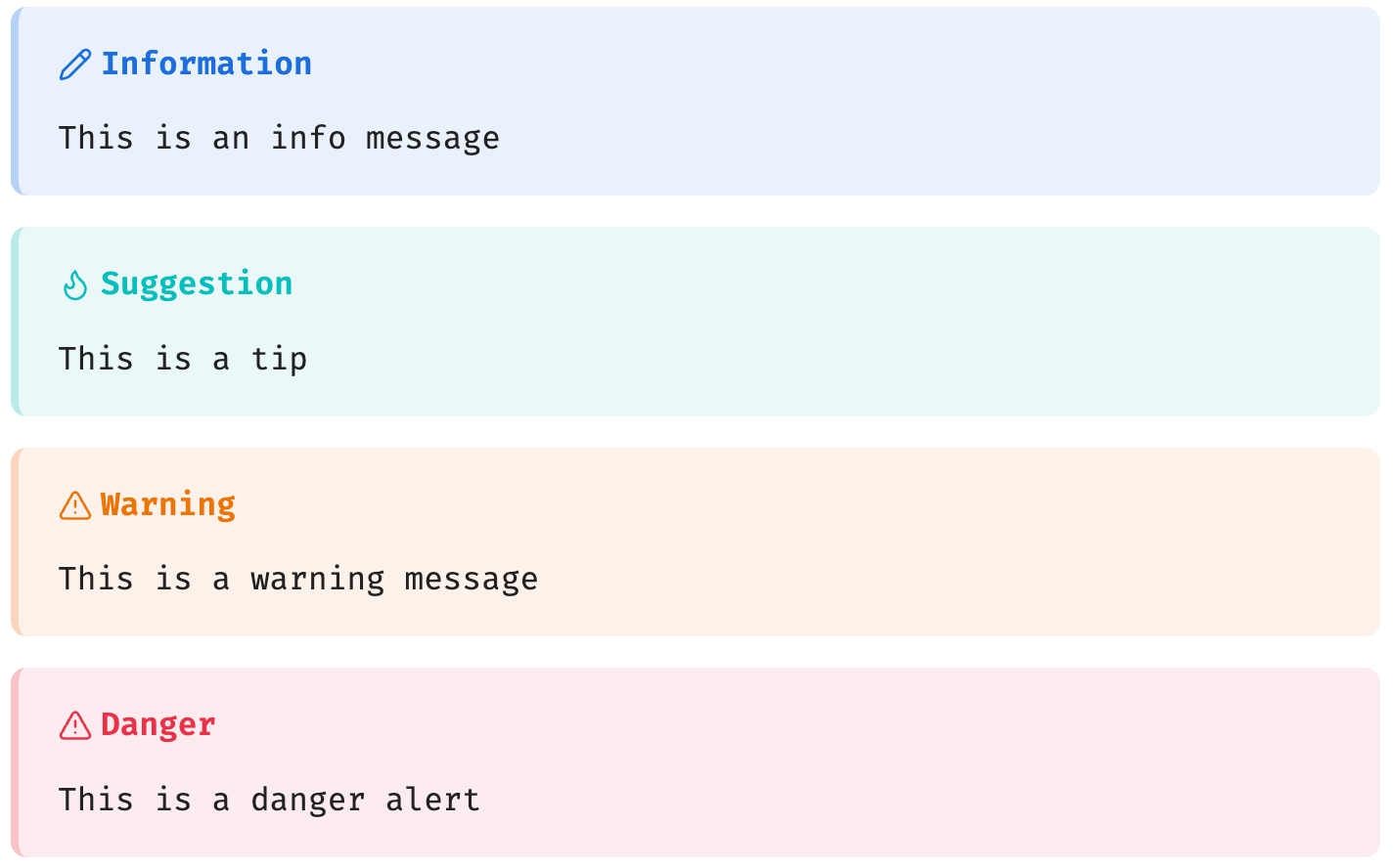
Alert Containers
Renders VitePress native ::: syntax as GitHub Alert-style cards with optional custom titles:
::: info Information
This is an info message
:::

::: tip Suggestion
This is a tip
:::

::: warning Warning
This is a warning message
:::

::: danger Danger
This is a danger alert
:::
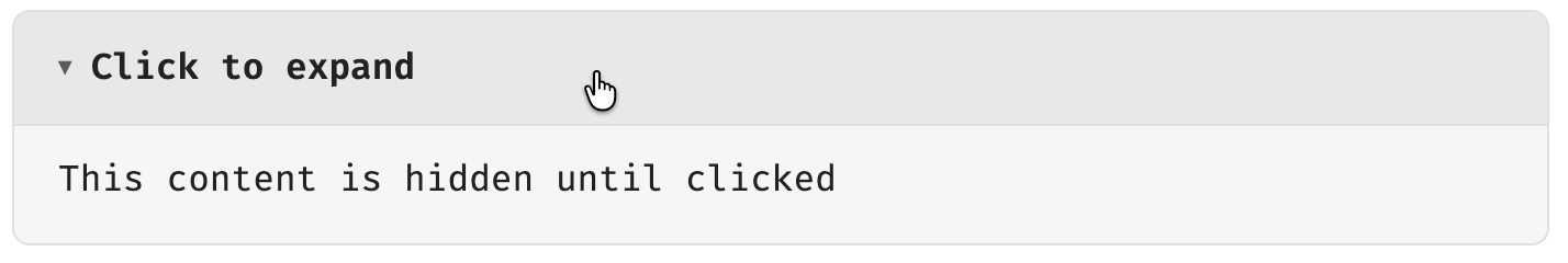
Collapsible Container
Renders ::: details as a native clickable <details>/<summary> element:
::: details Click to expand
This content is hidden until clicked
:::
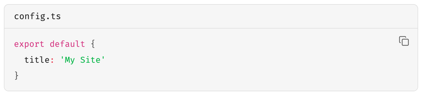
Enhanced Code Blocks
Code blocks automatically get a language label and filename display, supporting VitePress [filename] syntax:
```ts [config.ts]
export default {
  title: 'My Site'
}
```
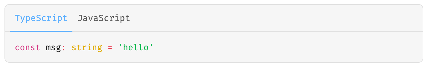
Code Groups
Groups multiple consecutive code blocks into a tabbed switcher:
::: code-group

```ts [TypeScript]
const msg: string = 'hello'
```

```js [JavaScript]
const msg = 'hello'
```

:::
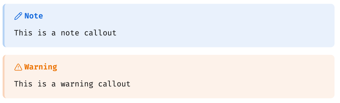
Obsidian Callout Adaptation
Native Obsidian Callouts are automatically styled to match VitePress colors:
> [!note]
> This is a note callout

> [!warning]
> This is a warning callout
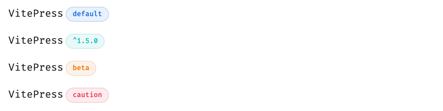
Badge Component
VitePress-style badges for marking status or versions:
VitePress <Badge type="info" text="default" />
VitePress <Badge type="tip" text="^1.5.0" />
VitePress <Badge type="warning" text="beta" />
VitePress <Badge type="danger" text="caution" />
Emoji
Support VitePress Emoji, and put the mouse on it to display the code corresponding to Emoji:
:cn: :eight: :seven:

Additional Styles
- Typography — Headings, line-height, and link styles consistent with VitePress
- Links — Relative path resolution support (
./file.md) and line highlighting references (#L10) - Tables — Unified borders and background colors
Compatibility
| Feature | Reading Mode | Live Preview | Source Mode |
|---|---|---|---|
| Alert containers (info/tip/warning/danger) | ✅ | ❌ | ❌ |
| Collapsible container (details) | ✅ | ❌ | ❌ |
| Badge component (Badge) | ✅ | ❌ | ❌ |
| Code group (code-group) | ✅ | ❌ | ❌ |
| Code block enhancements | ✅ | ❌ | ❌ |
| Callout styles | ✅ | ✅ | ❌ |
| Table / Typography / Links | ✅ | ✅ | ❌ |
Note: VitePress-specific syntax (
:::containers) is parsed and rendered in Obsidian Reading Mode via Post Processor. Live Preview and Source Mode are intentionally left unprocessed to preserve raw text for editing.
Installation
From Source
git clone https://github.com/weizwz/obsidian-vitepress-theme
cd obsidian-vitepress-theme
pnpm install
pnpm run build
Copy manifest.json and main.js to your Obsidian vault's .obsidian/plugins/vitepress-theme/ directory, then enable it under Settings → Community Plugins.
Manual Installation
- Download the latest release (
manifest.jsonandmain.jsandstyles.css) - Place them in
.obsidian/plugins/vitepress-theme/ - Enable under Settings → Community Plugins
Development
# Install dependencies
pnpm install

# Development mode (watch + auto-copy to root)
pnpm run dev

# Production build (minified + copied to root)
pnpm run build
Settings
| Setting | Description | Default |
|---|---|---|
| Enable code block styles | Language labels and filename display | ✅ |
| Enable container styles | Alert container and details CSS | ✅ |
| Enable typography styles | Heading, link, and layout styles | ✅ |
| Parse VitePress containers | Parse ::: syntax and render containers |
✅ |
| Process links | Internal link resolution and cross-file references | ✅ |
| Follow Obsidian theme | Auto-adapt to Obsidian's color theme | ✅ |
| Custom primary color | Custom brand color (when not following theme) | #409eff |
| Debug mode | Enable console debug logging | ❌ |
License
MIT