Unidraw
 yukisova27 downloads
Draw Unicode character art, element-based diagrams and shapes inside Obsidian.
- Overview
- Scorecard
- Updates2
An element-based Unicode character-art studio for Obsidian.
Unidraw combines the grid-first spirit of ASCII Canvas, the smart
line drawing of asciiflow, and the object, element and
text workflow of Monodraw — in a native
Obsidian view with JSON .unidraw element files.
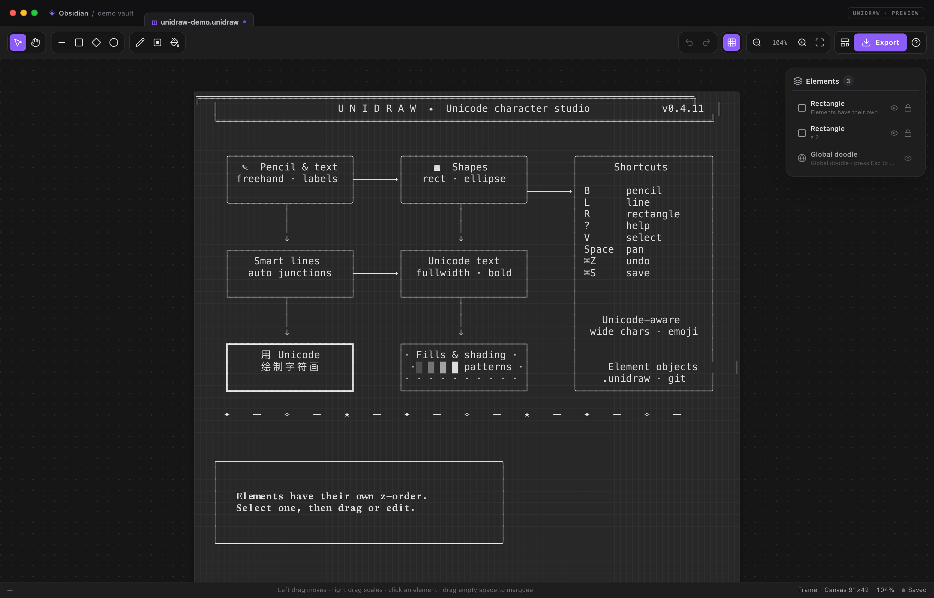
Highlights
| Elements & z-order | Rectangles, ellipses, diamonds, lines, doodles and groups are independent elements. Every element has its own z-order, visibility and lock state, and can be selected, moved, resized and deleted. |
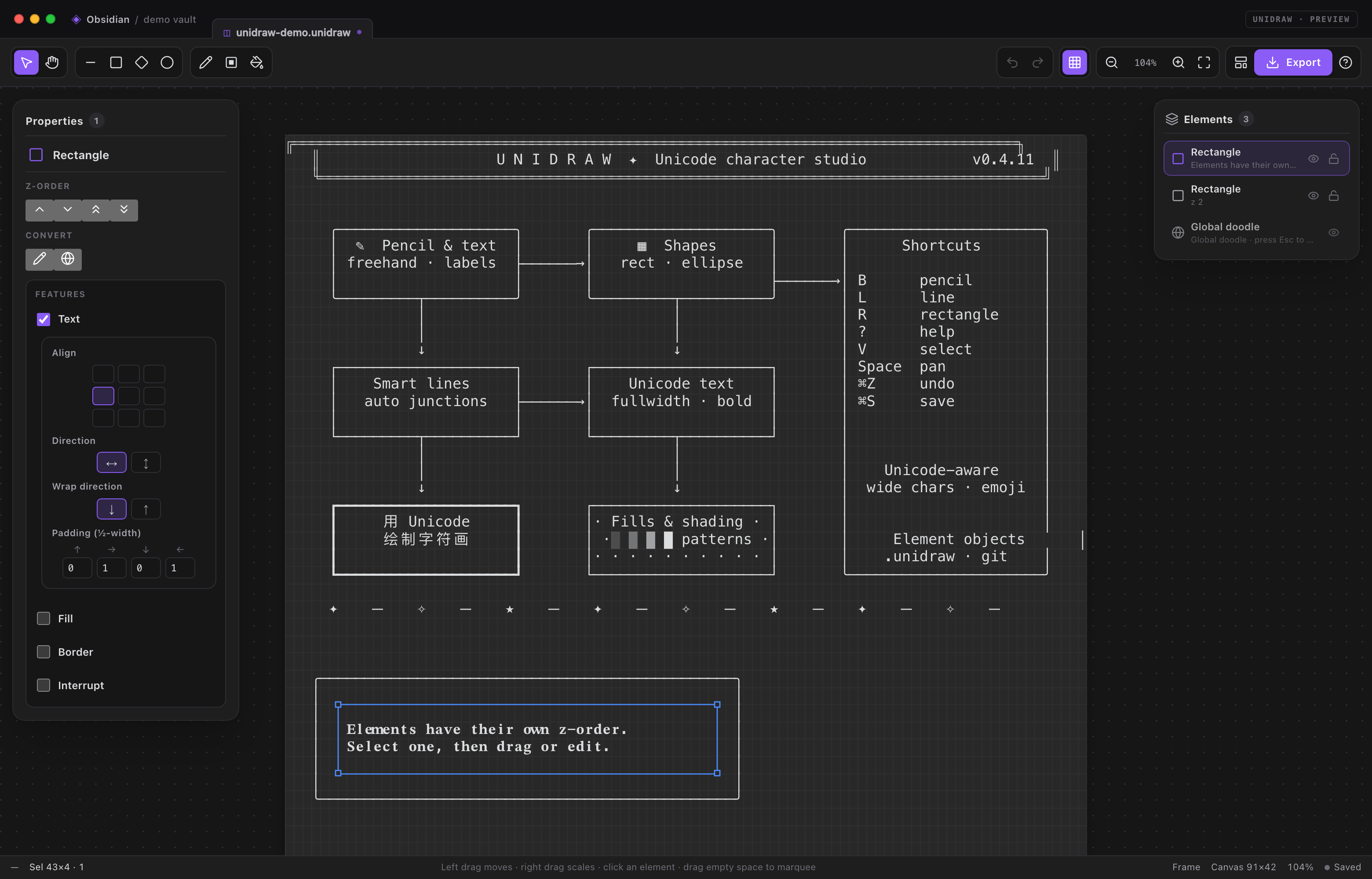
| Excalidraw-style workspace | Selecting an element opens the element inspector on the left. The canvas is built from three stacked canvases: static art, interactive selection and the new element being drawn. |
| Real element selection | Click an element, drag it, resize it from its corner handles, marquee several elements, Ctrl-click to add or remove, and align or distribute a multi-selection. |
| Global doodle & groups | Every frame starts with a global doodle pinned below all elements. It is never hit by clicks; press Esc to select it and draw into it. It has no handles or inspector card. Convert selected elements into a doodle, merge them into the global doodle, or group them. |
| Unicode accuracy | One grapheme per cell; CJK, emoji, combining marks and wide characters occupy the correct columns. |
| Smart character lines | Grid-snapped endpoints, 4-way/8-way routing, five line styles, interruption, independent start/end arrows, and obstacle-aware pathfinding. Endpoints auto-link to shapes. |
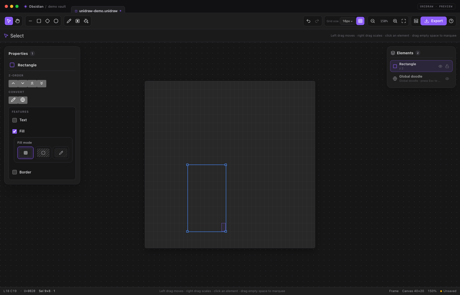
| Rectangle features | Rectangles expose optional Text, Fill, Border and Interrupt checkboxes. Each enabled feature reveals its own nested card: text layout, fill mode/swatch, stroke, or an interrupted border pattern. |
| Element list actions | Icon buttons toggle visibility and locking; right-click a row for duplicate/delete. Global doodle rows can clear their contents. |
| Obsidian-native | JSON .unidraw element files, ![[drawing.unidraw]] embeds, unidraw code blocks, commands, ribbon action, autosave, theme-aware UI and settings. |
| No runtime dependencies | The plugin has no network calls and ships no fonts or external runtime libraries. |
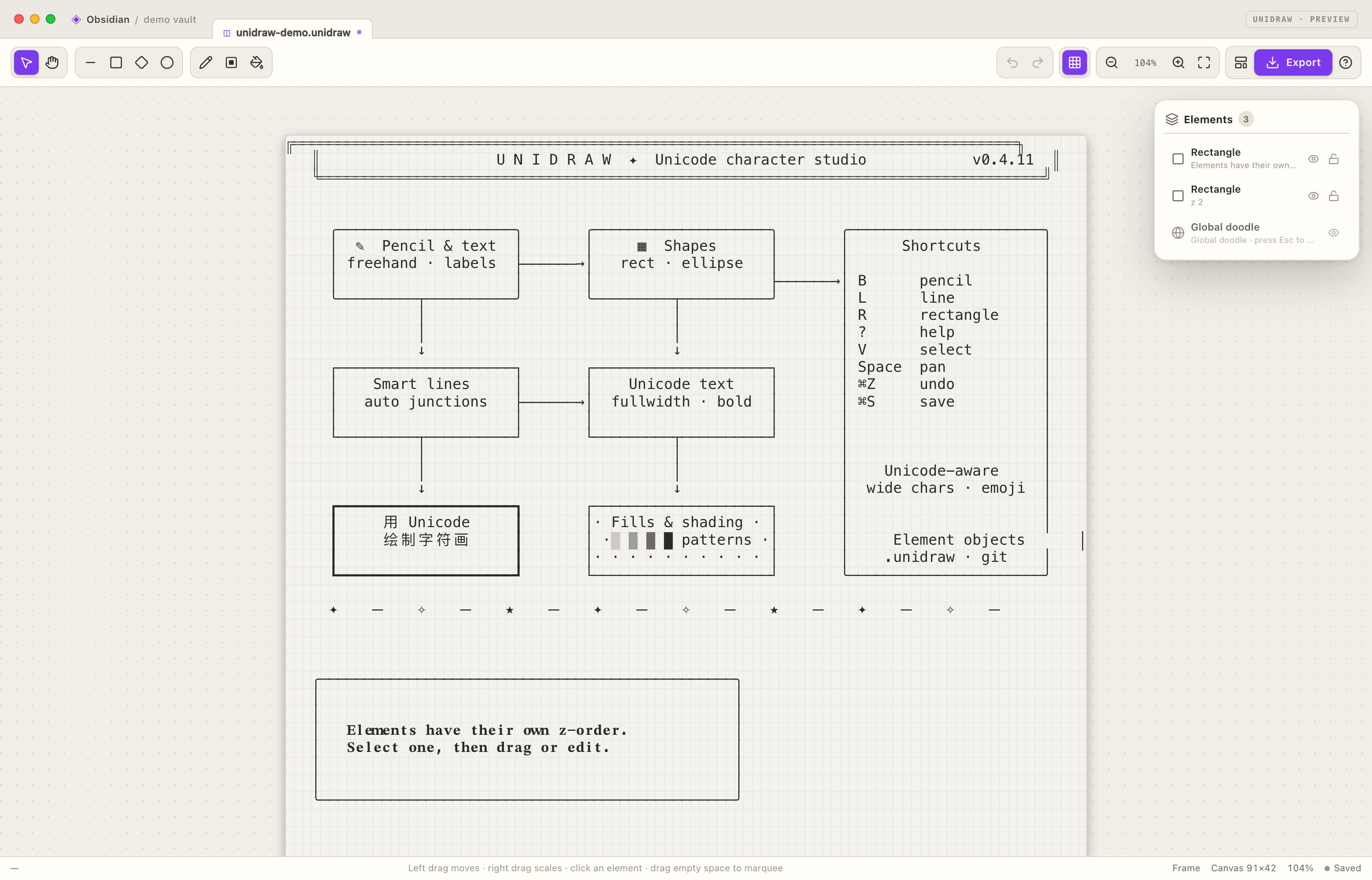
Screenshots
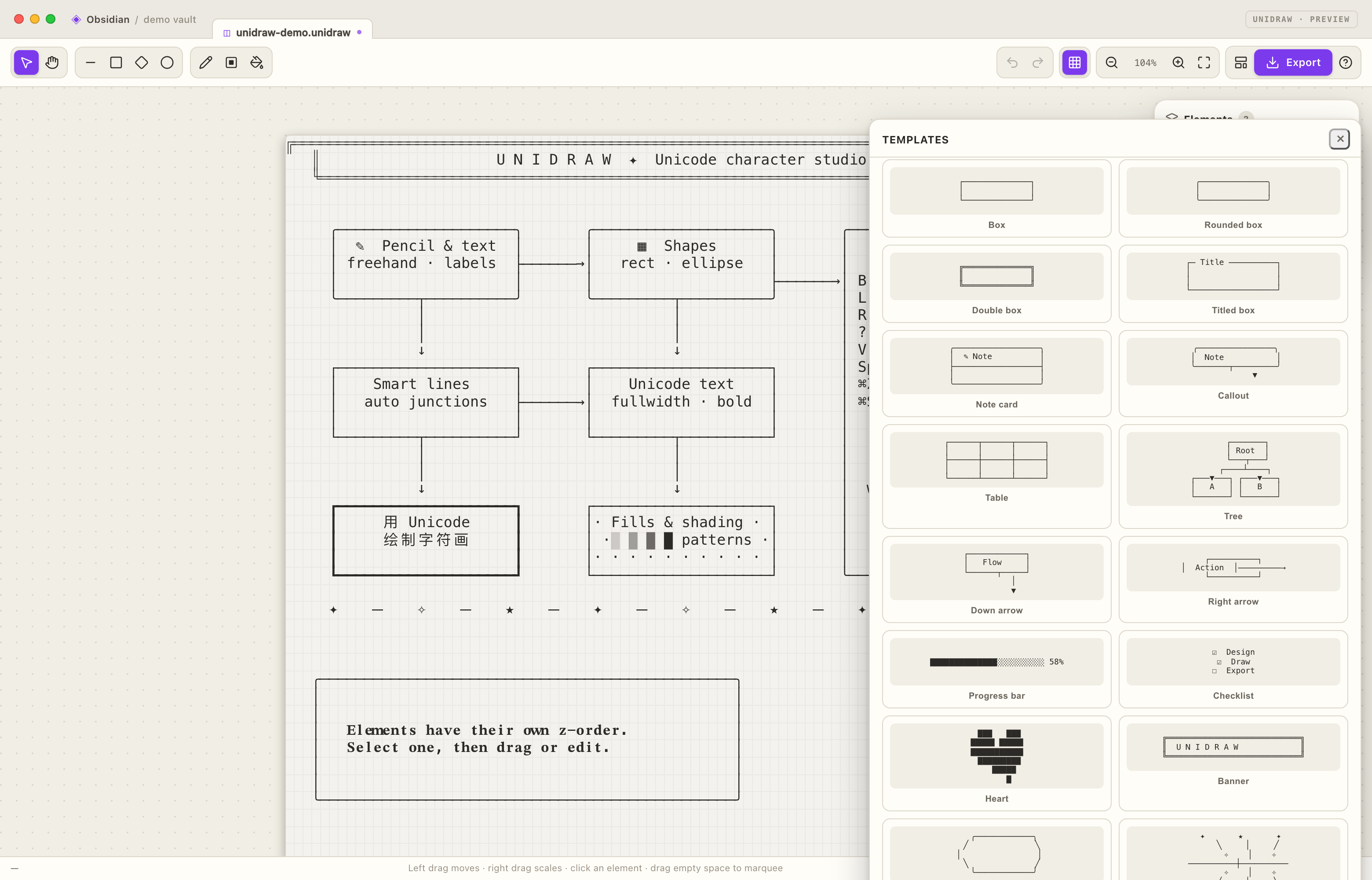
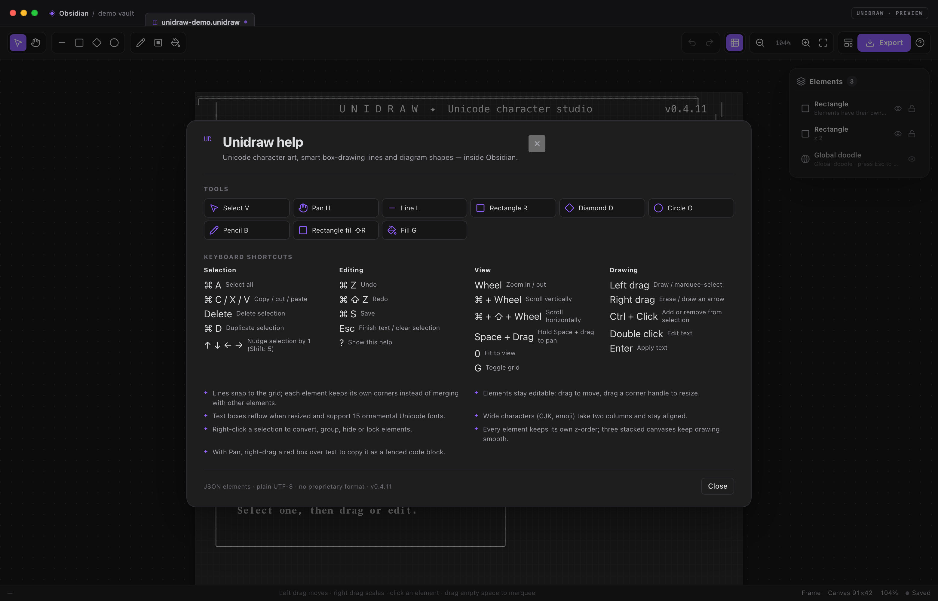
Installation
From the release package
Build or download dist/unidraw-0.4.11/unidraw-0.4.11.zip. Unzip it so that
main.js, manifest.json and styles.css live inside:
<your-vault>/.obsidian/plugins/unidraw/
Then restart Obsidian, open Settings → Community plugins, disable Restricted Mode if necessary, and enable Unidraw.
Unidraw requires Obsidian 1.7.5 or newer. It is not desktop-only; the right-click tools use pointer buttons, so a desktop or mouse is recommended for all features.
From source
npm install
npm run build          # type-check, bundle, dist/ and release zip
npm run link -- "/path/to/vault"
npm run link creates the plugin folder link and lets Obsidian reload the
current build.
Quick start
- Run Unidraw: New drawing from the command palette, or click the ribbon pencil.
- Pick a tool, then drag on the canvas. Elements are created as you go; drawings autosave.
- New elements are placed on top of the frame. Use the left element inspector to adjust z-order, visibility and lock state.
- Click an element with Select. Its bounding box and corner handles appear, and the property inspector opens on the left.
- Use Export for PNG, transparent PNG, text, Markdown, or to insert the drawing into the active note.
Workspace
- Tool areas — operation (Select, Pan), shapes (Line, Rectangle, Diamond, Ellipse), and drawing (Pencil, Rectangle fill, Fill). Text is a rectangle feature, not a tool.
- Right element list card — every element in top-to-bottom z-order with a type-specific icon. Drag any row directly to change its z-index; selection is not required. Groups have a chevron and expand into indented child rows, where children can be shown/hidden, locked and dragged to adjust their z-index inside the group. Click a row to select it; Ctrl/Cmd-click toggles, Shift-click selects a range. Icon-only eye and lock buttons toggle visibility and locking. The global doodle has no lock button and stays at the bottom.
- Group inspector — rename the group directly in the inspector title, switch
Separate / Merge intersection rendering, or save the group as a JSON
template. Templates are appended to
group-templates.jsonin the plugin directory. - Left element card — type-specific icon and title, an icon-only z-order area, an icon-only conversion area, shape/text properties, and icon-only duplicate/delete/edit actions. Visibility and lock controls live in the right element list.
- Canvas — grid-snapped character art built from three stacked canvases: StaticCanvas (committed elements in z-order), InteractiveCanvas (selection boxes, handles, marquee and hover) and NewElementCanvas (the temporary element being drawn or moved).
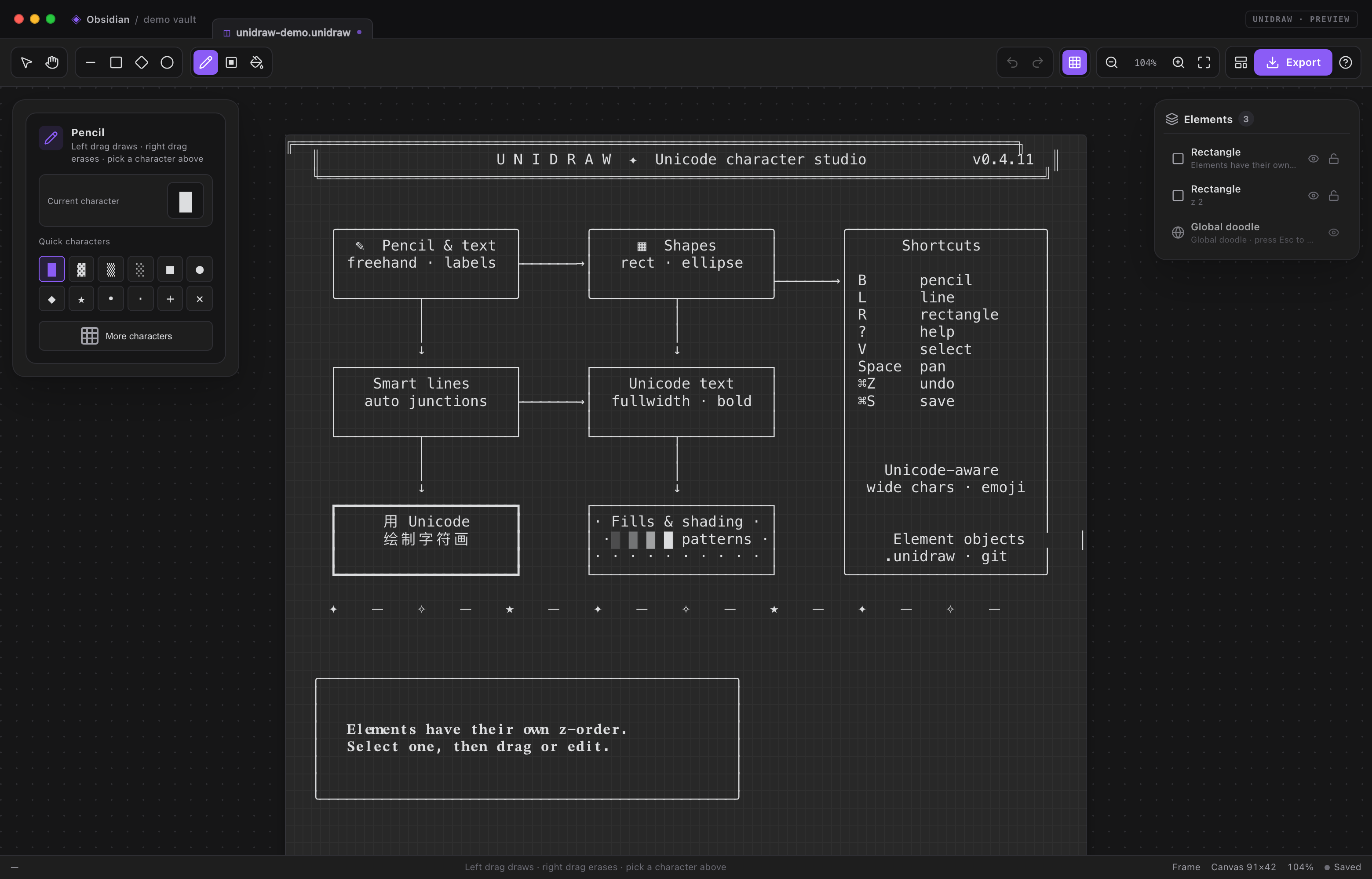
- No contextual style bar — tool settings live in the selected-element inspector; the status bar keeps the current tool hint. Pencil, filled-rectangle and fill tools replace the inspector with a drawing-tool card showing the active tool, its current character and quick character switches.
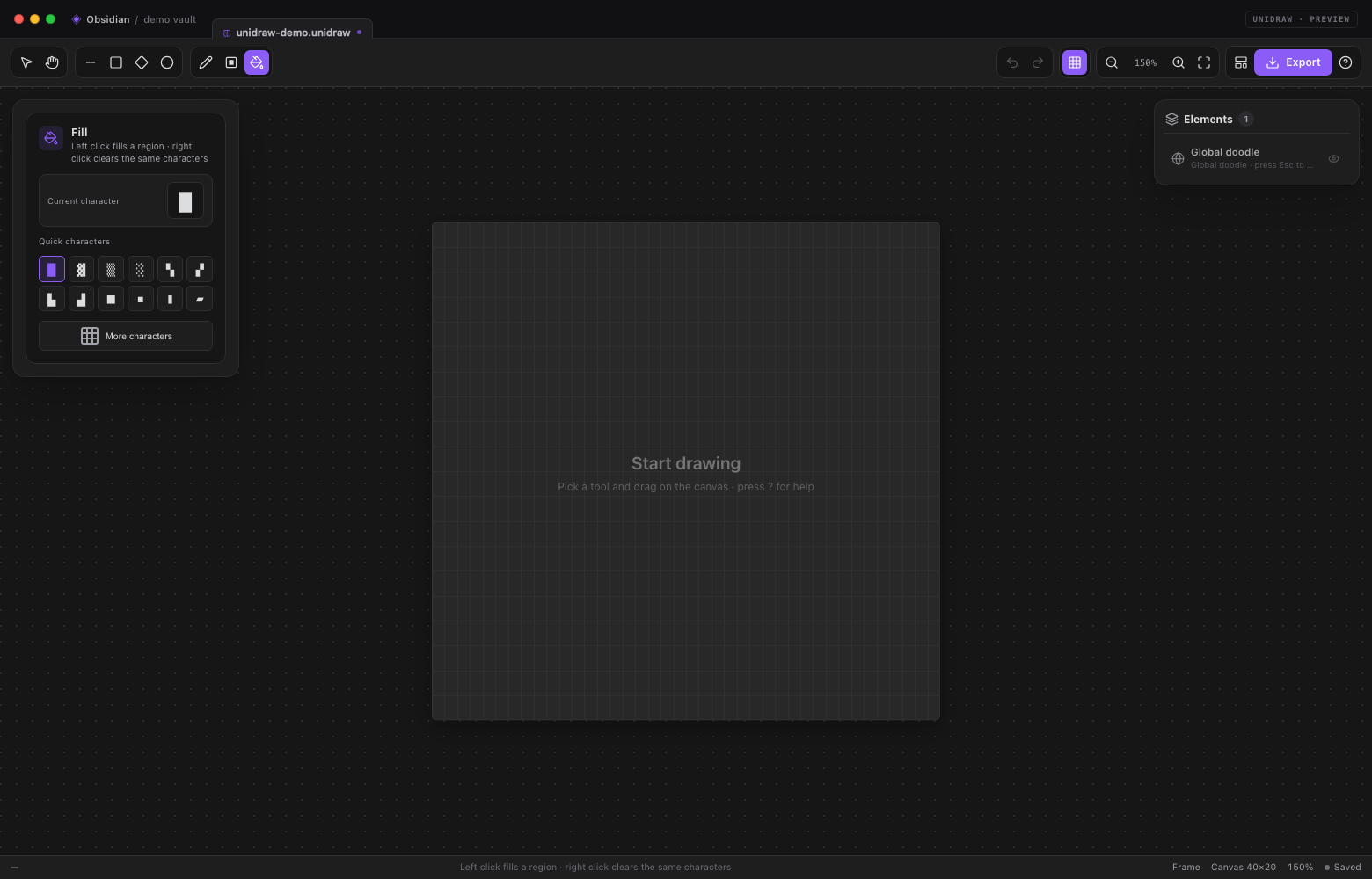
- Shape tools switch back to the Select tool after a shape is created. The Select tool's first click only selects; moving starts on the following drag. Dragging with no selection marquee-selects.
Tools
| Tool | Shortcut | Left drag / click | Right drag / click |
|---|---|---|---|
| Select | V |
Marquee empty canvas; click an element to select; drag to move; double-click empty grid to create a text box | Drag to scale the selection |
| Pan | H |
Drag to pan | Drag a red box to select text; releasing copies a fenced code block |
| Pencil | B |
Draw the current character | Erase cells |
| Line | L |
Draw a line | Draw an arrow |
| Outline rectangle | R |
Draw a rectangle border | Erase the border |
| Rectangle fill | Shift+R |
Fill a rectangular area with the current character | Erase the whole area |
| Fill | G |
Flood-fill the contiguous region | Clear the same-character region |
| Ellipse | O |
Draw an aspect-corrected ellipse | Erase the ellipse area |
| Diamond | D |
Draw a diamond | Erase the diamond area |
Keyboard and view
- Wheel — zoom around the pointer.
- Ctrl/⌘ + wheel — scroll vertically.
- Ctrl/⌘ + Shift + wheel — scroll horizontally.
- Hold Space to temporarily switch to the Pan tool; middle-button drag also pans. Release Space to return to the previous tool.
- Ctrl/⌘ + A — select every element in the frame.
- Ctrl/⌘ + C / X / V — copy, cut and paste objects.
- Ctrl/⌘ + D — duplicate the selected element(s) at the grid cell under the pointer, preserving their relative layout.
- Delete / Backspace — delete the selection.
- Arrow keys — nudge the selection by one cell; Shift moves five.
- Ctrl/⌘ + Z, Ctrl/⌘ + Shift + Z (or Ctrl+Y) — undo/redo.
- ? — help and shortcuts; 0 — fit to view; G — toggle the grid.
Drawing modifiers
- Right-dragging a tool performs its erase/arrow action.
- Ctrl/⌘-click an object to add or remove it from the selection.
- Start and End arrows are independent checkboxes in the line card. Enabling one reveals its arrow subcard.
- The adaptive arrow follows the line's direction using four cardinal arrows; the start arrow points outward, opposite the end arrow at the same endpoint.
- The custom mode uses any character entered in the arrow subcard.
- Endpoints snap to the character grid.
Lines
The line object supports two routing modes:
- 4-way — every step is horizontal or vertical, with the middle vertical/horizontal segment centered so the line enters the endpoint along the final axis instead of always making an L at the end.
- 8-way — diagonal steps are allowed alongside horizontal/vertical steps.
Corners within one line are drawn cleanly. Separate elements do not merge with
each other: a later overlapping shape simply prints on top, so crossings never
turn into ┼/╬ glyphs.
Select a line to edit its routing, style, interruption, arrows and shape ignoring in the left inspector.
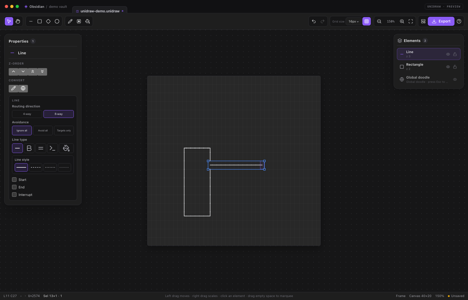
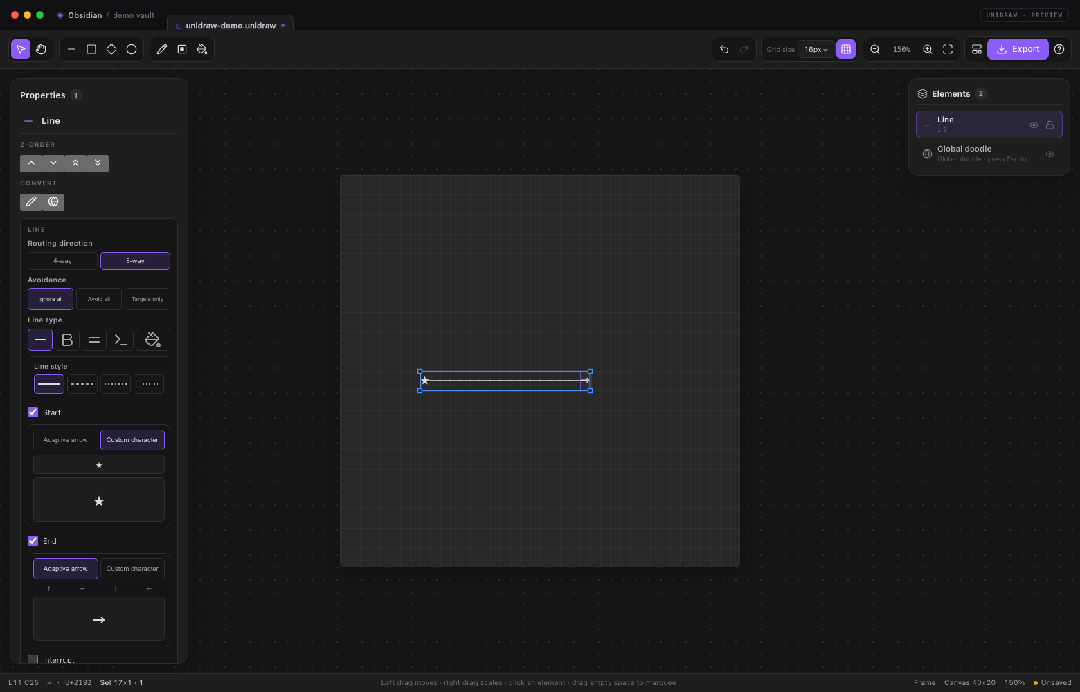
Line settings
- Routing direction: 4-way keeps every step horizontal/vertical;
8-way also allows diagonals. Direct 8-way lines use a centered
diagonal/axis/diagonal polyline so parallel
╲╲runs are avoided.
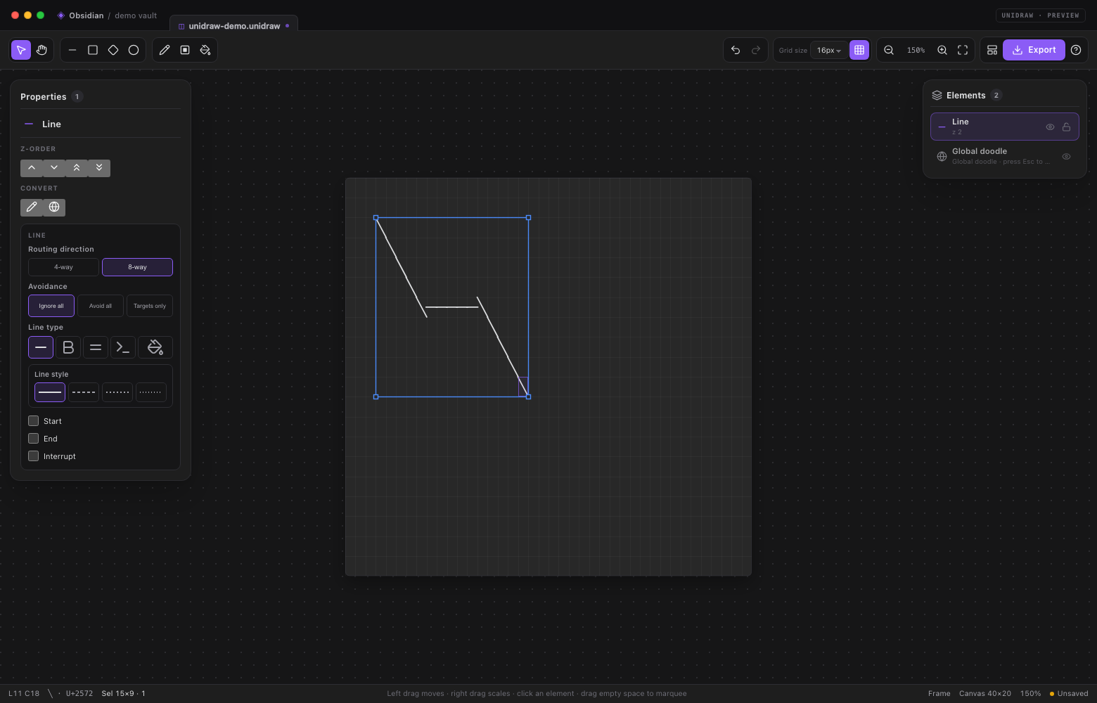
- Avoidance: Ignore all, Avoid all or Targets only.
- Line type: Straight / Bold / Double / ASCII / Filled. Bold uses the heavy box-drawing family; Double uses the double-line family; Filled draws the path with a chosen character.
- Line style: for Straight and Bold, choose Solid / Dash 2 / Dash 3 / Dash 4.
- Checkboxes at the bottom: Start, End and Interrupt. Enabled Start/End arrows reveal an Adaptive arrow / Custom character subcard. The interrupt fields use the same segment/gap/offset configuration as rectangle borders.
- A line endpoint dropped on or within one cell of a shape edge automatically links to that shape. The linked endpoint stays on the shape edge and follows moves or resizes. New lines start in Do not ignore mode, so obstacle avoidance is active while the link is maintained.
Rectangle features and text
Text is no longer a separate element kind. Every rectangle has four optional features in its element-specific card:
- Text — a label inside the rectangle.
- Fill — an empty or character fill that covers the rectangle interior.
- Border — the rectangle outline and stroke style.
- Interrupt — a segmented border pattern.
New rectangles start with Border on. Text is enabled with the Text checkbox, by pressing Enter, or by double-clicking an existing label; there is no separate text tool. Checking a feature reveals a nested card immediately below it; unchecking it hides the subcard without discarding its saved settings.
Text subcard
- Tick Text, or select a rectangle and press Enter.
- Click the type button in the subcard or double-click an existing label.
Editing happens directly over the rectangle on the canvas — no floating
card or popup covers the board. The canvas label is hidden while the
in-place editor is active. The editor isolates the rectangle, hiding other
elements underneath, and matches the character-cell letter spacing, line
height and padding of the final rendering.
- Enter applies.
- Shift+Enter adds a line.
- Esc cancels.
- Clicking outside applies the current text.
- The subcard is arranged as vertical fields:
- Alignment — a 3×3 grid for horizontal and vertical placement.
- Text direction — horizontal or vertical.
- Wrap direction — down/up or right/left.
- Padding — four compact inputs marked with ↑/→/↓/← icons for top, right, bottom and left, measured in half-width character cells.
All buttons and inputs in the subcard are horizontally centered; only the field labels stay left-aligned.
Font editing is no longer exposed in the subcard; existing font data remains readable and preserved.
Quick text boxes
With the Select tool, double-click an empty grid cell. Unidraw creates a 20×5 rectangle at that position with:
- Text on
- Border off
- Fill off
In-canvas editing starts immediately. Esc removes the temporary empty text box; Enter or clicking outside keeps it. A confirmed box participates in undo/redo.
Interrupt
The Interrupt feature turns the rectangle border into a repeating pattern along the perimeter (clockwise, starting at the top-left). It has three integer fields:
- Segment — length of each drawn segment, minimum 1.
- Gap — length of each skipped segment, minimum 1.
- Offset — shifts the pattern, minimum 0.
Enabling Interrupt also turns on the Border feature. The current line style, fill and text are preserved. The pattern is saved with the element.
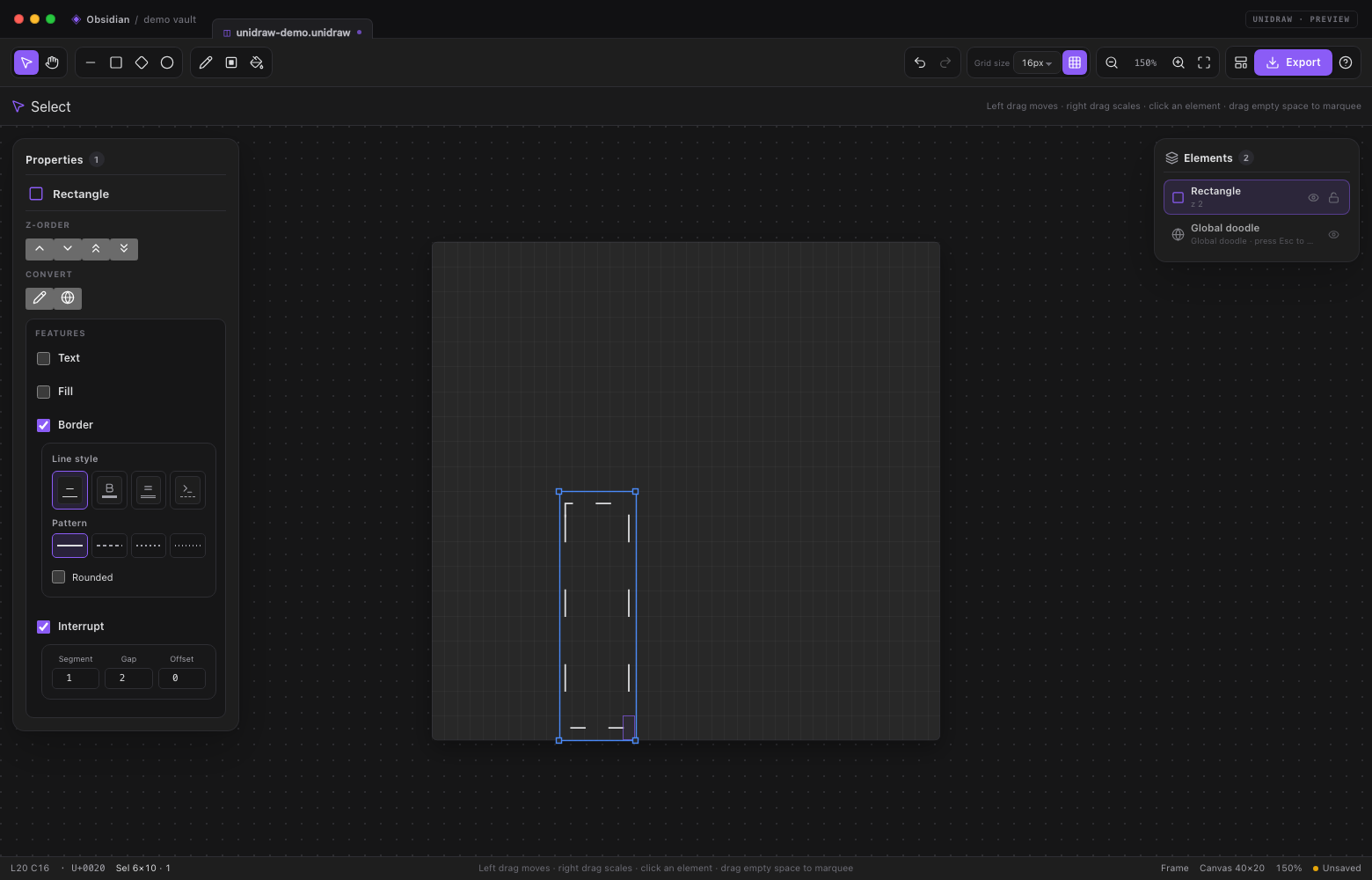
Text that does not fit is clipped. The rectangle keeps its Text/Fill/Border/ Interrupt feature flags when saved, moved, resized, copied or deleted.
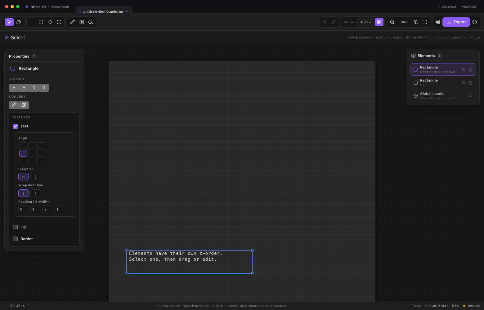
Fill and border subcards
- Fill uses three icon-only tabs (tooltips name each mode) with preview
swatches:
- Empty — covers the interior with blanks.
- Block — opens a grid of shaded/block glyphs.
- Custom — opens the fill-character picker for any glyph. Turning Fill off is true transparency.
- Border uses a tabbed line-style card:
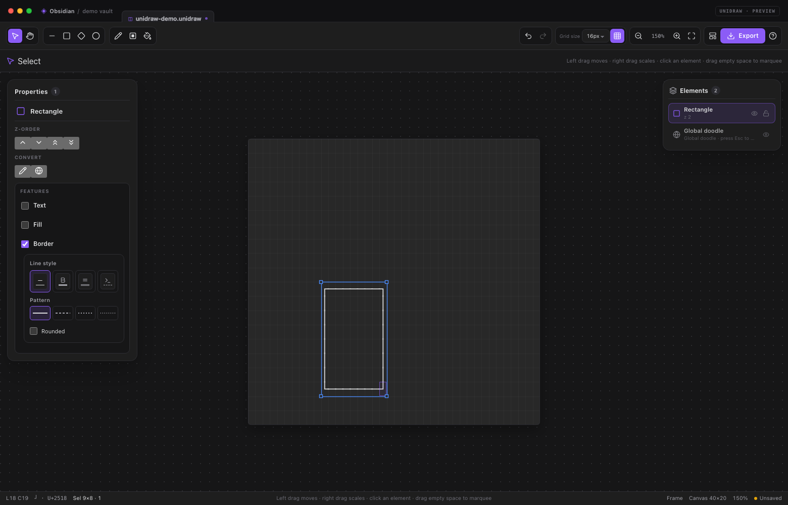
- Four icon-only tabs: Straight / Bold / Double / ASCII, each with a tooltip and a CSS line preview.
- Straight and Bold reveal four pattern presets: Solid / Dash 2 / Dash 3 / Dash 4. Each has a CSS line preview and a corresponding Unicode stroke family.
- Rounded is available only for Straight and restores the previous light style when unchecked.
- Double and ASCII hide the pattern/rounded extras, so the detail area changes with the selected tab. Turning Border off leaves the fill and text intact.
Elements, selection and transforms
Everything drawn on the frame is an element:
| Element | Created by |
|---|---|
rectangle |
Rectangle tool and every rectangle, including text labels |
ellipse |
Ellipse/circle tool |
diamond |
Diamond tool |
line |
Line tool, or right-drag for an arrow |
doodle |
Pencil, solid rectangle, fill, or converting elements |
group |
Merging two or more selected elements |
- Right-click the global doodle row in the element list to clear its contents; the doodle itself stays in place and the action is undoable.
- Every frame starts with a global doodle pinned at the bottom of the stack. It cannot be clicked, moved or re-ordered. Press Esc to select it (and Esc again to release it); it is drawn with a quiet outline, no handles and no inspector card. Drawing while it is selected adds to the global doodle. Converting to global doodle merges the selected elements into it.
- New elements are appended to the top of the frame.
- Doodles cannot be scaled with selection handles. Use the drawing tools to change their contents instead.
- Drawing-area tools paint into an existing doodle only: the selected doodle, otherwise the non-global doodle under the pointer, otherwise the global doodle. They never create a new doodle element.
- Click an element to select it; marquee on empty canvas to select several; Ctrl/⌘-click to add or remove.
- Drag a selected element to move it; drag a corner handle to resize.
- Delete removes selected elements from the row context card. The global doodle is protected.
- Elements whose visible content is completely erased are removed automatically, except the global doodle.
- The icon-only Z-order area moves the selection one step forward or backward, or brings it to the front/back. The icon-only Convert area contains convert-to-doodle and convert-to-global; merge-into-group appears only when multiple elements are selected.
- Closed shapes (rectangle, ellipse, diamond) have a Fill setting:
- No fill — transparent; elements underneath remain visible.
- Empty fill — covers the interior with blanks; elements underneath are hidden.
- Character fill — covers the interior with the chosen glyph.
A filled shape always covers what is underneath it; empty fill is different
from no fill. Dragging a shape previews the final frame directly; a single
click creates
□(rectangle),◇(diamond) or○(ellipse). Moving and resizing are not limited to the current auto-fit board; the canvas grows live while extending or moving past its edge, and transforms still render in z-order.
- With the Pan tool, right-drag selects a rectangle of text with a red marquee. Releasing copies it to the clipboard as a plain fenced code block that can be pasted into another note. Esc clears the red text selection.
- With the Select tool, right-drag inside the selection scales it.
- Drawing-area tools (Pencil, Rectangle fill and Fill) only modify doodles. If a single doodle is selected it is the target; otherwise the non-global doodle under the pointer is focused, falling back to the global doodle. Drawing-area tools never create a new doodle element.
- Visibility and lock are stored per element and are toggled from the right element list. Locked elements cannot be selected, moved or edited with the left mouse button; unlock them with the row's unlock button. The global doodle has no lock control and remains Esc-only.
- Use the element list's row actions for visibility/lock and its right-click card for duplicate/delete. The Select tool's canvas right-click no longer opens an old context menu.
- A selected rectangle shows a Features card with Text, Fill, Border and Interrupt checkboxes. Each checked feature opens its own nested settings card. Text is a rectangle feature; enable it with the Text checkbox or Enter.
Grid, canvas and view
- Fixed 16 px character cells; the grid-size selector has been removed.
- Toggle grid lines from the toolbar; the setting is saved with the plugin.
- The canvas has no fixed edge in normal use: objects expand it as needed.
- Minimum canvas width and height are stored per drawing.
- Erasing content below the minimum/visible bounds automatically contracts the canvas.
- Zoom range 20–400%; zoom, pan and fit are preserved in the status bar.
Files and embeds
A .unidraw file is a UTF-8 JSON element document (single frame):
{
  "format": "unidraw",
  "version": 1,
  "minCols": 40,
  "minRows": 20,
  "activeLayerId": "frame-1",
  "layers": [
    {
      "id": "frame-1",
      "name": "Frame",
      "visible": true,
      "locked": false,
      "objects": [
        {
          "id": "doodle-global",
          "kind": "cells",
          "role": "draw",
          "global": true,
          "cells": []
        },
        {
          "id": "line-1",
          "kind": "line",
          "x1": 2, "y1": 2, "x2": 20, "y2": 8,
          "style": "light",
          "route": "elbow",
          "arrowStart": "none",
          "arrowEnd": "solid"
        }
      ]
    }
  ]
}
Existing plain-text .unidraw files are still imported: the text becomes one
global doodle element, so older drawings open without migration steps. Text exports
and code blocks remain plain character art.
Embed a drawing in a note:
![[my-diagram.unidraw]]
or keep the art directly in a code block:
```unidraw
╭──────────────╮
│  Hello 🌍     │
╰──────────────╯
```
File embeds render in Reading view with a copy/open bar and read the latest file contents. The code-block form is self-contained and uses the monospace font.
Export
The Export menu offers:
- Copy as text — the composed character art.
- Copy as Markdown — a
unidrawfenced block. - Copy as image — PNG to the clipboard where supported.
- Export PNG — theme-coloured PNG at 2× resolution.
- Export transparent PNG — transparent background.
- Export text file — saves
.txtbeside the current drawing (downloads in the standalone demo). - Export Markdown file — saves
.mdwith a fenced art block beside the current drawing. - Insert into active note — inserts a fenced block at the cursor.
The current release lives in dist/unidraw-0.4.11/: the three plugin
files plus unidraw-0.4.11.zip. Previous releases are kept compressed in
dist/backup/ (unidraw-0.1.0/, unidraw-0.2.0/, unidraw-0.2.1/ … unidraw-0.4.10/).
Settings
Open Settings → Unidraw for:
- Interface language (automatic, English, Chinese).
- Fixed grid size: 16 px.
- Canvas font family and line height.
- Grid style (dots/lines/off).
- Default stroke, default text style and pencil character.
- Autosave and delay.
- Status bar visibility.
- Embedded drawing font size and line height.
The active drawing grows and shrinks with its visible content; the minimum canvas size is stored in the document.
Commands
- Unidraw: New drawing
- Unidraw: New drawing from selection
- Unidraw: Undo / Redo
- Unidraw: Copy drawing as text
- Unidraw: Export drawing as PNG
- Unidraw: Insert current drawing into note
- Unidraw: Toggle canvas grid
- Unidraw: Fit drawing to view
- Unidraw: Open help & shortcuts
Architecture
src/
  core/       element model, JSON file format, Unicode grid, history, i18n
  model/      element rasterization, line routes, diamond, group, text layout
  glyphs/     box-drawing tables, strokes, fills, Unicode typefaces
  editor/     tool state machine, element selection, transforms, z-order, undo
  render/     three stacked canvases, previews, theme colours, PNG export
  ui/         toolbar, left element inspector, context menus, popovers
  view/       Obsidian ItemView and reading-mode embeds
  main.ts     plugin entry, commands, processors, settings tab
  settings.ts settings schema and settings UI
The editor core has no Obsidian runtime dependency. demo/ mounts the same UI
with a small mock host, and the screenshot pipeline in scripts/ uses headless
Chrome to generate the documentation images.
Seamless Unicode rendering
Box-drawing (U+2500–U+257F), block (U+2580–U+259F) and braille
(U+2800–U+28FF) glyphs are drawn with vector geometry in the editor and PNG
export, avoiding the seams that monospace fonts leave at cell boundaries.
Regular text, CJK and emoji use the configured font. Reading-mode embeds use the
font directly, so they can show tiny seams depending on the installed font.
Development
npm install
npm run dev          # watch mode, bundles main.js
npm run build        # type-check, bundle, zip and package dist/
npm test             # 59 unit tests for the grid, elements, fills and shapes
npm run demo         # build the browser demo
npm run screenshot   # capture the documentation screenshots (Chrome required)
npm run link -- /path/to/vault
npm run build produces dist/unidraw-0.4.11/main.js,
dist/unidraw-0.4.11/manifest.json, dist/unidraw-0.4.11/styles.css and
dist/unidraw-0.4.11/unidraw-0.4.11.zip, while leaving dist/backup/ untouched.
The screenshot script uses CHROME_PATH if set, otherwise the macOS Chrome
location, and drives Chrome through the DevTools Protocol with a temporary
profile.
Credits
Unidraw was inspired by:
- ASCII Canvas by Huseyin Akbas — a minimal ASCII-only canvas plugin and structural reference.
- asciiflow — fast keyboard-friendly box-line drawing and smart intersections.
- Monodraw — professional character-art elements, groups, text and export.
Unicode character data is defined by the Unicode Standard. The demo uses Lucide icons; Obsidian provides its own icon set at runtime. No fonts are bundled.
License
MIT. See LICENSE.