SQLSeal Charts
 h-sphere2k downloads
Generate charts from your data. Graph line charts, pie charts, scatter plots and more.
- Overview
- Scorecard
- Updates8
SQLSeal Charts is an extension for SQLSeal Obsidian Plugin allowing to visualise your data using charts!
Powered by ECharts. Check their documentation for more examples of usage.
Features
- Support for basic charts: line, bar, pie charts
- Support for compex charts like scatterplot, heatmap, etc.
Getting started
Install the plugin by downloading latest release and unpacking it in .obsidian/plugins/sqlseal-charts. Make sure you have SQLSeal plugin already installed.
Example query
Pie Chart
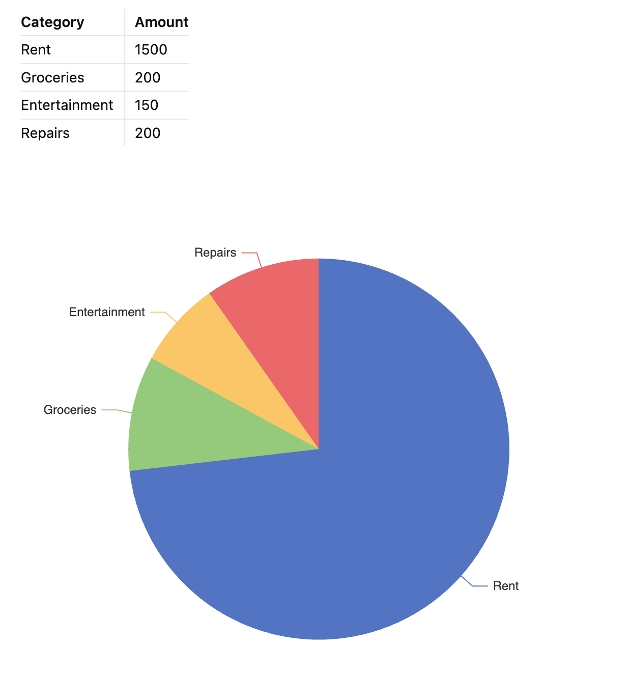
Query below takes the first table in your current markdown tile and displays it as a piechart.
| Category | Amount |
|---|---|
| Rent | 1500 |
| Groceries | 200 |
| Entertainment | 150 |
| Repairs | 200 |
TABLE finances = table(0)

CHART {
    series: [{
        type: 'pie'
    }]
}
SELECT * FROM finances
Line Chart
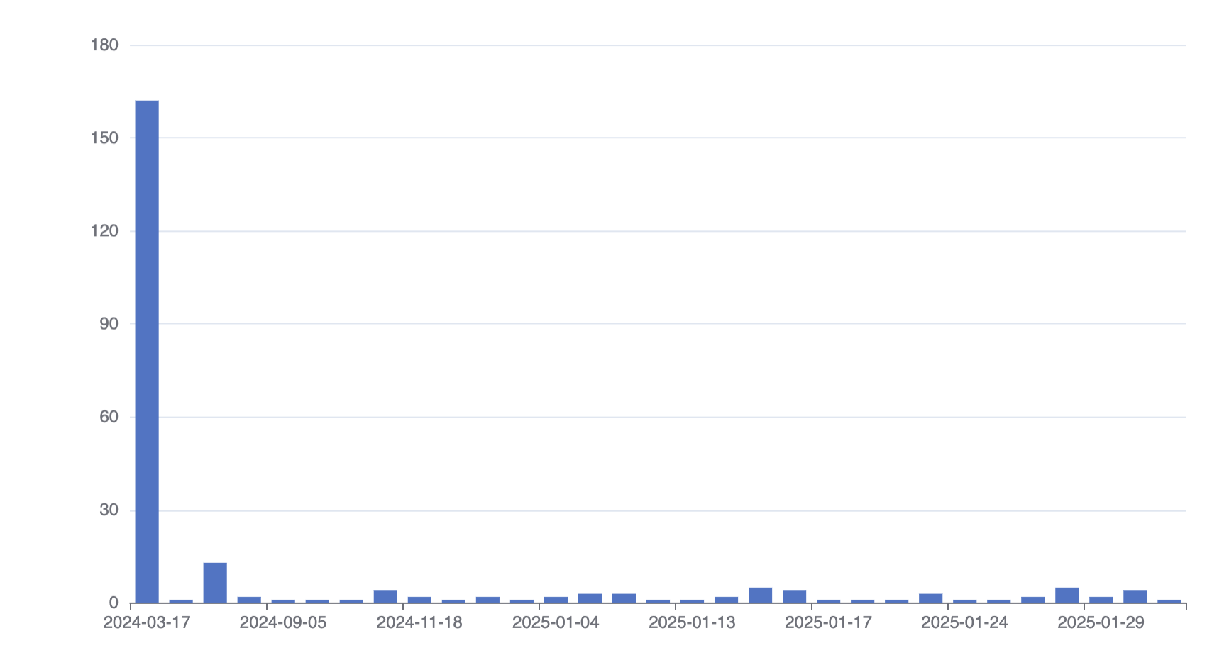
CHART {
    xAxis: {
        type: 'category'
    },
    yAxis: {},
        series: [{
        type: 'bar',
        }]
}
SELECT
    strftime("%Y-%m-%d", created_at) as created_date,
    COUNT(*) as count
FROM files
GROUP BY created_date
ORDER BY created_date
Syntax
SQLSeal Charts uses ECharts under the hood. It automatically exposes data returned by your SQL query as a data dataset in ECharts. This means you can generate plenty of charts without worrying too much about how the data is being passed down. For more complex use-cases, you can always refer to the data by column name, it's index or even filter it down to create separate data-sets for different series.
To read more about datasets, check out ECharts documentation.
For more advanced transformations, SQLSeal Charts exposes the following data and functions to be used to transform data further.
Data
| Variable Name | Description |
|---|---|
data |
Array of objects containing raw data |
columns |
array of column names |
| Object for each column | You can refer to each of the column data by their name, i.e. for SELECT category, amount FROM data you can use category and amount columns |
Functions
The following functions are exposed in your query to allow you to further process data.
| Function | Description |
|---|---|
column(name: string) |
Returns array of the values for a specified column |
mean, max, min, uniq, uniqBy |
Lodash functions to help with data processing |
array(...arrays) |
creates subarrays from arrays, i.e. array([1,2], [3,4 ]) == [[1,3], [2,4]]. Useful when grouping multiple columns together when reshaping the data |
assembleObjects(...definitions: { key: string, values: array }[]) |
Assembles multiple arrays into array of objects using provided key values |
assemble(definition: Record<string, array>) |
Assembles multiple arrays into array of objects using a key=>value map |