Heading Colors

Adds colored markers to heading levels (H1-H6) to help distinguish them at a glance.
- Overview
- Scorecard
- Updates1
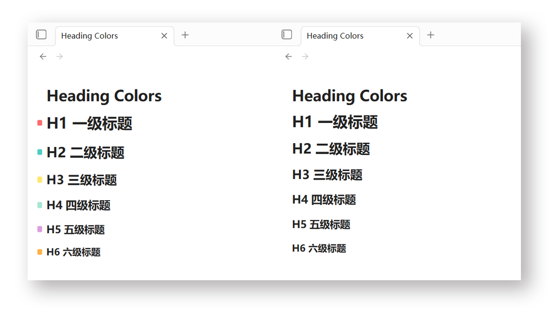
Heading Colors / 标题着色
English
A plugin for Obsidian that adds colored markers to heading levels (H1–H6), helping you quickly distinguish heading levels at a glance. Supports both Edit mode (Live Preview / Source Mode) and Reading mode.
Installation
From Obsidian Community Plugins
- Open Obsidian → Settings → Community Plugins
- Disable Safe Mode if needed
- Click Browse and search for "Heading Colors"
- Install and enable the plugin
Manual Installation
- Download
main.js,styles.css, andmanifest.jsonfrom the latest release - Copy them into your vault's
.obsidian/plugins/heading-colors/folder - Open Obsidian → Settings → Community Plugins → Enable "Heading Colors"
Configuration
Open Settings → Heading Colors to customize the color for each heading level (H1–H6) using the built-in color pickers. Changes apply instantly.
Alternatively, install the Style Settings plugin to configure the same colors through its unified settings panel.
Advanced: CSS Variables
For marker size, position, and other advanced tweaks, edit styles.css directly or override via CSS snippets:
/* Marker size */
--marker-width: 8px;
--marker-height: 10px;
--marker-radius: 2px;

/* Position offset (edit mode) */
--marker-left: -14px;
--marker-vertical: 0px;

/* Reading mode compensation */
--reading-left-adjust: -1px;
--show-reading-markers: 1;

/* Heading line height */
--heading-line-height: 1.37;
Default Color Scheme
| Heading Level | Color Code | Color Name |
|---|---|---|
| H1 | #FF6B6B |
Coral Red |
| H2 | #4ECDC4 |
Tiffany Blue |
| H3 | #FFE66D |
Butter Yellow |
| H4 | #A8E6CF |
Mint Green |
| H5 | #DDA0DD |
Lavender |
| H6 | #FFB347 |
Light Orange |
License
MIT
中文
一款 Obsidian 插件,为标题层级(H1–H6)添加彩色标记,帮助你一目了然地分辨标题层级。支持编辑模式(实时预览 / 源码模式)和阅读模式。
安装
从 Obsidian 社区插件库安装
- 打开 Obsidian → 设置 → 第三方插件
- 如有需要,关闭安全模式
- 点击浏览,搜索 "Heading Colors"
- 安装并启用插件
手动安装
- 从 最新发布 下载
main.js、styles.css和manifest.json - 将文件复制到你的仓库的
.obsidian/plugins/heading-colors/文件夹 - 打开 Obsidian → 设置 → 第三方插件 → 启用 "Heading Colors"
配置
打开设置 → Heading Colors,使用内置的颜色选择器为每个标题层级(H1–H6)自定义颜色,修改即时生效。
也可以安装 Style Settings 插件,通过其统一设置面板配置相同的颜色。
高级:CSS 变量
如需调整标记尺寸、位置等高级选项,直接编辑 styles.css 或通过 CSS 片段覆盖:
/* 标记尺寸 */
--marker-width: 8px;
--marker-height: 10px;
--marker-radius: 2px;

/* 位置偏移(编辑模式) */
--marker-left: -14px;
--marker-vertical: 0px;

/* 阅读模式补偿 */
--reading-left-adjust: -1px;
--show-reading-markers: 1;

/* 标题行高 */
--heading-line-height: 1.37;
默认配色方案
| 标题层级 | 颜色代码 | 颜色名称 |
|---|---|---|
| H1 | #FF6B6B |
珊瑚红 |
| H2 | #4ECDC4 |
蒂芙尼蓝 |
| H3 | #FFE66D |
黄油黄 |
| H4 | #A8E6CF |
薄荷绿 |
| H5 | #DDA0DD |
薰衣草紫 |
| H6 | #FFB347 |
浅橙 |
许可证
MIT