
- Overview
- Scorecard
- Updates13
Introduction
A light-weight plugin for displaying inline "badges" in Obsidian.md.
Installation
Install from community.obsidian.md
From Obsidian's settings or preferences:
- Community Plugins > Browse
- Search for "Badges"
Manually:
- download the latest release archive
- uncompress the downloaded archive
- move the
badgesfolder to/path/to/vault/.obsidian/plugins/ - Settings > Community plugins > reload Installed plugins
- enable plugin
or:
- download
main.js,manifest.json&styles.cssfrom the latest release - create a new folder
/path/to/vault/.obsidian/plugins/badges - move all 3 files to
/path/to/vault/.obsidian/plugins/badges - Settings > Community plugins > reload Installed plugins
- enable plugin
Usage
default syntax
`[!!KEY:VAL]`
| syntax | details |
|---|---|
KEY |
the type and name of the ICON |
VAL |
the value and text displayed |
shorthand syntax
For built-in badge types, you can omit the value and colon:
`[!!KEY]`
For example, [!!success] displays as "Success" with a checkmark icon. This works for all types defined in constants.ts.
[!TIP] In addition to the built-in badge types (note, info, success, etc.), you can use any Lucide icon name as the
KEY. For example:[!!rocket:launched]or[!!heart:favorite].
[!IMPORTANT] the
VALcannot contain either the|pipe or the:colon symbols, as they are used as delimiters for the custom syntax. See Usage in tables for using badges inside Markdown tables.
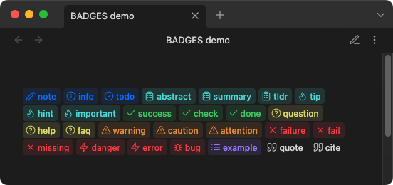
example
`[!!note:note]`
`[!!info:info]`
`[!!todo:todo]`
...
`[!!cite:cite]`
results
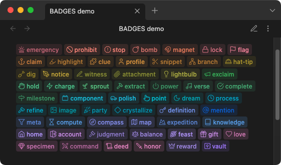
example
`[!!emergency: emergency]`
`[!!prohibit: prohibit]`
`[!!stop:stop]`
…
`[!!reward: reward]`
`[!!vault: vault]`
results
Github
syntax
`[!!|GHX>KEY:VAL]`
| syntax | details |
|---|---|
| |
start pipe symbol |
GHX |
Github style, either ghb for the blue style or ghs for the green success style |
> |
greater than symbol (delimiter) |
KEY:VAL |
KEY is the type or label, VAL is the value text displayed. e.g. release:1.0.0 |
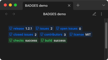
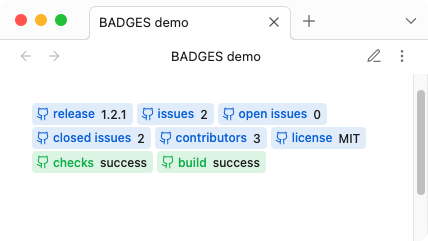
example
`[!!|ghb>release:1.2.1]`
`[!!|ghb>issues:2]`
`[!!|ghb>open issues:0]`
`[!!|ghb>closed issues:2]`
`[!!|ghb>contributors:3]`
`[!!|ghb>license:MIT]`
`[!!|ghs>checks:success]`
`[!!|ghs>build:success]`
results
Plain-text
syntax
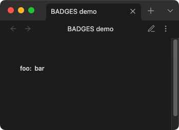
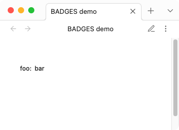
`[!!|KEY:VAL]`
| syntax | details |
|---|---|
| |
start pipe symbol |
KEY:VAL |
KEY is the type, VAL is the value |
example
`[!!|foo:bar]`
results
custom
syntax
`[!!|ICON|KEY:VAL|COLOR-RGB]`
| syntax | details |
|---|---|
| |
start pipe symbol |
ICON |
Lucide icon name. e.g. dice or lucide-dice |
| |
pipe symbol |
KEY:VAL |
KEY is the type or label, VAL is the value text displayed. e.g. release:1.0.0 |
| |
pipe symbol |
COLOR-RGB (optional, defaults to currentColor) |
3 (R.G.B.) numeric (0-255) values, separated by commas. e.g. 144,144,144 or CSS variable e.g. var(--color-red-rgb) |
[!NOTE] The
KEYis used for the aria-label (accessibility) and is not displayed visually. Only theVALtext is shown. To display a label, include it in theVAL:`[!!|tag|release:Release 1.2.1]`or simply:
`[!!|tag|:Release 1.2.1]`
[!IMPORTANT] Custom syntax requires actual Lucide icon names (e.g.,
pen-tool,message-square). The built-in aliases likenoticeorsuccessonly work with standard syntax. For example, use[!!|pen-tool|notice:text|color]not[!!|notice|notice:text|color].
example
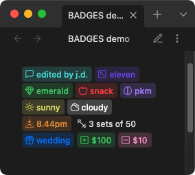
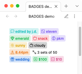
`[!!|message-square|comment:edited by j.d.|var(--color-cyan-rgb)]`
`[!!|dice|roll:eleven|120,82,238]`
`[!!|gem|mineral:emerald|var(--my-custom-rgb)]`
`[!!|apple|fruit:snack|var(--color-red-rgb)]`
`[!!|brain|brain:pkm|var(--color-purple-rgb)]`
`[!!|sun|weather:sunny|var(--color-yellow-rgb)]`
`[!!|cloudy|weather:cloudy|var(--mono-rgb-100)]`
`[!!|sunset|weather:8.44pm|var(--color-orange-rgb)]`
`[!!|dumbbell|reps:3 sets of 50|var(--mono-rgb-00)]`
`[!!|gift|event:wedding|var(--color-blue-rgb)]`
`[!!|plus-square|credit:$100|var(--color-green-rgb)]`
`[!!|minus-square|debit:$10|var(--color-pink-rgb)]`
results
Links
Badges can be made clickable by adding a link using the >> syntax.
syntax
`[!!KEY:VAL>>LINK]`
| syntax | details |
|---|---|
>> |
link delimiter |
LINK |
wikilink [[Note]] or external URL https://... |
examples
`[!!info:Documentation>>https://obsidian.md]`
`[!!note:See also>>[[My Note]]]`
`[!!tip:Jump to section>>[[My Note#Heading]]]`
[!NOTE] Links work with all badge types including custom badges.
Usage in tables
When using badges inside Markdown tables, the | pipe character conflicts with the table cell separator. To work around this, use escaped pipes \| instead of | in your badge syntax.
syntax
`[!!\|ICON\|KEY:VAL\|COLOR-RGB]`
example
| Task | Status |
| ---- | ------ |
| Review code | `[!!\|snowflake\|comment:On Hold\|var(--color-cyan-rgb)]` |
| Write docs | `[!!success:Done]` |
[!NOTE] Badges without pipes (e.g.
[!!success:Done]) work in tables without any changes.
CSS
Custom CSS styles can be applied via CSS snippets. All colors and styles can be over-written just the same.
See CSS snippets - Obsidian Help
variables
body {
    /* border */
    --inline-badge-border-color: transparent;
    --inline-badge-border-radius: var(--radius-s);
    --inline-badge-border: 1px solid var(--inline-badge-border-color);
    /* example custom color */
    --my-custom-rgb: var(--color-green-rgb);
}
/* example CSS customization */
.inline-badge[data-inline-badge^="vault"] {
    --badge-color: var(--my-custom-rgb);
    color: rgba(var(--badge-color), .88);
    background-color: rgba(var(--badge-color),.22);
}
Styling plain-text badges by type
Plain-text badges include a data-badge-type attribute containing the KEY value, enabling CSS targeting of specific badge types.
examples
/* Style all "Status" badges */
.inline-badge-extra[data-badge-type="Status"] {
    background-color: rgba(var(--color-green-rgb), .22);
    color: rgba(var(--color-green-rgb), .88);
}

/* Style "Priority" badges differently */
.inline-badge-extra[data-badge-type="Priority"] {
    background-color: rgba(var(--color-red-rgb), .22);
    color: rgba(var(--color-red-rgb), .88);
}
Dataview
Badges can act similarly to a key-value store(database) for querying via default search or Dataview plugin.
View and copy example dataview queries: badges-dataview
Development
Clone this repo
cd /path/to/vault/.obsidian/plugins
git clone https://github.com/gapmiss/badges.git
cd badges
Install packages and run
npm i
npm run dev
Enable plugin
- open
Settings→Community plugins - enable the
Badgesplugin.
Notes
Thanks to Markdown Furigana Plugin as an example implementation of Live Preview.
Lucide Icons: https://lucide.dev
Lucide Icons LICENSE: https://lucide.dev/license