Starship Helm Console

Starship Helm Console: an unofficial Obsidian theme inspired by LCARS from Star Trek: The Next Generation. Dark and light modes. Not affiliated with Paramount or CBS.
- Overview
- Scorecard
- Updates2
An unofficial theme for Obsidian inspired by LCARS, the computer interface style from Star Trek: The Next Generation. Not affiliated with or endorsed by Paramount Global or CBS Studios.
Swept colour bars, rounded end caps and segmented panels on a black screen, with a clean, cool light mode alongside.
This is an independent, unofficial, fan-made theme. It is inspired by the LCARS interface style seen in Star Trek: The Next Generation. It is not affiliated with, endorsed by, sponsored by, licensed by, or connected to Paramount Global, CBS Studios, or any other rights-holder. It reproduces no artwork, logos, insignia or typefaces from any production. Star Trek and related marks are trademarks of CBS Studios Inc.; LCARS is a term from that franchise. Both are used here only to describe the style. See Affiliation and intellectual property.
Contents
- What this is
- At a glance
- Screenshots
- Dark and light
- What the theme changes
- The palette
- The geometry
- Installation
- Options
- Fonts
- Working with plugins
- Accessibility
- Requirements and platform support
- Documentation
- Building from source
- Quality checks
- Contributing
- Affiliation and intellectual property
- Licence
What this is
Starship Helm Console is an Obsidian theme in the LCARS idiom, built from one idea: draw the interface as flat coloured bars.
The style comes from LCARS, the panelled computer interface seen on screen in Star Trek: The Next Generation and the series that followed it. There are no bevels, shadows or gradients. Panels are blocks of solid colour. Where two panels meet they join with a curved "elbow". Buttons and tabs are pills with rounded ends. Interface labels are short words in capitals. Colour does the work that borders and shadows usually do.
The theme brings that look to Obsidian without getting in the way of writing. Your notes keep their own fonts and their own case. The bars and caps sit around your text, not over it, and every text colour meets the WCAG 4.5:1 contrast standard.
At a glance
| Modes | Dark (the reference look) and a clean, cool light mode |
| Fonts | None set. Obsidian's defaults, or your choice, always apply |
| Contrast | 4.5:1 or better for all text, in both modes, enforced by tests |
| Plugins needed | None. Style Settings is optional, for three switches |
| Remote resources | None. Nothing is downloaded |
| Obsidian version | 1.6.0 or later |
| Licence | MIT |
Screenshots
All screenshots come from the demo vault in docs/Helm Console Demo.
It holds a handful of sample notes that between them use every element the theme styles,
so you can open it yourself and compare. Obsidian's own fonts are used throughout,
because the theme sets none.
The workspace
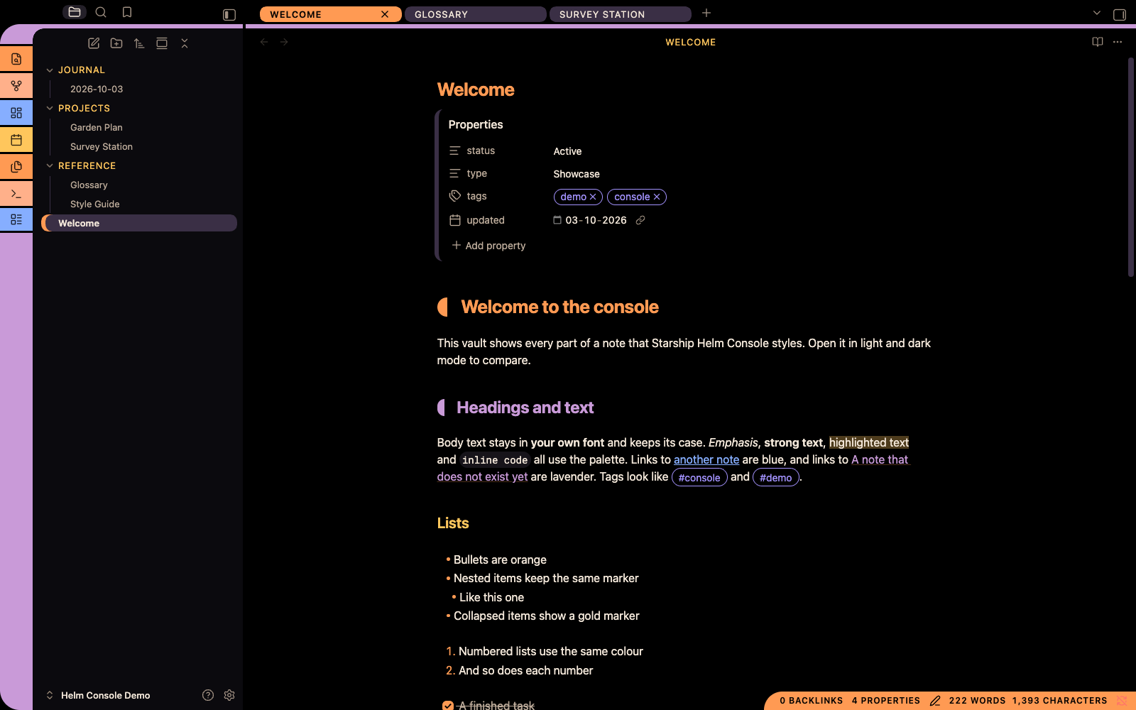
Dark mode. From left to right: the segmented ribbon, whose top curves into the lavender bar under the tab row; the file explorer with gold folder names and the open file marked by an orange cap; the pill tabs, with the active one in orange; and the note, with its orange and lavender heading caps. The orange status bar sits in the lower right.
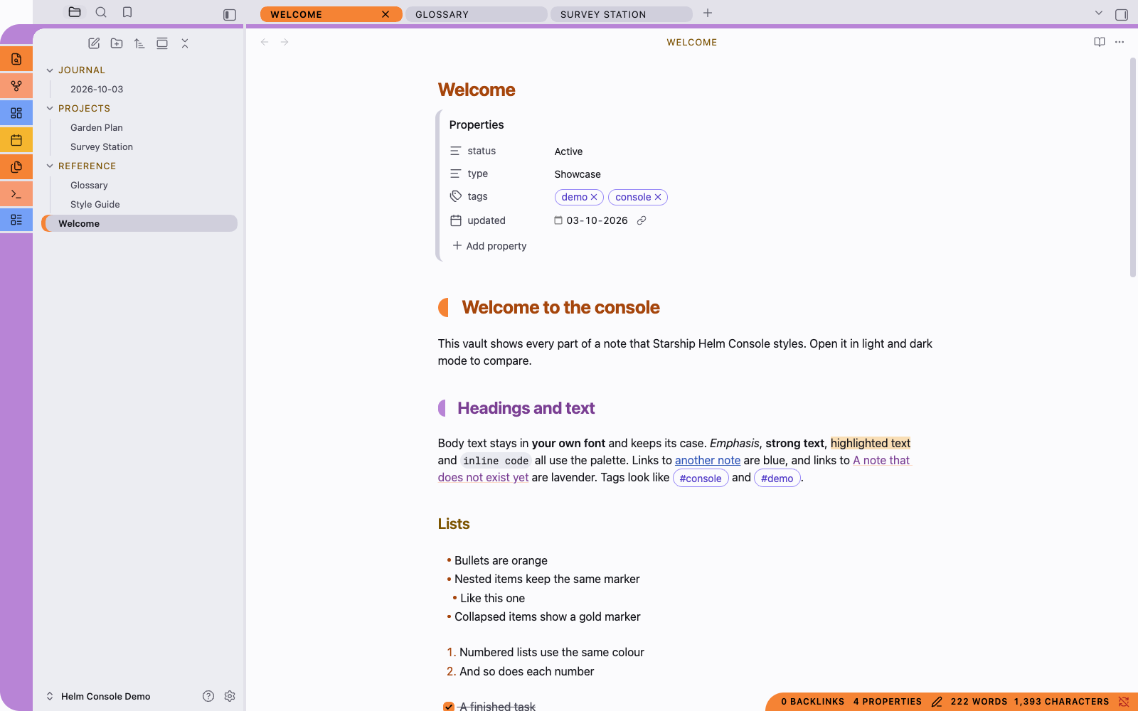
Light mode. The same window. The page is near-white, the tab row and dividers are a light cool grey, and the sidebar is a shade darker so the parts of the window stay distinct. The bars keep their black labels; headings and links switch to deeper inks so they stay readable on white.
Gallery
Each row shows the same scene in both modes. Select an image to open it full size.
| Dark | Light | |
|---|---|---|
| Note content in reading view: callouts with coloured caps and tints, the segmented rule, a table with a lavender header, and a code block with a blue cap |  |
 |
| Command palette, searching for "toggle": the chosen command is a full orange bar, and the letters you typed are picked out in every result |  |
 |
| Settings: the chosen section is an orange bar, buttons are lavender pills, and the font-size slider and toggles are pills too |  |
 |
| A file's menu and a notice: the row under the pointer is a lavender bar, Delete is red, and the notice has a gold cap |  |
 |
Dark and light
Each mode was designed on its own; neither is an automatic inversion of the other. Switch between them with Settings → Appearance → Base colour scheme.
Dark
Dark mode is the look the style is known for: bright bars on a black screen.
- The page, the tab row and the gaps between panes are pure black.
- Sidebars are a near-black panel, so they read as a separate surface.
- Bars are bright orange, gold, peach, lavender, violet, blue and red, always with black labels.
- Body text is a warm off-white, not pure white, which is easier on the eyes over a long session.
Light
Light mode is clean and cool, with no black anywhere.
- The page is near-white.
- A light grey frame covers the tab rows, the gaps in the ribbon and the dividers between panes. Sidebars are a slightly darker grey, so each part of the window stays distinct without dark chrome.
- The bars are more saturated than in dark mode so they hold their own on white. They still carry black labels.
- Coloured text (headings, links, folder names) uses deeper versions of the bar colours, so it still meets 4.5:1 on white.
What the theme changes
The theme styles the whole application, not just the editor.
The window
| Dark | Light |
|---|---|
 |
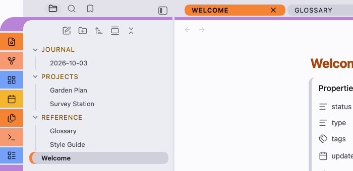 |
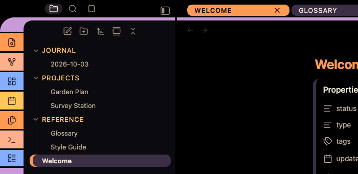
The ribbon and the elbow. Each ribbon icon sits on its own coloured segment, and the segments are separated by thin gaps. At the top, the column's rounded corner joins the lavender bar under the tab row, and a small concave curve fills the inside of the bend. In the file explorer, folders are gold capitals and the open file is a dim bar with an orange cap on its left edge.
The ribbon (the column of icons at the far left) is a stack of coloured segments separated by thin gaps. The order is orange, peach, blue, gold, repeating, with the settings buttons at the foot in violet. The column's rounded top corner joins a lavender bar that runs along the foot of the tab row, and a concave inner curve completes the elbow.
Tabs are pills. Inactive tabs are dim, and turn violet with black labels on hover. The active tab is peach, or orange in the pane you are working in.


Sidebars sit on a panel colour of their own. Sidebar tabs are icons, and the active one sits in a lavender pill.
The file explorer shows folder names in gold. The open file is a dim bar with an orange end cap, and other selected files carry a gold cap.
The status bar is an orange bar with a rounded left end, in the lower right of the window.


Interface labels (tab titles, view headers, folder names, buttons, settings headings) are shown in capitals with open letter spacing.
Your notes
- Headings: first-level headings carry an orange end cap and second-level headings a lavender one. Each cap is a small block with a rounded outer edge and a straight inner edge, centred on the heading text with a clear gap before it. Headings three to six are coloured gold, blue, violet and grey.
- Horizontal rules are segmented bars (orange, lavender, blue) with rounded ends.
- Quotes have a thick lavender bar down the left.
- Callouts have a thick coloured cap on the left and a light tint of the same colour behind them. Their titles are in capitals.
- Code blocks have a rounded blue cap on the left. Inline code and code blocks sit on a background that stands apart from the page in both modes.
- Tables have a lavender header row with black labels and a rounded top-left corner. Alternate rows are tinted.
- Tags are outlined violet pills.
- Links are blue. Links to notes that don't exist yet are lavender.
- Properties keep Obsidian's own layout, with property names in gold and a dim bar down the left of the block.
The text of your notes is never changed. Its font is your font and its case is your case. Only interface labels are capitalised.
Controls and overlays
- Buttons are filled pills: lavender by default, orange for the main action, red for destructive actions, and gold on hover.
- Text fields and dropdowns keep Obsidian's own shapes, in the theme's colours.
- Toggles are pills. On is orange; off is dim with a visible knob.
- The command palette and quick switcher show the selected row as a full orange bar with black text.
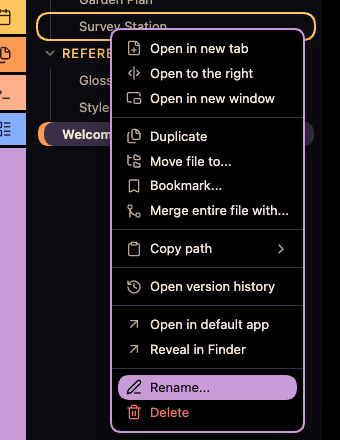
- Menus are rounded panels. The row under the pointer becomes a lavender bar, with a black label and icon.
- Settings shows the selected section as an orange bar.
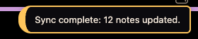
- Notices (Obsidian's pop-up messages, including errors) are panels with a gold cap and border, so their text and links stay readable.
- Tooltips are peach pills.
| Dark | Light |
|---|---|
  |
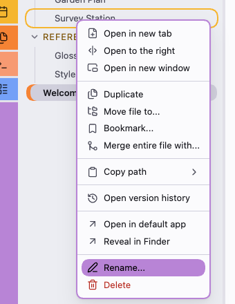 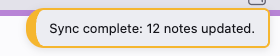 |
A file's right-click menu, with Rename… under the pointer, and a notice. Menus keep Obsidian's grouping and icons; the theme adds the rounded frame and the bar for the row you're pointing at. Notices are dark or light panels with a thick gold cap, so error messages and any links in them stay readable.
The palette
Every colour the theme uses is listed here. Nothing is hidden behind an image or a generated gradient.
| Role | Dark | Light | Used for |
|---|---|---|---|
| Screen | #000000 |
#fbfbfd |
The page |
| Frame | #000000 |
#e2e2ea |
Tab rows, ribbon gaps, dividers |
| Panel | #0c0a0e |
#ededf2 |
Sidebars |
| Code background | #17141a |
#eaeaf0 |
Inline code and code blocks |
| Text | #f4e8da |
#15151b |
Body text |
| Muted text | #bcab9a |
#4a4a58 |
Secondary text |
| Faint text | #948472 |
#5e5e6c |
Hints and placeholders |
| Orange bar | #ff9a52 |
#f58434 |
Active tab, main buttons, status bar, H1 cap |
| Gold bar | #ffc65c |
#f5b630 |
Hover, keyboard focus |
| Peach bar | #ffb08a |
#f79a72 |
Active tab in other panes, tooltips |
| Lavender bar | #c99ad8 |
#b884d6 |
Ribbon, tab-row bar, buttons, table headers, H2 cap |
| Violet bar | #a493ff |
#988af7 |
Tab hover, ribbon settings segment |
| Blue bar | #86aeff |
#73a0f7 |
Ribbon segment, code-block cap |
| Red bar | #ff7468 |
#f2705f |
Warnings, destructive buttons |
| Dim bar | #3a2f44 |
#cfcfdc |
Inactive tabs, toggles when off |
Labels on bars are always black. The test suite checks every text and background pair in both modes, at 4.5:1 for text and 3:1 for disabled controls.
The geometry
| Property | Value | Notes |
|---|---|---|
| Elbow radius | 28px | Where the ribbon turns into the tab-row bar |
| Bar thickness | 6px | The tab-row bar, rules, quote bars |
| Segment gap | 3px | Between ribbon segments |
| Pill radius | Fully round | Tabs, buttons, menu rows, the status bar end |
| Panel radius | 18px | Dialogs, callout caps, notices |
| Ribbon width | 46px | |
| Heading cap gap | 0.75em | Between a heading cap and its text |
Installation
Manually
- Download
theme.cssandmanifest.jsonfrom this repository. - In your vault, create the folder
.obsidian/themes/Starship Helm Console/. The folder name must be exactlyStarship Helm Console. The.obsidianfolder is hidden on most systems. - Put both files in that folder.
- In Obsidian, open Settings → Appearance. Under Themes, choose Starship Helm Console.
- If the theme isn't listed, close and reopen Obsidian.
From Obsidian's community themes
The theme hasn't been submitted to the directory yet. Once it's listed, open Settings → Appearance → Themes → Manage, search for Starship Helm Console and choose Install and use.
Updating
Replace theme.css and manifest.json with the new versions. Obsidian doesn't reload a
theme when its file changes, so switch to another theme and back, or restart Obsidian.
Options
The theme needs no plugins. If you have the Style Settings plugin, it adds a Starship Helm Console section with three switches:
| Switch | What it does |
|---|---|
| Mixed-case interface labels | Keeps tab, header and button labels in their original case instead of capitals |
| Plain ribbon | Draws the ribbon as one plain bar instead of the swept, segmented column, and removes the tab-row bar |
| Plain headings | Removes the end caps from first- and second-level headings |
All three are off by default. You can also change colours and sizes with a CSS snippet; the User Guide shows how.
Fonts
The theme sets no fonts at all. It uses Obsidian's default fonts, or whatever you choose under Settings → Appearance → Font (interface font, text font and monospace font). A test fails the build if a font is ever added to the theme.
Working with plugins
The theme is written to stay out of plugins' way:
- Plugin buttons take the theme's colours through Obsidian's own variables, so plugins that restyle their buttons keep readable black labels on the bars. A plugin's own active or selected styles still apply.
- Buttons inside properties, notices, note content, the editor, the file tree, the status bar and the view header are not filled. Small inline buttons there keep Obsidian's quieter style.
- File-colour plugins that colour file names stay readable: the open file is shown as a dim bar with an orange cap rather than a bright fill that would hide the name's colour.
If a plugin looks wrong, see the User Guide's troubleshooting section.
Accessibility
- Contrast: all text meets 4.5:1 against its background, in both modes. Labels on bars meet 4.5:1. Disabled controls meet 3:1. The tests check every pairing.
- Keyboard focus is always visible as a gold outline.
- Reduced motion: if your system asks for reduced motion, the theme sets Obsidian's animation timings to zero, so panels, menus and dialogs appear without animating.
- Increased contrast: if your system asks for more contrast, muted and faint text is drawn at full strength and borders are strengthened.
- Printing and PDF export drop the colour bars, heading caps and screen palette in favour of black text on white.
- Case: if you find capitalised labels harder to read, the Mixed-case interface labels switch turns them off.
Requirements and platform support
- Obsidian 1.6.0 or later.
- The theme is plain CSS and needs no plugins.
| Platform | Status |
|---|---|
| macOS desktop | Developed and tested on macOS with Obsidian 1.13 |
| Windows and Linux desktop | Expected to work, not yet tested. The ribbon's elbow is tuned for macOS's hidden title bar and may sit slightly differently with a native title bar |
| Mobile | Not yet tested |
Documentation
- User Guide: a full, illustrated walkthrough of the theme, customisation with CSS snippets, plugin notes, troubleshooting and a FAQ.
- Regenerating the screenshots: how the images are made from the demo vault.
Building from source
theme.css is generated from the modules in src/. Edit those modules, never the
generated file.
npm install        # dev-only tools: oxlint, stylelint, TypeScript
npm run build      # regenerate theme.css from src/
npm run lint       # oxlint (anti-slop rules) on the TypeScript, stylelint on the CSS
npm run typecheck  # strict TypeScript check of scripts/ and tests/
npm test           # contrast, packaging, naming, font and token tests
npm run check      # all of the above, plus a check that theme.css is not stale
HELM_CONSOLE_VAULT=/path/to/vault npm run deploy   # build, then copy into a vault
The build needs only Node 22.18 or later, which runs the TypeScript scripts directly with no compile step. There are no runtime dependencies. The only packages are dev-only tools.
Source layout
| Path | Contents |
|---|---|
src/00-settings.css |
Style Settings options |
src/01-tokens.css |
Sizes and spacing shared by both modes |
src/02-palette-dark.css |
The dark palette |
src/03-palette-light.css |
The light palette |
src/04-obsidian-variables.css |
The palette mapped onto Obsidian's own variables |
src/10-workspace.css |
Ribbon, tabs, panels, file explorer, status bar |
src/20-content.css |
Headings, rules, quotes, callouts, code, tables, tags, properties |
src/30-controls.css |
Buttons, fields, toggles, sliders, focus |
src/40-overlays.css |
Dialogs, command palette, menus, notices, tooltips, settings |
src/90-accessibility.css |
Reduced motion, increased contrast, print |
theme.css |
Generated. Never edit by hand |
scripts/build.ts |
Concatenates src/ in filename order. --check fails if theme.css is stale |
scripts/deploy.ts |
Copies manifest.json and theme.css into a vault's theme folder |
scripts/json.ts, scripts/project.ts |
The single place JSON is parsed, into named types |
tests/ |
The test suite (TypeScript, node --test) |
.stylelintrc.json |
CSS lint rules: Obsidian's theme guidelines plus slop checks |
tools/oxlint/anti-slop/ |
Vendored anti-slop lint rules |
.github/workflows/ |
CI on every push; a release workflow that runs only when a version tag is pushed |
docs/Helm Console Demo/ |
The demo vault the screenshots are taken from |
docs/images/ |
Screenshots for the README and User Guide |
scripts/screenshots.sh |
Captures the screenshots from the demo vault |
screenshot.png |
The 512×288 image for Obsidian's community theme directory |
Palettes hold colours only. Structure lives in the component modules and refers to the
palette through --hc-* variables, so a colour change never touches structure.
Quality checks
Three layers run the same checks: a pre-commit hook (enable it with
git config core.hooksPath .githooks), GitHub Actions on every push, and a Claude Code
hook that lints after every AI edit.
Obsidian's guidelines, enforced
Obsidian's theme guidelines and developer policies are checked automatically rather than by eye:
| Guideline | How it is enforced |
|---|---|
Override general variables under body and colours under .theme-light / .theme-dark |
The palette and Obsidian-variable modules are split exactly that way. A user's CSS snippet with the same selector overrides the theme |
| Use low-specificity selectors | stylelint caps every selector at 0,3,0. Style Settings switches sit inside :where() so they add no weight, and where Obsidian draws a state from a variable the theme sets the variable instead of outranking Obsidian's rule |
| Keep assets local; themes may not load from the network | stylelint allows only data: URLs and bans @import and @font-face |
Avoid !important |
stylelint bans it outright. Reduced motion and print use Obsidian's variables instead |
| No obfuscation, ads or telemetry | theme.css is the readable source modules joined together, with no scripts |
README, LICENSE, manifest.json and a 512×288 screenshot in the repository root |
A packaging test checks all four, and reads the screenshot's real dimensions |
Anti-slop
The scripts and tests are strict TypeScript, linted by the vendored
anti-slop oxlint rules. They reject the
low-evidence patterns AI-written code tends to contain: unknown types, unsafe
dictionaries, unexplained type assertions, typeof probing, Reflect calls, broad object
parameters and module mocking. JSON is parsed in exactly one file (scripts/json.ts),
into named types. The CSS gets the same treatment from stylelint (no duplicate selectors
or properties, no empty blocks, no unknown properties, no hex colours outside the
palettes) and from a test that every --hc-* token is both defined and used.
| Check | What it guards |
|---|---|
| Contrast tests | Every text and background pair in both modes: 4.5:1 for text and bar labels, 3:1 for disabled controls. Callout colours and --interactive-accent-hsl must come from the palette |
| Naming tests | No franchise names or in-universe terms (LCARS included) in the manifest, the stylesheet or the package file. The README must say "inspired by", "LCARS-inspired" and "not affiliated" |
| Packaging tests | Required files and screenshot size, manifest fields and matching versions, both modes present, MIT licence, and no fonts set |
| Token tests | Every --hc-* token read is defined, and every one defined is read |
| stylelint | Obsidian's CSS guidelines and CSS slop, as above |
| TypeScript and anti-slop | Strict types and the anti-slop rules on every script and test |
| Stale-build check | theme.css must match what src/ builds |
Contributing
Issues and pull requests are welcome. Please:
- Edit
src/, nevertheme.css, and runnpm run build. - Run
npm run checkbefore committing. It must pass. - Add any new text and background pairing to
tests/contrast.test.ts, and make it pass in both modes. - Keep the naming rules. No franchise names, show titles or in-universe terms in the theme itself.
- Don't add fonts, remote resources or
!important. Keep selectors light: prefer setting an Obsidian variable to outranking Obsidian's rule.
Affiliation and intellectual property
No affiliation
Starship Helm Console is an independent, community-made theme by a private individual. It is not affiliated with, endorsed by, sponsored by, licensed by, or connected to Paramount Global, CBS Studios, or any studio, network, production company or rights-holder of any television or film property. No such relationship exists or is implied.
Inspired by, not copied from
The theme is inspired by the LCARS interface style from Star Trek: The Next Generation: flat coloured bars, rounded end caps and curved panel joins. A general visual style is not owned by anyone. This theme expresses it in original CSS and copies nothing from the show.
"Star Trek" and "LCARS" appear in this README and the User Guide only to describe the style the theme is inspired by. Neither is the theme's name, and neither appears in the theme itself. The theme's own name, Starship Helm Console, is original.
The project deliberately avoids:
- any franchise name, show title, character, ship, organisation or in-universe term in the theme's name, manifest, stylesheet or interface
- original screen graphics, artwork, logos, insignia, or tracings of them
- proprietary typefaces, or digitisations of them
- screenshots of any production, as assets or otherwise
Every shape in the theme is drawn with ordinary CSS: borders, radii and gradients. The colour values are listed above. Colours themselves are not copyrightable.
The tests enforce this. They fail the build if a franchise name or in-universe term, LCARS included, appears in the manifest, the stylesheet or the package metadata.
Trademarks
Star Trek, Star Trek: The Next Generation and related marks are trademarks of CBS Studios Inc., part of Paramount Global. LCARS is a term from that franchise, and any rights in it belong to its owners. These names are used here only descriptively, to identify the style that inspired this independent theme, and imply no endorsement or connection. All other trademarks are the property of their respective owners. Obsidian is a trademark of Dynalist Inc. This theme is a community theme for Obsidian and is not produced or endorsed by Dynalist Inc.
If you are a rights-holder
If you think anything here oversteps, please open an issue. Any good-faith concern will be dealt with promptly and without argument.
Licence
Released under the MIT Licence. See LICENSE. That licence covers only the original CSS and documentation in this repository, and grants no rights in any third party's trademarks or copyrighted works.
The lint rules in tools/oxlint/anti-slop/ are © Dillon Mulroy, also under the MIT
Licence. See their LICENSE.