Opal
 Cyrius Weng577 downloads
Opal — a comprehensive, accessibility-checked Obsidian theme with dual light/dark flavours and ~83 Style Settings controls.
- Overview
- Scorecard
- Updates3
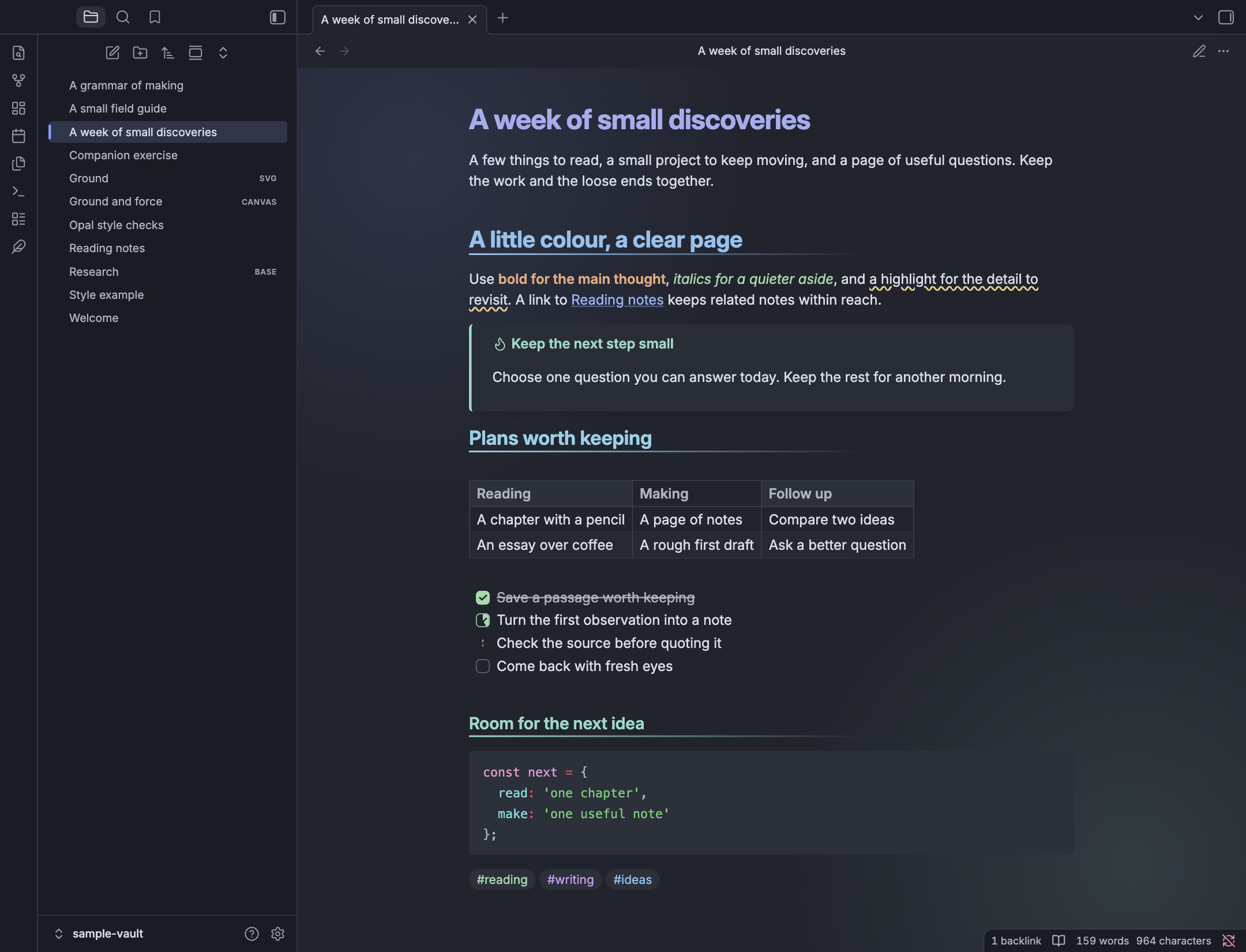
Opal gives Obsidian soft grey backgrounds, colourful headings and rounded controls. Light mode uses pale, cool-grey pages; dark mode uses deep blue-grey. Peach bold text, green italics and blue links give different parts of a note their own colour.
Use the theme's defaults, or add Style Settings to change its fonts, colours, layout and effects. Opal Companion is an optional plugin for applying styles to individual notes and inserting callouts, highlights, task markers and image-layout tokens.
Dark mode
Light mode
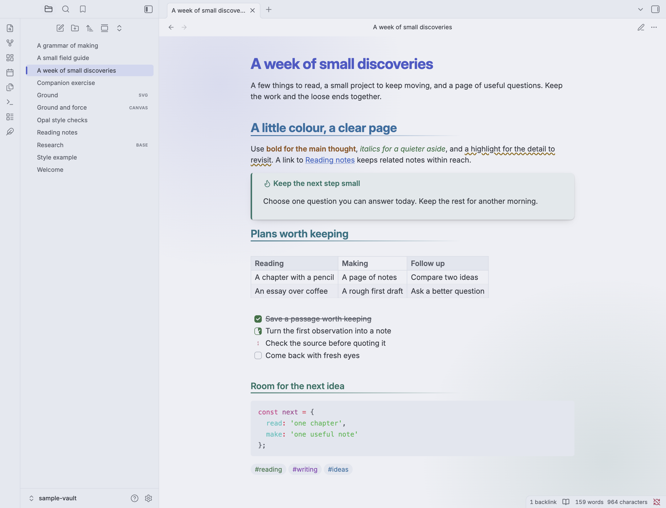
Both screenshots show a real Obsidian window with 16 px body text and an original demonstration note. Font appearance depends on the fonts available on your device.
Install Opal
The theme requires Obsidian 1.13.0 or later.
- Open Settings → Appearance → Themes → Manage.
- Search for Opal, open its page and choose Install and use.
- Choose Light, Dark or Adapt to system as the base colour scheme.
You can also use the Obsidian Community listing. For a manual installation, download theme.css and manifest.json from the latest release. Put both files in .obsidian/themes/Opal inside your vault, then select Opal in Appearance settings.
What the theme changes
Opal styles Reading view and Live Preview, along with the surrounding workspace. Some decorations depend on how Obsidian renders a note; the sections below describe those differences.
- Text and headings. Bold text, italics, highlights and links have separate colours. Each heading level has its own size, weight and colour controls. Choose multicoloured headings, shades of one colour, a shared accent, custom colours or the body text colour. Add fading or plain underlines. Reading view also supports hanging hash marks and automatic H2 and H3 numbering.
- Highlights and links. Highlights can use a wavy underline, a solid fill, a soft background or coloured text. Unresolved links can have a dashed underline, muted text, a blur or a question badge. Link underlines have their own switch.
- Tags, lists and folders. Tags can take colours from groups of first letters or recognised keywords, or use one colour. Lists can use different shapes by depth, a colour cycle or plain dots. File folders can share a colour down each top-level branch, follow the prefixes
00,10,20and90, use one colour or keep their usual appearance. - Callouts. Choose a soft card with a side line, a hard shadow, a thin outline, a glowing border, a coloured title bar or a folded-paper corner. Standard callout types are supported, along with Chinese aliases for common types. Folding continues to work as usual.
- Tasks. Mark work as in progress, cancelled, handed over, scheduled, a question, important, a favourite or a quotation. Digits provide coloured numbered icons. You can also choose Obsidian's usual checkbox appearance.
- Tables, code and diagrams. Tables have optional stripes, border choices and a full-width setting. Code has its own font, wrapping, ligatures and OpenType feature controls. Maths, Mermaid diagrams, blockquotes, footnotes, images and embedded content receive matching styles. Wide Mermaid diagrams can scroll horizontally.
- The workspace. Bases tables and cards, Properties, the graph, tabs, ribbon, command palette, settings, status bar and tooltips use Opal's colours. Canvas includes six-colour styling, coloured card edges and dashed group outlines.
Tag colours based on first letters or keywords apply in Reading view. Live Preview uses one orchid tag colour.
Task markers
- [ ] To do
- [x] Finished
- [/] In progress
- [-] Cancelled
- [>] Handed over
- [<] Scheduled
- [?] Question
- [!] Important
- [*] Favourite
- ["] Quotation
- [1] First item
The digits 0 through 9 display numbered icons. These markers change how a task looks; scheduling, recurring tasks and queries come from Obsidian or the task plugin you use.
Make it your own with Style Settings
Install and enable Style Settings, then open Settings → Style Settings → Opal. The theme has 83 controls in eight groups.
| Group | What you can change |
|---|---|
| Colours | Primary and secondary accents, colour intensity, background tint and contrast, code and highlight backgrounds, highlight style, heading colours, tag colours and unresolved links. |
| Fonts | Separate fonts for body text, headings, code and the interface; body text size; line height; letter spacing; code-font features; and bold-text colour. |
| Heading levels | Size and weight for all six levels, custom colours, underlines and prefixes. |
| Layout and sizing | Reading width, vertical margins, paragraph spacing, table width, diagram scrolling, list indentation, first-line indents, image width, image corners and shadows, background textures, and interface corner size and shape. |
| Borders and dividers | Border thickness and colour, divider style, keyboard-focus outline, table borders, scrollbar width, pane borders, and file-tree and list guides. |
| Element toggles | List markers, link underlines, code wrapping, ligatures, table stripes, active-line colour, focused writing, native checkboxes and background glow. |
| Skins and motion | Solid or glass-like menus, interface presets, callout styles, folder colours, animation level, page entrance and retro palettes. |
| Print and PDF export | White or dark output, serif, current or typewriter-style text, paragraph alignment and first-line indentation. |
The settings reference lists every control, its starting value, choices and range. Setting names and descriptions are available in English and Simplified Chinese. Choice menus include both languages.
Fonts
Opal uses fonts installed on your device. It starts with Inter for body text, headings and the interface, and JetBrains Mono for code, with system-font fallbacks when those fonts are unavailable. All four font fields can be changed separately. Install a font on your device before entering its name in the corresponding field.
Interface styles and motion
Choose Neutral, Cupertino, Fluent or Material to change control shapes and shadows. Menus can use solid backgrounds, frosted glass or a stronger glass effect. Corner choices include rounded, squircle, scoop and bevel shapes; the more specialised shapes depend on your Obsidian version's rendering support.
The background glow is a static colour gradient and has its own off switch. Motion choices are Off, Subtle, Standard and Lively, with blur, slide and bounce entrance options. Retro styles include Synthwave, a green phosphor terminal, an amber CRT and Digital rain.
For keyboard navigation, keep the Outline or Glow focus-ring option enabled. The theme follows system preferences for reduced motion and transparency. Your colour choices, snippets and other plugins can change the final contrast and layout.
Style individual notes with Opal Companion
Opal Companion puts per-note actions behind a floating toolbar, visual choice cards, commands and an editor context menu. Install it from Settings → Community plugins, then enable it while using Opal. For a manual installation, download main.js and manifest.json from its latest release, put them in .obsidian/plugins/opal-companion, reload Obsidian and enable the plugin.
The current Companion interface uses Chinese labels. Search Opal in the command palette, or use the toolbar icons described below. The theme's Style Settings controls have separate English and Chinese labels.
Switch the note to editing mode before inserting callouts, highlights, task markers or image tokens. Then select the text or place the cursor where you want the change.
| Toolbar icon | What it does |
|---|---|
| Palette | Add a page state, width, note type or one of eleven accent colours to the note's cssclasses property. |
| Callout | Insert Note, Info, Tip, Success, Question, Warning, Danger, Failure, Bug, Example, Quote, Abstract or Todo. Select a paragraph first to use it as the contents. |
| Highlighter | Wrap selected text in an amber, green, sky-blue, rose or orchid highlight. Select the text before opening the picker. |
| Task list | Apply one of the ten named task states to the current line. Numbered markers can be typed directly. |
| Image | Add img-invert, img-grid, img-banner, img-left or img-right to an image description. Put one image on the current line before using this tool. |
| More | Open the tool menu, including the action for removing a saved page-style class. |
Click a visual card to apply it, or focus it with Tab and press Enter or Space. The text menus support searching. Keep the intended note active while choosing a page style.
A new accent replaces older accent- classes. Other page styles are added to the existing list. Use the removal action to clear an earlier state or width when changing it. The image picker also adds its token, so remove the previous layout token from the image description when switching layouts.
Companion saves these choices in the note as Markdown, HTML highlight tags and cssclasses. Turning off the plugin keeps those edits.
Move the floating toolbar
Drag its grip with a mouse, touch or pen. Companion remembers desktop and mobile positions separately and adjusts the toolbar to the visible window, on-screen keyboard, screen orientation and safe areas. On narrow screens, the row of 44 px buttons scrolls horizontally.
With the grip focused, use the arrow keys to move it, Shift + arrow for a larger step, or Home to reset its position. The ribbon icon toggles toolbar visibility. The command palette also includes toolbar toggle and reset commands.
Per-note styles
The theme's classes can also be added by hand. Put this block at the start of a note, or add the entries to its existing cssclasses list.
---
cssclasses:
  - important
  - wide
  - accent-teal
---
This gives the note an amber left border, a wider text column, and teal H1 headings and internal links. The filename shown above the note, external links and callout colours keep their usual colour rules.
| Category | Classes and effects |
|---|---|
| Page state | important adds an amber edge and tint; alert adds a red outline; draft adds a diagonal Reading-view watermark; archived reduces colour and brightness; pinned adds a teal top edge. The Draft watermark currently uses a Chinese label. |
| Width | wide uses 55rem, narrow uses 30rem, and full-width uses all the available width. Keep one width class at a time. |
| Note type | meeting adds a blue top line in Reading view. daily warms the base colour used by elements such as callouts. Companion also offers moc and project; these save class names for use with your own snippets. |
| Accent | Add accent- before rose, peach, amber, green, teal, sky, blue, indigo, violet, orchid or pink. These affect H1 headings, internal links and interactive accents. |
Page-state classes change the note's appearance. Move a file to an archive folder or pin its tab through Obsidian when you want those actions.
Highlights and images
A coloured highlight uses a small HTML tag.
<mark class="opal-hl-amber">A detail worth keeping</mark>
Replace amber with green, sky, rose or orchid to use another colour.
Image-layout tokens belong in the description. Replace Diagram.png with an image in your vault.

![[Diagram.png|A diagram img-invert]]
img-banner makes the image full-width. img-invert inverts its colours in dark mode, which can help with diagrams on pale backgrounds. img-left and img-right apply floats to the image itself; the surrounding Obsidian embed can limit text wrapping.
The grid rule targets HTML images directly inside a paragraph. In Obsidian 1.13.7, the tested native Markdown and wikilink embeds kept their normal stacked layout with img-grid. Use the banner or ordinary embed layout for a predictable result with those embeds.
Plugins and PDF export
Opal includes styles for Dataview, Editing Toolbar, Calendar, Admonition and Timeline, plus the visible interfaces of spreadsheet and D2 views, Better Export PDF and Advanced PDF Export. These styles adjust appearance; each plugin continues to control its own features.
For Obsidian's PDF export and Better Export PDF, the default print rules use white paper. To keep dark colours, enable Keep dark colours in exports and turn on background printing in the exporter. Print settings also offer a serif, current or typewriter-style font and paragraph alignment.
Advanced PDF Export controls its own preview and PDF pages through its pageBackground setting. Choose #ffffff in its Page background color control for white paper. Opal styles the surrounding dialogue.
Examples and support
The examples folder contains the English notes used for the new screenshots. They are original demonstration content. The screenshots and documented note-style examples were checked in Obsidian 1.13.7 on macOS. Physical mobile devices and full third-party plugin workflows need separate testing.
To report a problem, include your Obsidian version, operating system, relevant Style Settings choices and a small note or screenshot that shows it. Your own CSS snippets and plugin styles are useful context.
Credits and licence
Opal's palette was inspired by Catppuccin. The theme, documentation and example notes use the MIT Licence, copyright 2026 Cyrius.