
- Overview
- Scorecard
- Updates82
| Jump: | Settings | Alt Checkboxes | Admonitions | Tables | Embeds | Colors | Custom accents |
This is a dark and light theme for Obsidian, a note-taking application and Obsidian Publish, a static site generator.
Headers are styled, sized, and responsive (meaning friendly for all screens) with and without stacked tabs enabled. Modals, tables, and other panels are also styled.
Some light styling has also been applied for the following community plugins:
This theme is compatible with custom task snippets from the Snippetor.
Style Settings
This theme does support style settings. Settable attributes:
(0.3.25) "Suppress/remove this theme's checkbox styles" Set this to true if you are going to use your own task snippet (💡 Check out Snippetor!)
(0.6.1) "Suppress/remove this theme's tag styles" Set this to true if you are going to use your own tag snippet
(0.5.x) "View header actions to the left" Set this to true if the view header is visible, and you want the controls on the left side of the tab contents, rather than the right.
"Show external links in edit mode" If true, external links (or the content of Markdown links) will be shown in edit mode. External links are hidden by default.
(0.1.8) "Float front-matter in a box to the right" If true, front-matter in preview mode will be collapsed in a top-right container.
(0.5.x) "Hide the heading used to embed a document" If true, the heading used to embed a document will be hidden.
Custom Fonts
"Headings" Font for text headings (h1 to h6); empty will use default text font
(0.3.24) "Heading Font Caps Variant" Capitalization variant for h1 text headings
"Tags" Font for displaying inline tags; empty will use default text font
"Callout/admonition titles" Font for callout/admonition titles; empty will use default text font
Colors This allows you to select the primary or secondary color from the colors in the palette (purple, pink, green, teal, or blue). You can also select a "custom" accent color, in which case, you should define and enable your own snippet as described below.
"Primary accent color" Choose the primary accent color. You should define a snippet if you select primary-accent-custom. See the Theme's README.
"Secondary accent color" Choose the secondary accent color. You should define a snippet if you select secondary-accent-custom. See the Theme's README.
Alternative Checkboxes
This theme provides styles for the following checkbox values:
| Syntax | Description |
|---|---|
- [ ] |
Unchecked |
- [x] |
Checked |
- [-] |
Cancelled |
- [/] |
In Progress |
- [>] |
Deferred |
- [!] |
Important |
- [?] |
Question |
- [r] |
Review |
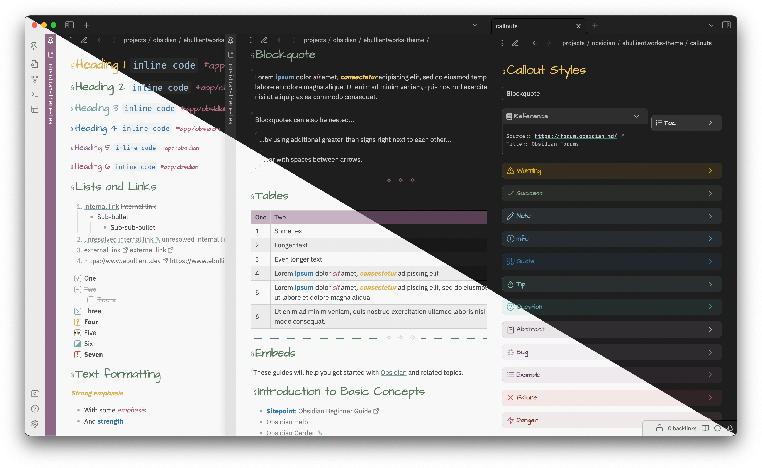
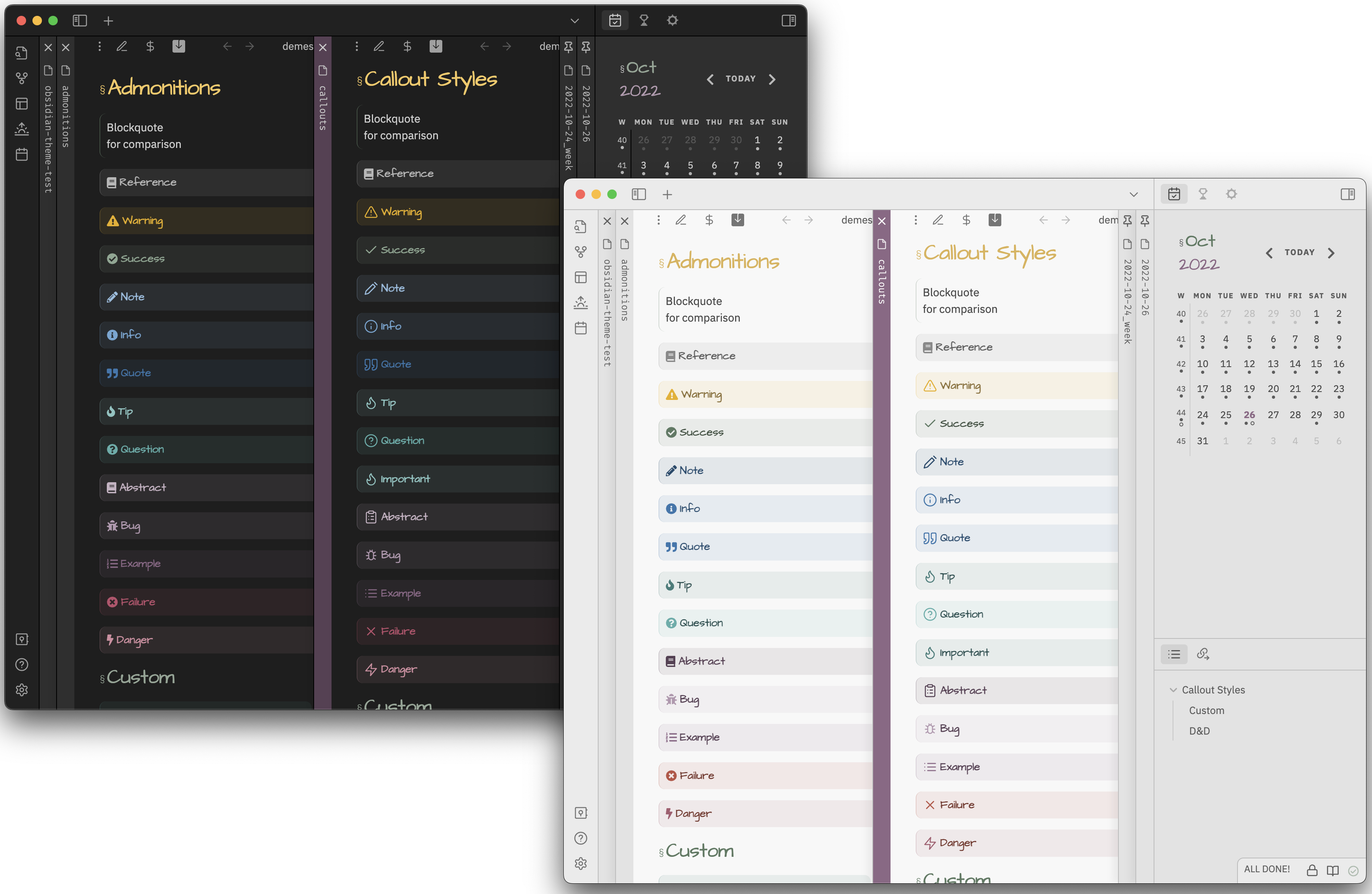
Admonitions and callouts
As of Admonitions version 6.5.1, you can disable the color picker for admonitions (globally or per-admonition) to have colors picked up from CSS styles instead.
All the default admonitions, in addition to two additional custom types, have been styled.
Custom admonitions:
chatStyled with a speech bubble to represent a conversation of some kindexcerptStyled similarly to quote, for a captured text snippet.reference
Styled for inline reference metadata. Compact, monospace font.tocStyled to create a floating (hover:right) section for Table of Contents
You can import these admonitions using admonitions.json
Here is what they look like (Callouts and Admonitions):
Tables
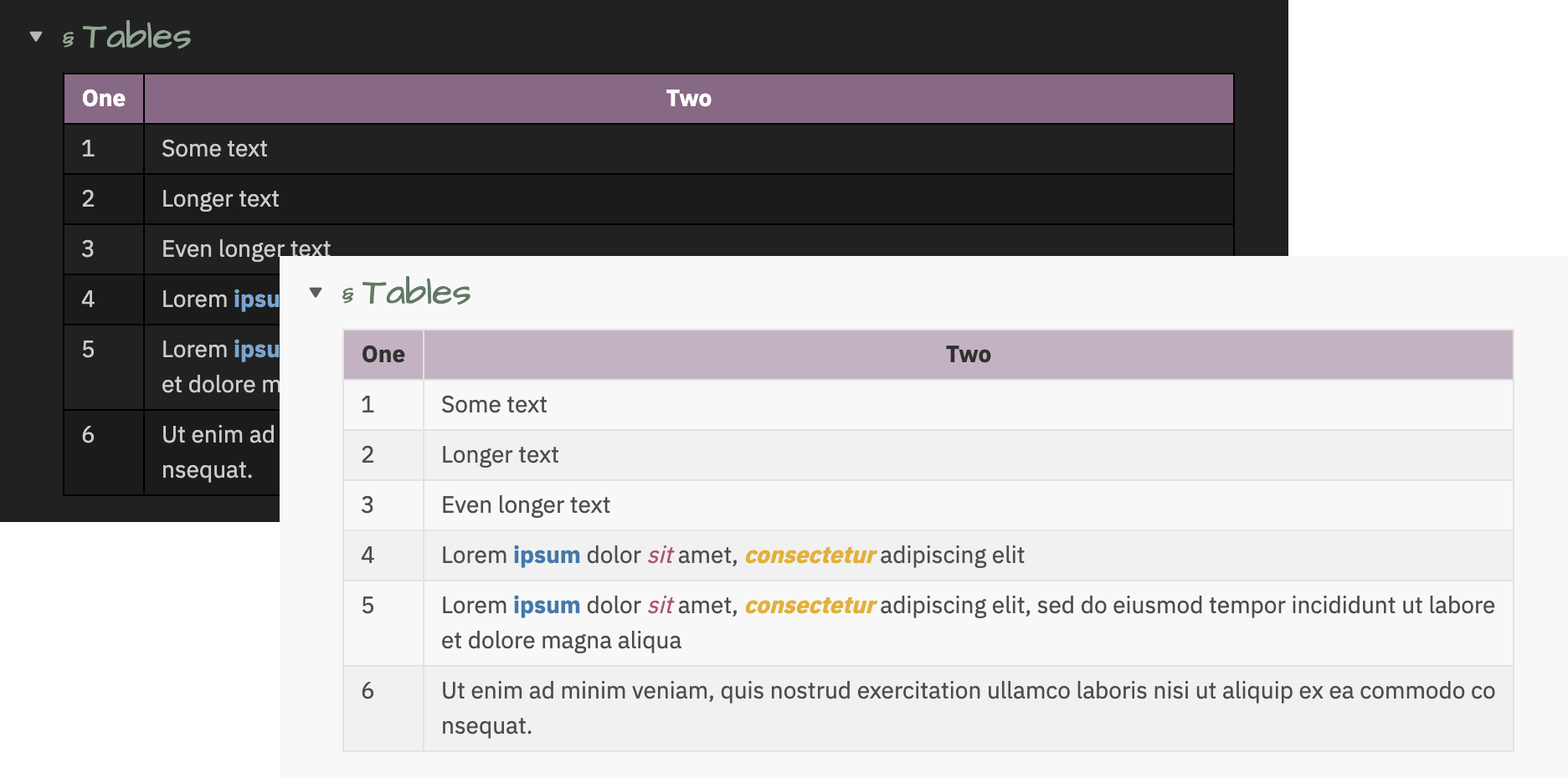
To constrain the table content to the width of the pane, use:
---
cssclass: force-wrap
---
To prevent column headers from wrapping, use:
---
cssclass: word-wrap
---
Embeds
To make embedded content "invisible" (same background color as the including page and much less padding), use the invisible-embed css class:
---
cssclass: invisible-embed
---
Colors
All colors are sourced from this palette

|

|
Creating your own accent colors
A simple way to select colors that will work with this palette is by applying a grayscale filter to a selected hue.
Use the following URL to apply the grayscale filter to a color of your choice: https://grayscale.design/app?lums=71.05%2C60.94%2C48.16%2C35.39%2C17.24%2C6.39%2C2.80&palettes=%235c7a62%2C%238e6787&filters=0%7C0%2C0%7C0&names=green%2Cpurple&labels=%2C
Create a snippet that contains your customized colors.
Example
For example, let's use a REALLY BOLD RED: #ae2012.
- If we visit the link above, we can scroll down a bit until we see a button "Add a color", and we paste this value (including the
#in that field). This will show us something like this:
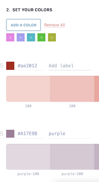
Scroll down until you see
Step 3, which is the step you need to export your colors. You'll want to use the CSS variables.If we want to use this red as the primary color:
.primary-accent-custom {
    --primary-accent-0: rgb(250, 210, 206); /* red-100 */
    --primary-accent-1: rgb(248, 192, 187); /* red-200 */
    --primary-accent-1-rgb: 248, 192, 187;  /* Note removal of rgb() function */
    --primary-accent-2: rgb(245, 163, 156); /* red-300 */
    --primary-accent-3: rgb(241, 127, 117); /* red-400 */
    --primary-accent-4: rgb(222, 40, 23);   /* red-500 */
    --primary-accent-4-rgb: 222, 40, 23;    /* Note removal of rgb() function */
    --primary-accent-5: rgb(142, 25, 15);   /* red-600 */
    --primary-accent-6: rgb(95, 17, 10);    /* red-700 */
}
If we want to use this red as the secondary color:
.secondary-accent-custom {
    --secondary-accent-0: rgb(250, 210, 206); /* red-100 */
    --secondary-accent-1: rgb(248, 192, 187); /* red-200 */
    --secondary-accent-1-rgb: 248, 192, 187;  /* Note removal of rgb() function */
    --secondary-accent-2: rgb(245, 163, 156); /* red-300 */
    --secondary-accent-3: rgb(241, 127, 117); /* red-400 */
    --secondary-accent-4: rgb(222, 40, 23);   /* red-500 */
    --secondary-accent-4-rgb: 222, 40, 23;    /* Note removal of rgb() function */
    --secondary-accent-5: rgb(142, 25, 15);   /* red-600 */
    --secondary-accent-6: rgb(95, 17, 10);    /* red-700 */
}
Create a snippet (e.g. a file named
accent-colors.css) containing this content in the.obsidian/snippetsdirectory. Go to the Obsidian Appearance settings use the refresh button if necessary to find the snippet, and enable it. Provided you've selected the "custom" value in the primary/secondary style settings drop-down, you should be off to the races with this brilliant red.
Changing tag colors
As of 0.5.3 (Obsidian 0.16+ / 1.x), use the "accent color" setting on the appearance pane to set your tag color. Resetting the value will use the theme default.
For 0.2.7 through 0.5.2, you can alter the color contrast (against the usual scale, 0-6) for tags in light or dark mode.
Credits
I've begged/borrowed/stolen CSS snippets from just about everywhere, but I started from vanilla and tried to be judicious about what to include to keep things lean.
I frequently reference the following two themes, as they're often the quickest to consume a new CSS trick or snippet:
If you have ideas or requests, please open an issue. ;)