
- Overview
- Scorecard
- Updates6
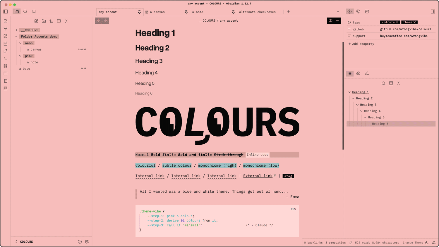
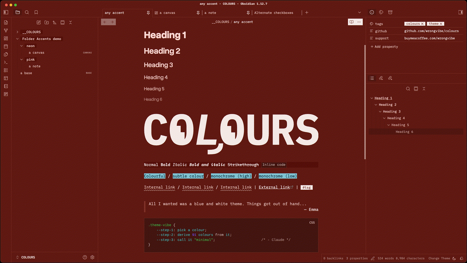
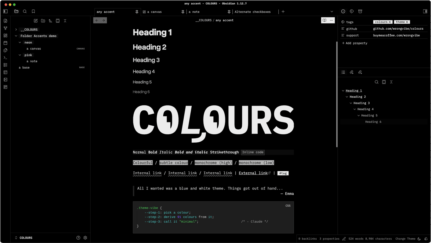
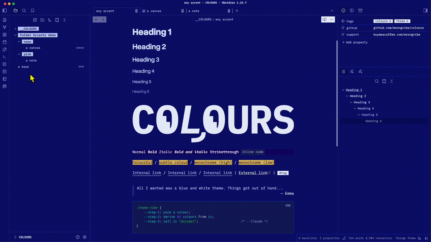
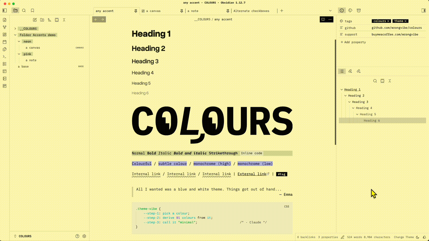
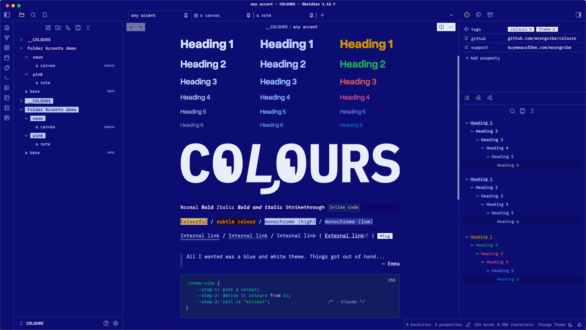
Accent-driven colour. A minimal Obsidian theme.
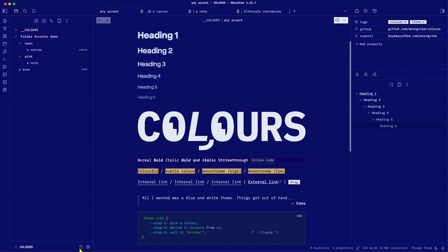
The entire colour palette is derived mathematically from single chosen accent colour. No longer restricted by theme's Light and Dark preset. More options in Style Settings.
 |
 |
 |
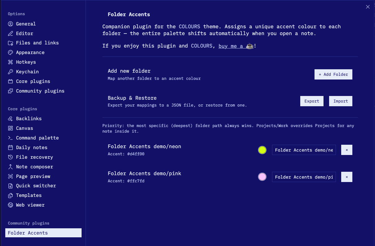
A companion plugin Folder Accents is available for changing accent colour when opening note in designated folder.
 |
 |
Features
- Single-accent palette — Every colour derived from
--color-accentviaoklch(); change one colour, everything updates - Auto contrast — Text automatically flips light/dark based on your accent's lightness
- Auto Dark mode — Dim palette from your chosen accent colour; Option to save preferred colour in Style Setting without this dim intervention.
- Style Settings — Colour, typography, layout options via the Style Settings plugin
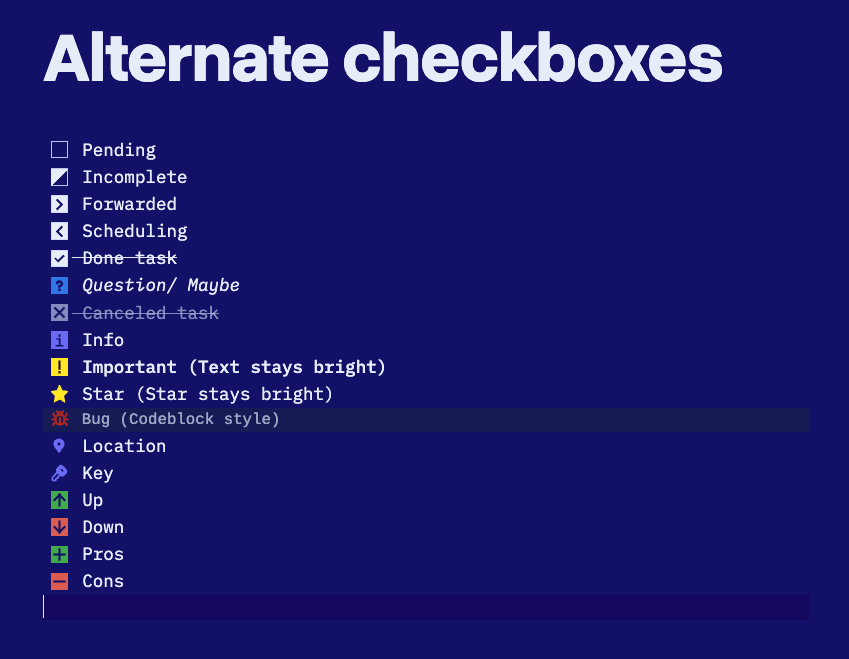
- Alternates task checkboxes — extra styled checkboxes for
important,star,bug,key,locationetc
Requirements
Obsidian 1.5.0+ (required for oklch(from …) relative colour syntax — ships with a modern Chromium base).
Installation
Community Themes
- Settings → Appearance → Themes → Browse
- Search COLOURS → Install
Manual
- Download
theme.cssandmanifest.json - Place both in
.obsidian/themes/COLOURS/inside your vault - Settings → Appearance → Themes → select COLOURS
Fonts
The theme respects Obsidian's font settings, which will override theme setting.
Title and Heading font can be customized via Style Settings → Typography → Heading Font.
| Area | Recommended fonts |
|---|---|
| Interface font | IBM Plex Mono |
| Text font | IBM Plex Mono |
| Monospace font | IBM Plex Mono |
| Title and Heading | Overused Grotesk |
You will need to install the fonts, they are not included in the theme.
Style Settings
Install Style Settings community plugin to access these options:
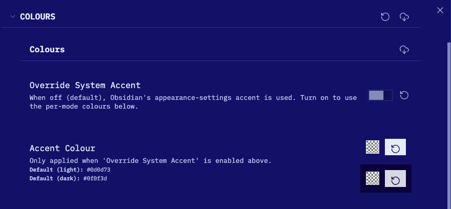
Colours
Override System Accent
When off (default), Obsidian's built-in accent colour picker drives the theme. Turn on to use the per-mode colours below instead of the system accent.
Accent Colour
(Only active when Override System Accent is on.)
Set separate accent colours for light and dark mode. Defaults: #0d0d73 (light) / #0f0f3d (dark).
Heading Style
How # H1 through ###### H6 are coloured:
| Option | Description |
|---|---|
| Monochrome (default) | Low-saturation accent tint — nearly grayscale |
| A little bit colour | Slightly more chroma |
| Go Crazy | Full chroma, different hue per heading level |
Coloured Alternate Checkboxes
(Default: on) Applies the Go Crazy hue palette to alternate checkbox backgrounds. Turn off to fall back to the Heading Style setting.
Highlight Style
How ==highlighted text== appears:
| Option | Description |
|---|---|
| Colourful (default) | Complementary hue, full saturation |
| Subtle Colour | Muted complementary tint |
| Monochrome (High contrast) | Dark on light (or vice versa) |
| Monochrome (Low contrast) | Subtle grey tones |
Typography
Heading Font
Set any font for headings using CSS font-family syntax.
- Default:
'Overused Grotesk Roman', 'Helvetica Neue', 'Inter', sans-serif - Example:
Georgia, serifor'Departure Mono', monospace
Quote names that contain spaces.
Heading Sizes
Scale all heading sizes up or down:
| Option | H1 → H6 range |
|---|---|
| Default | 2.5em → 1.1em |
| Compact | 1.8em → 1.0em |
| Large | 3.0em → 1.15em |
Line Height
| Option | Value |
|---|---|
| Default | Obsidian default |
| Relaxed | 1.8 |
| Compact | 1.4 |
Enable Uppercase
Applies text-transform: uppercase to the note title, table headers, and UI buttons (modals, settings, ribbon, view actions). Off by default.
Font Brightness
Scales text opacity. Lower values give a softer, more muted look. Range: 0.5–1, default: 1.
Layout
Table Style
| Option | Description |
|---|---|
| Tinted header row (default) | Header row tinted with accent |
| Tinted alternate rows | Zebra stripe on data rows |
Folder Style
| Option | Description |
|---|---|
| Light Background (default) | Subtle accent tint behind folder names |
| Inverted Background | High-contrast muted background with primary text colour |
| Plain | No background — unstyled folder names |
Internal Link Decoration
| Option | Description |
|---|---|
| Wavy (default) | Wavy underline on internal links |
| Underline | Solid underline |
| None | No decoration |
Auto-hide Scrollbar
Uses the OS overlay scrollbar — appears on hover/scroll, hidden otherwise. Replaces the theme's custom thin scrollbar.
Disable Cursor Line Highlight
Removes the background tint on the active editor line.
Hide Inline Title in Canvas
Shows the inline note title in the editor but hides it inside Canvas cards.
Readable Line Width
Custom line width when Readable line length is on. Range: 400–1400px, default: 700px.
Base Embed Width Multiplier
Controls how wide embedded Bases (![[Base.base]]) are relative to the readable line width.
- Range: 1× (same as line width) → 5× wider
- Default: 1×
Only has a visible effect when readable line length is enabled.
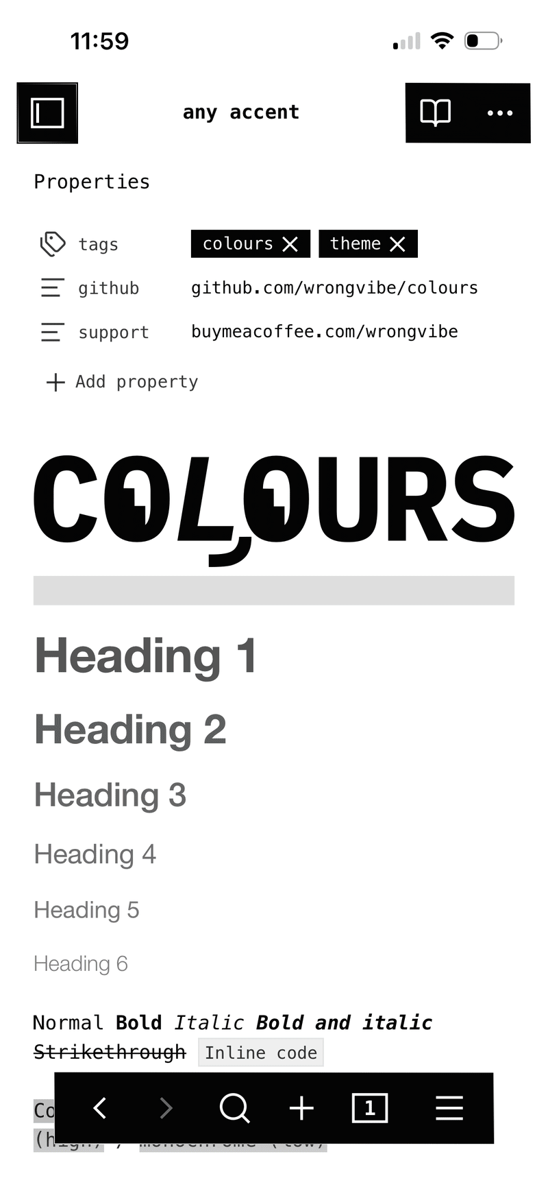
On phone
Contributing
Pure CSS — no build step. Edit theme.css directly.
License
GPL-3.0