Bureau
 Sonophage1k downloads
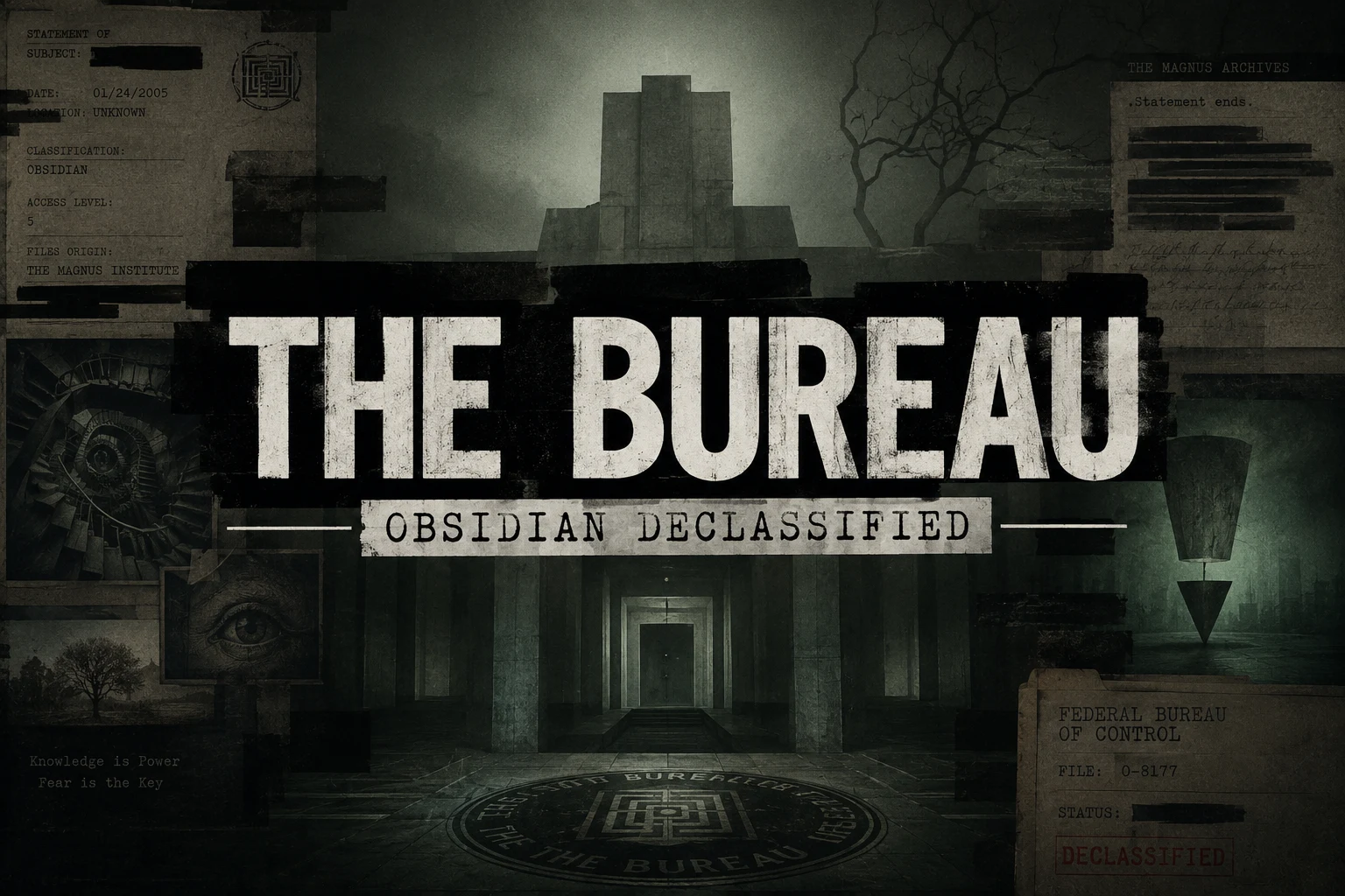
The Bureau — a theme for Obsidian, inspired by the Federal Bureau of Control, Magnus Archives and Deus Ex Machina
- Overview
- Scorecard
- Updates21
A noir theme for Obsidian. A worn case-file on a concrete desk, wired to a CRT that hums whether or not you're listening.
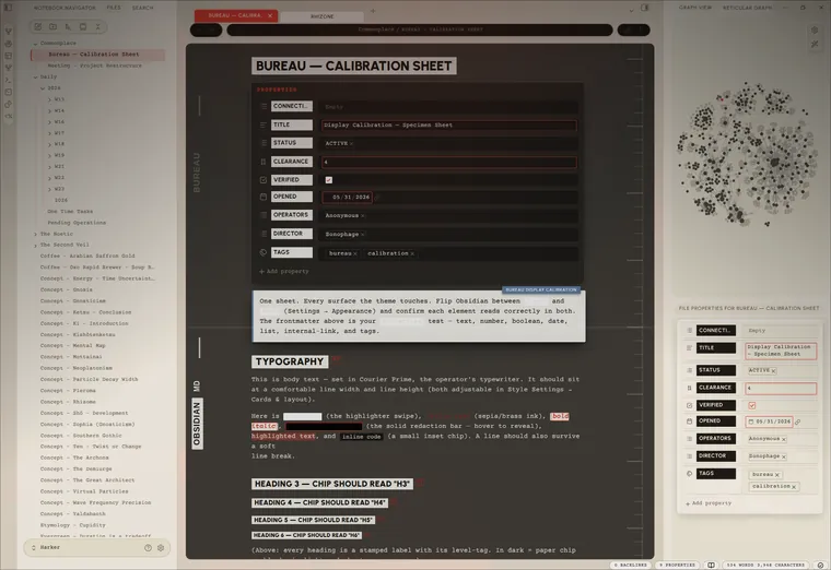
[!IMPORTANT] Most of Bureau lives in the Style Settings plugin. Install it and you get a single Bureau panel (Settings → Style Settings → Bureau) with every option in one place. The theme runs fine without it — just on its built-in defaults.
I've always liked that redacted-bureau look. The brutalism of it: heavy type that doesn't apologise, stamped labels, lines blacked out by someone who decided you didn't need to read them. Documents with purpose, and what is Obsidian for most of us if not a collection of notes and documents that serve a purpose? A lot of themes are a pile of effects in a trench coat — gorgeous in the screenshot, unlivable by the second week. Pretty to look at but hard to work in. I themed hopped for months and never really felt at home. Like I was using someone elses desk. Settings that were cool but didnt work right or made editing difficult. Then there were things that some themes just could not do. I didn't want effects. I wanted a room you could sit in at 2 AM and feel like the work mattered. One cohesive place I could spend hours in.
The mood comes from three places, and each one is an accent you pick — the single colour the whole UI, the glow, and every highlight read from, the way a room reads from one bad bulb:
- Control — the institutional dread of the Federal Bureau of Control, the red of a door you shouldn't open. The default red accent.
- Magnus — The Magnus Archives: dust, quiet wrongness, a tape still running. The green accent.
- Deus — Deus Ex: black-and-gold cyber-renaissance, conspiracy with good lighting. The gold accent.
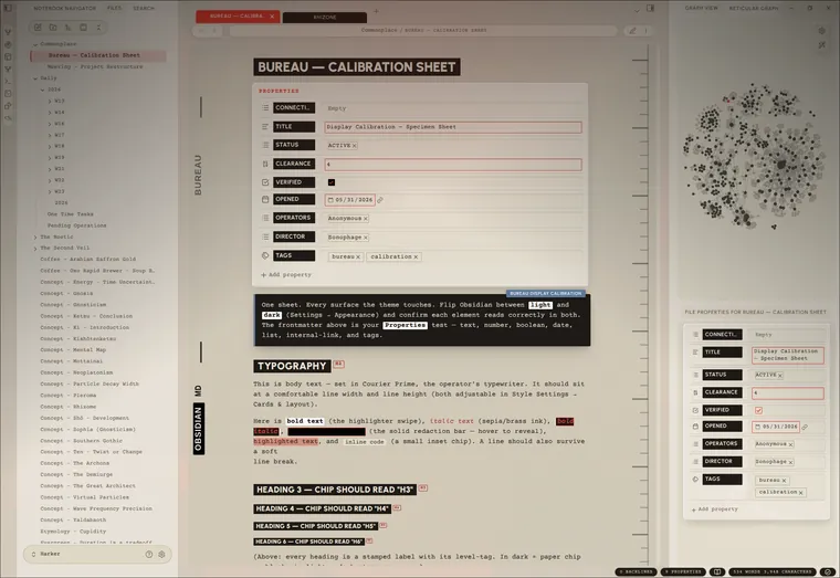
Most themes pick a side and defend it like an identity, Dark only, or if your lucky Dark and Light versions. But even the light versions are too bright and the dark versions are too dark. Bureau runs both; a near-black noir and a daylight case-file in paper. The interesting part is the ground between them.
Set the editor to the opposite palette of its chrome and you get a lit page on a dark desk, or a dark page in a lit room. The picture lives in that seam where light meets dark.
Everything textural is procedural SVG, drawn by the stylesheet instead of photographed and dragged in (mostly for sharpness and responsiveness). There's a CRT layer if you want it: scanlines, phosphor glow, a white line that scans down the page and glitches like a loose wire, a power-on that fades up from black each time you open a note. None of it is load-bearing — leave it off and the theme still stands. Turn it on when you want the machine to feel haunted. On a phone it quiets all of that down on its own.
Showcase
 White — daylight |
 Black & White |
 White & Black |
Install
Community themes: Settings → Appearance → Manage → search Bureau.
Manual:
- Download
theme.cssandmanifest.json. - Drop them into
<vault>/.obsidian/themes/Bureau/. - Settings → Appearance → Themes → Bureau.
Install the Style Settings plugin. Everything below lives there, in one Bureau panel. Without it the theme still runs — it just runs the way the house came: someone else's defaults.
Light or dark is Obsidian's own switch (Settings → Appearance), not the theme's. Bureau dresses both: a full daylight variant — aged paper, a black marginalia ledger, dark ink — sits behind light mode the same way the noir sits behind dark. The theme can't throw Obsidian's switch for you.
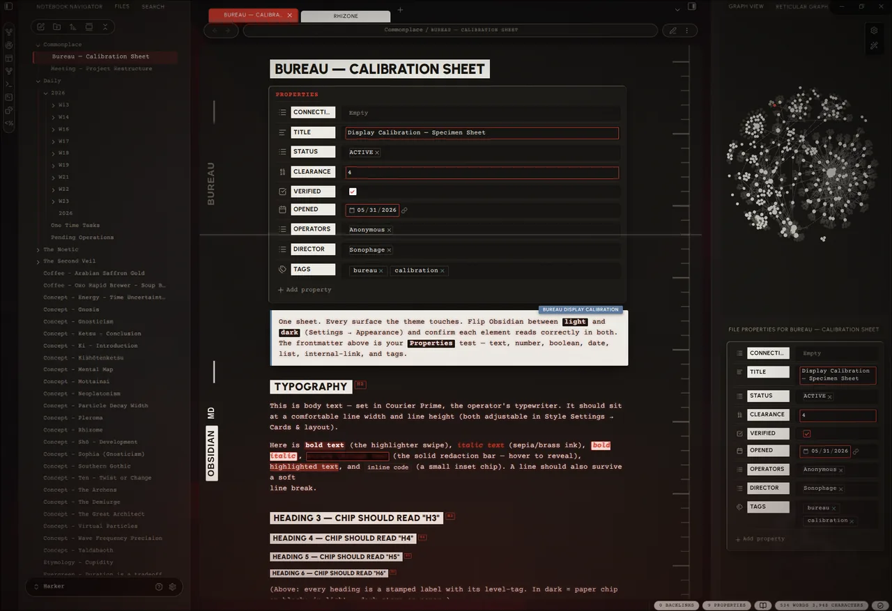
The panel
Everything is in Settings → Style Settings → Bureau. The panel remembers what you told it — switching presets never paves over your choices. What follows walks the panel top to bottom, in the order you'll find it.
Mode
One dial that decides how haunted the room gets, layered over everything else.
| Mode | What you get |
|---|---|
| Low | The bones. Styling only — no texture, no glow, no CRT, no motion. |
| Medium | Texture and the ambient glow. Lived-in. No CRT, no animation. |
| High | Everything awake. The machine knows you're here. |
| Custom | Your own arrangement — every toggle below, exactly as you left it. |
Low and Medium override the individual toggles while they're active; your toggles are never lost — switch to Custom and they come back.
Color & accent
- Inverted editor — the chiaroscuro switch: the editor pane takes the opposite palette to the rest of the UI. Caret, texture and ink all flip with it. (Flip Obsidian's own light/dark to swap which side is which.)
- Per-mode palette — for finer control than the single switch above, set the sidebars and the editor to light or dark independently, and lock each in per Obsidian appearance. Four selectors (sidebars + editor, for light mode and dark mode), all defaulting to follow the appearance — so e.g. light mode can run a paper editor on dark sidebars while dark mode stays dark-on-dark, and your light/dark hotkey flips between exactly what you set for each.
- Accent preset — Control (red) · Magnus (green) · Deus (gold) · Custom, plus a Custom accent colour when you want your own.
- Phosphor terminal — collapse the body text to the accent, like a single-phosphor tube. (A dark accent recolours all body text — that's the trade.)
- Native accent — Bureau doesn't force Obsidian's built-in accent, so the startup colour follows Settings → Appearance → Accent color. Match it to your Bureau accent for a seamless launch (the startup screen paints before Style Settings loads).
- Text colour (per mode) and Black / White level — set the ink, and how far the darkest surface and the brightest paper go.
Atmosphere
The ambient layer — all sliders, 0 = off, so it's there only as much as you want.
- Glow intensity / reach — accent light bleeding up from the bottom of the window.
- Film grain — fine grain over everything; proof the image was developed, not generated.
- Shadow strength — the master depth of every cast shadow in the theme.
- Sidebar texture — concrete grain on the panels behind the cards.
- Vignette — the edges darkened, the way attention darkens at the edges.
- Accent halo — a soft accent ring that breathes outward behind the UI (stills to a faint ring under reduced-motion).
CRT
The tube. Optional, and quietly the whole point.
- CRT scanlines (strength + spacing) — faint horizontal lines over the editor.
- CRT text glow — phosphor bloom on the body text.
- Fullscreen CRT mode — go fullscreen and the screen curves: tube vignette, scanlines and glow up, chrome receding into the dark until you reach for it.
- Focus line — every line dims except the one you're on, which gets an accent mark in the margin.
Cards & layout
- Cards layout — every pane floats as a bordered card on a dark desk. Paper on concrete. The cards carry a faint glass bevel (lit top-left, shaded bottom-right) so they read as slabs, not stickers.
- Card gap / rounding / shadow (darkness · blur · spread) — how far apart, how soft the corners, how deep the shadow.
- Reading line width / line height / paragraph spacing — the density dials.
- Horizontal settings nav — reflow the settings window's tab list into a strip across the top (desktop only).
- Print — show link URLs — print internal/external links with their target spelled out.
Floating & glass
Optional soft looks over the brutalist base — all off by default.
- Heavier card float — a deeper shadow and more space, so panes lift higher off the desk.
- Frosted glass panes — translucent, blurred editor and sidebars; the stage (or your wallpaper) shows through.
- Flat card edges — drop the bevel for a flat, matte card.
- Pill terminal (floating editor) — the full Ultra-Lobster move: the header breaks into flat pills, the title bar goes transparent, and the editor floats as its own rounded card below the chrome (the status bar splits into pills too). Best with Cards layout on. Desktop only — it auto-suppresses on phones and tablets, where the floating card breaks layout.
- ↳ Pill terminal — hover to reveal — the header pills collapse until you hover or focus the row, reclaiming the space.
- Editor-only cards — only the editor floats as a card; the sidebars sit flush.
Pill editor card
Fine-tuning for the floating card in Pill terminal mode (needs Pill terminal on): remove or recolour its border, set its rounding (drives the clip-path, so corners clip cleanly), and nudge the stacked-tabs spine inset to line the tab spine up with the card.
Background
A wallpaper behind the workspace, visible through the frosted glass, plus the empty New-Tab pane's artwork.
One thing to know up front: pure CSS can't point at a vault file by path.
Obsidian serves vault files over a per-install app://<token>/… URL that only
JavaScript can mint; the old app://local/… shortcut no longer resolves, and
relative paths don't resolve inside an injected stylesheet. So a web image can
be linked directly, but a local image has to be embedded or fed in by a plugin.
Three ways:
- Web image — paste a full
url('https://…')into Background image — web URL. Layers on top, so a web URL always wins. (Re-fetched every launch.) - Local, point-and-click (easiest) — install the optional Redacted Background companion plugin (via BRAT), then right-click any vault image → Set as Redacted Background. It feeds Bureau a live resource path — no encoding step — and sets the new-tab image too.
- Local, no plugin — turn the image into a base64 data URI (any "image to base64" tool, or
magick img.png -quality 82 -strip /tmp/bw.jpg && base64 -w0 /tmp/bw.jpg) and paste the wholeurl('data:image/jpeg;base64,…')into the same web-URL field.
New-tab image paints the empty New-Tab pane: Bureau image (the packaged
artwork, shown by default, embedded as base64 webp in theme.css), Off, or
Custom URL — with a size slider. The 3-way select + data-URI delivery is
adapted from the Border theme by Akifyss; the
artwork is original. To swap it, replace new-tab.webp and re-embed it as
--bu-new-tab-default-image (printf 'url("data:image/webp;base64,%s")' "$(base64 -w0 new-tab.webp)").
Why the plugin isn't bundled: Obsidian distributes a theme as only
theme.css+manifest.json— it can't ship or install a plugin for you. So Redacted Background lives in its own repo, installed via BRAT.
Tabs
- Tab shape — Folder (connected, like a real file drawer) or Pill (fully rounded). The active tab fills solid accent and rises taller; inactive tabs invert (black-on-white / white-on-black) and are editor-aware, flipping with Inverted editor so they track the editor's palette. Labels sit dead-centre and stay put when the close button appears.
- Main / Left / Right tab content — Icons · Labels · Icons + Labels, per dock.
- Pinned tabs → icon only — the ones you've decided to keep say less.
Hide / Focus
For when the room has too much furniture.
- Focus Mode — kills the tab bar, window buttons, and status bar in one move. Bind a hotkey to Style Settings → Toggle Focus Mode to clear the desk without looking down.
- À-la-carte, hide any of: status bar, breadcrumbs, tab close button, left/right sidebar toggles, folder collapse arrow, command-palette instructions.
Animation
Restrained, CRT-flavoured, eased — never bouncy. A master Animations toggle gates all of it, with a speed slider and an easing select; Respect "reduce motion" hands control back to the OS setting.
The headline pieces: CRT power-on (content fades up from black on open), Boot sequence (a CRT switch-on flash on app launch), Channel-change crossfade (fade + scan-line wipe on note switch), the Scanning line (a faint line that drifts down the editor and glitches, with brightness / interval / depth sliders), and Limelight (spotlight the active pane; everything else dims until you look at it). Past those sit the small tics — terminal block caret, active-line scan, CRT flicker, eased checkbox tick, typewriter tooltips, breathing glow, faded menus — the wobble in the fan.
Resize handles
The divider lines between sidebars and editor: remove them for a seamless edge, or set a custom colour. (Remove wins if both are on.)
Scrollbars
Hide them (content still scrolls), set the width, fade them in on hover (with a delay), accent the thumb while scrolling, or give the resting thumb and its grip their own custom colours.
Daily notes
One accent per weekday (Sun–Sat) — so Tuesday doesn't get to look like Friday
— with text and background derived from that accent automatically, light and
dark. Add the weekday class (e.g. cssclass: monday) to key a note's palette. If
you ran the old "Daily Note Themes" snippet, switch it off — Bureau owns this room
now.
Changelog (in-panel)
The foot of the panel carries a live What's new note and the full Release history, regenerated on every release so the app always shows the same changelog as this repo.
On mobile
The theatre dims itself on phones and tablets, automatically — no toggle, no Style Settings required. Grain, scanlines, glow, motion and the heavy card shadows drop; tap targets grow; and the Pill terminal / floating editor auto-suppresses even if you left it on for desktop, because the floating card and pill header don't survive a small screen. The device that can't afford the show doesn't have to sit through it.
Changelog
The full history lives on the releases page,
and inside the app at the foot of the Bureau Style Settings panel (Release
history). When cutting a new release, add its ### X.Y.Z entry below this
paragraph, newest first — release.py reads it from here (see Releasing).
2.10.0
- Mobile sidebar no longer renders blank until tapped — on phones, opening or switching a side-drawer view (file explorer, Notebook Navigator, search) left it blank until you tapped it once. The cause was the mobile baseline's blanket
body.is-mobile * { animation: none }: alongside Bureau's decorative animations it also killed the zero-duration CSS animations Obsidian's list views use as a render hook, so the lists never got told to paint. The blanket rule is gone; Bureau's own animations are now held off mobile at the source (everybu-animrule is gated:not(.is-mobile)), so a phone still shows no Bureau animation while Obsidian's hooks keep working. - Per-mode palette (independent sidebars + editor) — the sidebars/chrome and the editor pane can now be set to light or dark independently, locked in per Obsidian appearance, via four new Style Settings selectors under Color & accent (sidebars + editor, for light mode and dark mode). All four default to following the appearance, so existing setups are untouched; the global Inverted editor toggle is unchanged. The selectors are fully orthogonal — your editor choice always wins over a sidebar flip — so a paper editor on dark sidebars in light mode (with dark-on-dark in dark mode) is now a clean two-click setup that your light/dark hotkey flips between.
- Base-hue tint — a per-appearance Base hue + Base tint strength pair (under the new Dark mode / Light mode sections) re-tints the whole base palette — backgrounds, surfaces, borders, text — in oklch, so the colour stays visible even on the near-black surfaces. Defaults are no-ops (the stock warm look); the accent is untouched.
- Callout title pill no longer cropped in Live Preview — the floating callout TITLE pill (which sits above the callout's top edge) was getting clipped by the editor's collapsed top margin in Live Preview; restored the top margin so it shows whole, as it already did in reading view.
2.9.3
- New README hero — the README now leads with the Bureau wallpaper artwork (full 1536×1024, served as a 264 KB webp) in place of the small store screenshot. Docs/asset only — no theme changes.
Credits
Bureau picked these pockets, gratefully:
- blobob — the hide/focus options, the animation principles, the way the tabs are handled.
- Daily Note Themes (CyanVoxel) — the per-weekday colour-scheme idea, lifted wholesale and grateful for it.
- Elysian — styling it taught me by example.
- Minimalist Paradise — same debt, different teacher.
- Limelight (smikula) — the spotlight-the-active-pane idea, rebuilt here in pure CSS.
- Ultra-Lobster (7368697661) — the floating-card glass UI: frosted panes, a custom wallpaper behind them, and pill chrome.
- Border (Akifyss) — the new-tab image select and its data-URI delivery.
Fonts, embedded in the stylesheet as woff2 (latin + latin-ext) so they load instantly and offline, with system fallbacks: Urbanist (the labels, the stamps) and Courier Prime (the body, the mono). Both OFL.
Development
Pulling the lid off, filing a bug, or sending a change? CONTRIBUTING.md
has the house rules — one file, no !important, no :has(), opt-in atmosphere —
and the @settings scars worth not reopening.
It's one theme.css. Edit it and reload Obsidian — hard-reload, or toggle the
theme off and back on, because Obsidian caches the stylesheet and will lie to you
about whether your change took. Retheme from the .theme-dark token block at the
top, where the whole palette lives in one place. The Style Settings config is the
@settings block at the foot — it looks like a comment and it is not; leave it
alone unless you mean it.
Releasing
To cut a release: add the new ### X.Y.Z entry to the Changelog
(newest first, below the pointer paragraph), then run ./release.py X.Y.Z. The
script stamps manifest.json and the theme.css header, regenerates the in-panel
What's new note and prepends the entry to Release history, validates the CSS
(braces + the @settings YAML), then commits, tags, pushes main + the tag, and
publishes the GitHub release with theme.css + manifest.json attached. Use
--dry-run to preview without touching a thing, --yes to skip the confirmation.
Tags carry no v prefix (Obsidian matches them to the manifest).
License
MIT. Take it apart. Build your own room.