Style Tuner
 Sofqi146 downloads
Fine-tune theme, plugin, and snippet CSS variables with configurable controls.
- Overview
- Scorecard
- Updates8
Style Tuner
像调音台一样,精细调校你的 Obsidian 外观。
中文为主文档语言,关键章节附英文对照;
/* @settings参考文档见文末(英文)。 Chinese is the primary language, with English alongside in key sections; the/* @settingsreference is at the bottom of this document.
📜 完整更新记录见 CHANGELOG · Full changelog: CHANGELOG
关键词 / Keywords
中文:主题变量调校 · CSS 片段可视化配置 · 独立标签页视图 · 外观面板(颜色模式 / 主题切换)· CSS 片段启停管理 · 打开片段文件夹 · 颜色选择器(亮/暗双模式)· 数值滑块 · 下拉选择 · 类开关 · 标题层级折叠 · 搜索过滤 · 变量名一键复制 · @settings 生态兼容 · 界面美化 · 已修改值高亮 · 按区块导出 / 导入 · 24 种界面语言
English: theme variable fine-tuning · visual CSS snippet configuration · standalone tabbed view · appearance panel (color mode / theme switching) · CSS snippet enable-disable management · open snippets folder · dual-mode color pickers (light/dark) · number sliders · dropdown selects · class toggles · collapsible heading groups · search filter · one-click variable-name copy · @settings ecosystem compatibility · beautified UI · modified-value highlighting · per-section export/import · 24 UI languages
简介 / Introduction
中文:Style Tuner 是一款 Obsidian 插件,让主题、CSS 片段与插件 CSS 声明一组可配置项,并把这些可调设置集中在同一个设置面板里:支持在 body 上开关类名,以及设置数值、文本、颜色等 CSS 变量——无需手动改 CSS,主题调校所见即所得。除了样式变量,面板还接管了 Obsidian 原生外观设置中的三件事:颜色模式(跟随系统 / 亮色 / 深色)、主题切换,以及 CSS 片段的启停管理——既可以作为插件设置页打开,也可以作为独立标签页打开,边调边看。它是 Style Settings(作者 mgmeyers)的独立维护分支,遵循 GPL-3.0 协议,解析与原版完全相同的 /* @settings 配置块,现有主题与片段无需任何修改即可使用。它是独立插件,不要与 Style Settings 同时启用。
English: Style Tuner is an Obsidian plugin that lets themes, CSS snippets, and plugin CSS declare a set of configurable options, and collects them into a single settings panel: toggle classes on body, and set numeric, text, or color CSS variables — no hand-editing CSS, WYSIWYG theme tuning. Beyond style variables, the panel also takes over three native Obsidian appearance settings: color mode (system / light / dark), theme switching, and CSS snippet management — usable either as a plugin settings tab or as a standalone view, so you can tune and preview side by side. It is an independently maintained fork of Style Settings by mgmeyers, licensed under GPL-3.0. It parses the exact same /* @settings blocks, so existing themes and snippets work unchanged. It is a separate plugin — do not enable it together with Style Settings.
功能 / Features
中文:
- 生态兼容 — 完整支持
/* @settings配置块:标题层级、类开关、类下拉、文本/数值/滑块/下拉变量、单色与亮暗双色取色器、信息文本、颜色渐变,以及按语言后缀的多语言标题(title.zh、title.de等)。parse-style-settings事件与style-settings-*类名沿用原版,主题与插件无需改动。 - 独立标签页视图 — 命令「打开 Style Tuner 视图」把面板作为标签页打开:顶部是搜索框、颜色模式(跟随系统 / 亮色 / 深色)与主题下拉、导入导出按钮,下方分「样式设置」与「CSS 片段」两个标签页;在侧栏这种窄宽度下也能用。
- 外观设置接管 — 颜色模式与主题(默认主题 + 已安装主题)可直接在视图里切换,切换后样式设置面板会自动重新解析,无需来回跳设置页。
- CSS 片段管理 — 「CSS 片段」标签页列出库
snippets目录中的全部片段并显示数量,逐项开关启停、可手动刷新列表,并能在系统文件管理器中直接打开片段文件夹(目录不存在时自动创建;桌面端专属,移动端隐藏)。 - 变量名一键复制 — 每个变量设置项标题旁显示等宽
--变量名chip,单击即复制到剪贴板(成功/失败均有通知);变量名直接取设置项 id,不依赖本地化标题文本。 - 界面美化 — 可折叠标题按层级着色、树形缩进线呈现嵌套关系、设置项横向布局、设置页自动加宽,深浅色主题自适应。
- 已自定义值高亮 — 改过默认值的设置行实时亮起标记,重置后立即熄灭。
- 导出/导入增强 — 「全部设置」导出时可按一级区块勾选,只导出所选区块及其后代;来源已停用但留有自定义数据的区块也会列出,方便备份与迁移。
- 稳定性 — 修复后台标签页恢复后的启动崩溃,懒挂载视图自动补齐数据;外观/片段变化引发的并发刷新不再重复渲染片段列表。
English:
- Ecosystem compatible — Full support for
/* @settingsblocks: heading levels, class toggles and selects, text/number/slider/select variables, single and light/dark themed color pickers, info text, color gradients, and language-suffixed titles (title.zh,title.de, …). Theparse-style-settingsevent andstyle-settings-*class names are kept from the original, so themes and plugins need no changes. - Standalone tabbed view — The "Show Style Tuner view" command opens the panel as a tab: search bar, color mode (system / light / dark) and theme dropdowns, and import/export buttons on top, with "Style Settings" and "CSS Snippets" tabs below — comfortable even in a narrow sidebar.
- Appearance settings built in — Switch color mode and theme (default theme + installed themes) right from the view; the settings panel re-parses automatically after a theme change, so there is no back-and-forth with Obsidian's own settings.
- CSS snippet management — The "CSS Snippets" tab lists every snippet in your vault's
snippetsfolder with a live count, toggles each one on/off, refreshes the list on demand, and opens the snippets folder in your system file manager (created automatically if missing; desktop only, hidden on mobile). - One-click variable-name copy — Each variable setting shows a monospace
--varchip next to its title; a single click copies the variable name to the clipboard (with success/failure notices). The name is taken from the settingid, independent of the localized title. - Beautified UI — Collapsible headings with per-level accent bars and tree guide lines, horizontal setting rows, auto-widened panel; adapts to light/dark themes.
- Modified-value highlighting — Rows whose saved values differ from defaults light up in real time and reset immediately clears the marker.
- Enhanced export/import — Exports can be filtered by first-level sections; stalled-but-stored sections are also listed for backup and migration.
- Stability — Fixes the startup crash after restoring a background tab and lazily hydrates the view; concurrent refreshes triggered by appearance/snippet changes no longer render the snippet list twice.
安装 / Installation
1. 通过 BRAT(Beta Reviewer's Auto-update Tool)
- 安装并启用 BRAT 插件。
- 执行命令
BRAT: Add a beta plugin for testing。 - 输入
Dyse-Sofqi/obsidian-style-tuner并确认。
English: Install and enable BRAT, run the command BRAT: Add a beta plugin for testing, then enter Dyse-Sofqi/obsidian-style-tuner.
2. 手动安装 / Manual installation
- 从本仓库的最新 Release 下载
main.js、manifest.json、styles.css。 - 在
<vault>/.obsidian/plugins/style-tuner/目录下放入这三个文件。 - 在 Obsidian 的「第三方插件」设置中启用 Style Tuner。
English: Download main.js, manifest.json and styles.css from the latest release, put the three files into <vault>/.obsidian/plugins/style-tuner/, then enable Style Tuner under Settings → Community plugins.
[!CAUTION] 不要同时启用 Style Tuner 与 Style Settings:两者都会渲染
/* @settings配置面板,同一变量被写入两次可能产生冲突。 Do not enable Style Tuner and Style Settings at the same time: both render/* @settingspanels, and the same variable may be written twice with conflicting results.
数据存储 / Data storage
你的全部调校值保存在 <vault>/.obsidian/plugins/style-tuner/data.json,只存储与默认值不同的覆盖项。卸载插件会删除该文件(主题与片段文件本身不受影响)——卸载前请用设置面板的导出功能备份,或直接复制 data.json。
English: All of your tweaks are stored in <vault>/.obsidian/plugins/style-tuner/data.json, and only values differing from the defaults are written. Uninstalling the plugin deletes that file (your theme and snippet files are not affected) — export a backup from the panel, or copy data.json, before removing the plugin.
供作者使用:/* @settings 参考文档(英文)
在 vault 的 snippets 目录(%yourVault%/.obsidian/snippets)中的 CSS 片段加入如下注释:
/* @settings

name: Your Section Name Here
id: a-unique-id
settings:
    -
        id: my-title
        title: My Settings
        type: heading
        level: 3
    -
        id: accent
        title: Accent Color
        type: variable-color
        format: hsl-split
        default: '#007AFF'

*/
将得到:
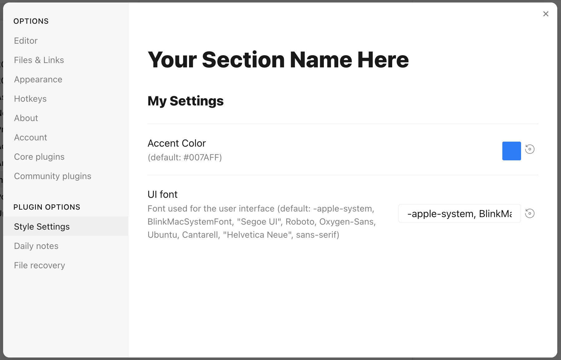
Each setting definition must be separated by a dash (-). There are 7 setting types.
All settings definitions must have these parameters:
id: A unique id for the setting parametertitle: The name of the settingdescription(optional): a description of the settingtype: The type of setting. Can be one of:heading: a heading element for organizing settingsclass-toggle: a switch to toggle classes on thebodyelementclass-select: a dropdown menu of predefined options to add classes on thebodyelementvariable-text: a text-based CSS variablevariable-number: a numeric CSS variablevariable-number-slider: a numeric CSS variable represented by a slidervariable-select: a text-based CSS variable displayed as a dropdown menu of predefined optionsvariable-color: a color CSS variable with corresponding color picker
heading
headings can be used to organize and group settings into collapsable nested sections. Along with the required attributes, headings must contain a level attribute between 1 and 6, and can optionally contain a collapsed attribute:
/* @settings

name: Your Section Name Here
id: a-unique-id
settings:
    -
        id: this-is-a-heading
        title: My Heading
        type: heading
        level: 2
        collapsed: true

*/
info-text
info-text displays arbitrary informational text to users. The description may contain markdown if markdown is set to true.
/* @settings

name: Your Section Name Here
id: a-unique-id
settings:
    -
        id: my-info-text
        title: Information
        description: "This is *informational* text"
        type: info-text
        markdown: true

*/
class-toggle
class-toggles will toggle a css class on and off of the body element, allowing CSS themes and snippets to toggle features on and off. The id of the setting will be used as the class name. The default parameter can optionally be set to true. class-toggle also supports the addCommand property. When set to true a command will be added to obsidian to toggle the class via a hotkey or the command palette.
/* @settings

name: Your Section Name Here
id: a-unique-id
settings:
    -
        id: my-css-class
        title: My Toggle
        description: Adds my-css-class to the body element
        type: class-toggle

*/
class-select
class-select creates a dropdown of predefined options for a CSS variable. The id of the setting will be used as the variable name.
- When
allowEmptyisfalse, adefaultoption must be specified. - When
allowEmptyistrue, thedefaultattribute is optional, and may be set tonone.
/* @settings

name: Your Section Name Here
id: a-unique-id
settings:
    -
        id: theme-variant
        title: Theme variant
        description: Variations on a theme
        type: class-select
        allowEmpty: false
        default: my-class
        options:
            - my-class
            - my-other-class
            - and-yet-another

*/
Options may also be given a label:
/* @settings

name: Your Section Name Here
id: a-unique-id
settings:
    -
        id: theme-variant
        title: Theme variant
        description: Variations on a theme
        type: class-select
        allowEmpty: false
        default: my-class
        options:
            -
                label: My Class
                value: my-class
            -
                label: My Other Class
                value: my-other-class
*/
variable-text
variable-text represents any text based CSS value. The id of the setting will be used as the variable name. The output will be wrapped in quotes if quotes is set to true. variable-text settings require a default attribute.
/* @settings

name: Your Section Name Here
id: a-unique-id
settings:
    -
        id: text
        title: UI font
        description: Font used for the user interface
        type: variable-text
        default: -apple-system, BlinkMacSystemFont, "Segoe UI", Roboto, Oxygen-Sans, Ubuntu, Cantarell, "Helvetica Neue", sans-serif

*/
This will output the variable:
--text: -apple-system, BlinkMacSystemFont, "Segoe UI", Roboto, Oxygen-Sans, Ubuntu, Cantarell, "Helvetica Neue", sans-serif;
Using quotes:
/* @settings

name: Your Section Name Here
id: a-unique-id
settings:
    -
        id: icon
        title: Bullet Icon
        description: Text used in bullet points
        type: variable-text
        default: •
        quotes: true
*/
This will output the variable:
--icon: '•'
variable-number
variable-number represents any numeric CSS value. The id of the setting will be used as the variable name. variable-number settings require a default attribute. Optionally, a format attribute can be set. This value will be appended to the number. Eg format: px will result in 42px
/* @settings

name: Your Section Name Here
id: a-unique-id
settings:
    -
        id: line-width
        title: Line width
        description: The maximum line width in rem units
        type: variable-number
        default: 42
        format: rem

*/
This will output the variable:
--line-width: 42rem;
variable-number-slider
variable-number-slider represents any numeric CSS value. The id of the setting will be used as the variable name. variable-number-slider settings require a default attribute, as well as these three attributes:
min: The minimum possible value of the slidermax: The maximum possible value of the sliderstep: The size of each "tick" of the slider. For example, a step of 100 will only allow the slider to move in increments of 100.
Optionally, a format attribute can be set. This value will be appended to the number. Eg format: px will result in 42px
/* @settings

name: Your Section Name Here
id: a-unique-id
settings:
    -
        id: line-width
        title: Line width
        description: The maximum line width in rem units
        type: variable-number-slider
        default: 42
        min: 10
        max: 100
        step: 1

*/
This will output the variable:
--line-width: 42;
variable-select
variable-select creates a dropdown of predefined options for a CSS variable. The id of the setting will be used as the variable name. variable-select settings require a default attribute as well as a list of options.
/* @settings

name: Your Section Name Here
id: a-unique-id
settings:
    -
        id: text
        title: UI font
        description: Font used for the user interface
        type: variable-select
        default: Roboto
        options:
            - Roboto
            - Helvetica Neue
            - sans-serif
            - Segoe UI

*/
Options can optionally be given a label:
/* @settings

name: Your Section Name Here
id: a-unique-id
settings:
    -
        id: text
        title: UI font
        description: Font used for the user interface
        type: variable-select
        default: Roboto
        options:
            -
                label: The best font
                value: Roboto
            -
                label: The next best font
                value: Helvetica Neue
*/
This will output the variable:
--text: Roboto;
variable-color
variable-color creates a color picker with a variety of output format options. A default attribute is required in hex or rgb format. Note: hex color values must be wrapped in quotes. A format attribute is also required.
Optional parameters:
- Setting
opacitytotruewill enable opacity support in all output formats. - A list of alternate output formats can be supplied via the
alt-formatsetting
/* @settings

name: Your Section Name Here
id: a-unique-id
settings:
    -
        id: accent
        title: Accent Color
        type: variable-color
        opacity: false
        format: hex
        alt-format:
            -
                id: accent-rgb
                format: rgb
        default: '#007AFF'

*/
This will output the variable:
--accent: #007AFF;
--accent-rgb: rgb(0, 123, 255);
variable-themed-color
variable-themed-color is identical to variable-color except that it generates two color pickers for a light and dark variant.
/* @settings

name: Your Section Name Here
id: a-unique-id
settings:
    -
        id: accent
        title: Accent Color
        type: variable-themed-color
        format: hex
        opacity: false
        default-light: '#007AFF'
        default-dark: '#2DB253'

*/
This will apply the variables to the current theme:
// light theme active
--accent: #007AFF;
// dark theme active
--accent: #2DB253;
The variables are set inline on <body> (body keeps the css-settings-manager
class, so themes that scope overrides with body.css-settings-manager keep
working), and the light/dark variants follow the active theme automatically.
variable-color formatting options
There are 8 formatting options:
hex
--accent: #007AFF;
When opacity is set to true:
--accent: #007AFFFF;
rgb
--accent: rgb(0, 122, 255);
When opacity is set to true:
--accent: rgba(0, 122, 255, 1);
rgb-values
--accent: 0, 122, 255;
When opacity is set to true:
--accent: 0, 122, 255, 1;
rgb-split
--accent-r: 0;
--accent-g: 122;
--accent-b: 255;
When opacity is set to true:
--accent-r: 0;
--accent-g: 122;
--accent-b: 255;
--accent-a: 1;
hsl
--accent: hsl(211, 100%, 50%);
When opacity is set to true:
--accent: hsla(211, 100%, 50%, 1);
hsl-values
--accent: 211, 100%, 50%;
When opacity is set to true:
--accent: 211, 100%, 50%, 1;
hsl-split
--accent-h: 211;
--accent-s: 100%;
--accent-l: 50%;
When opacity is set to true:
--accent-h: 211;
--accent-s: 100%;
--accent-l: 50%;
--accent-a: 1;
hsl-split-decimal
--accent-h: 211;
--accent-s: 1;
--accent-l: 0.5;
When opacity is set to true:
--accent-h: 211;
--accent-s: 1;
--accent-l: 0.5;
--accent-a: 1;
color-gradient
color-gradient outputs a fixed number of colors along a gradient between two existing color variables. A format attribute is also required. Note: The to variable must be set in style settings for the gradient to be generated. Also, gradients will only be generated using colors defined under the current style settings id.
Parameters:
from: The starting color, or color that will be at step 0to: The ending color, or color that will be at step 100step: The increment at which to output a CSS variable. For example, settingstepto10will output--var-0,--var-10,--var-20, etc...format: Can be one of:hsl,rgb, orhex;pad?: When set, the number section of the variable will be padded with0's until it contains this number of digits. For example, settingpadto3andstepto10will output--var-000,--var-010,--var-020
/* @settings

name: Your Section Name Here
id: a-unique-id
settings:
    -
        id: color-base
        type: color-gradient
        from: color-base-00
        to: color-base-100
        step: 5
        pad: 2
        format: hex

*/
Plugin Support
Plugins can specify a style setting config in the plugin's CSS. Plugins must call app.workspace.trigger("parse-style-settings") when the plugin loads in order for Style Tuner to be notified of CSS changes. This event name is kept for compatibility with the original Style Settings plugin interface.
Localization Support
Translations for titles and descriptions can be supplied for each language Obsidian supports by using one of the following postfixes:
en: English
zh: 简体中文
zh-TW: 繁體中文
ru: Русский
ko: 한국어
it: Italiano
id: Bahasa Indonesia
ro: Română
pt-BR: Português do Brasil
cz: čeština
de: Deutsch
es: Español
fr: Français
no: Norsk
pl: język polski
pt: Português
ja: 日本語
da: Dansk
uk: український
sq: Shqip
tr: Türkçe (kısmi)
hi: हिन्दी (आंशिक)
nl: Nederlands (gedeeltelijk)
ar: العربية (جزئي)
For example:
/* @settings

name: Your Section Name Here
id: a-unique-id
settings:
    -
        id: my-css-class
        title: My Toggle
        title.de: Mein Toggle
        title.ko: 내 토글
        description: Adds my-css-class to the body element
        description.de: Fügt my-css-class zum body-Element hinzu
        description.ko: my-css-class를 body 요소에 추가합니다
        type: class-toggle

*/
License
Style Tuner is licensed under the GNU General Public License v3.0, following the license of the upstream Style Settings project. Contributions are welcome under the same license.