Warm Burnout
 felipefdl467 downloads
Warm Burnout theme for Obsidian. Mirrored from felipefdl/warm-burnout.
- Overview
- Scorecard
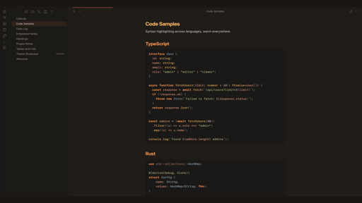
Your second brain was running on factory-default colors. Cold blues, harsh whites, zero consideration for 2am rabbit holes through your note graph. Fixed.
Full community theme for Obsidian with dark and light variants. Warm-first palette, contrast-audited chrome, one steel-blue accent where structure needs it.
Contents
Screenshots
Dark
| Headings | Callouts | Code |
|---|---|---|
 |
 |
 |
Light
| Headings | Callouts | Code |
|---|---|---|
 |
 |
 |
Install
Community Themes (recommended)
- Open Settings > Appearance > Themes
- Click "Manage" and search for Warm Burnout
- Install and activate
Manual
- Download
theme.css,manifest.json, and thefonts/folder from the latest release - Create a folder called
Warm Burnoutinside your vault's.obsidian/themes/directory - Place
theme.css,manifest.json, and thefonts/folder in it - Open Settings > Appearance > Themes and select Warm Burnout
Features
Heading gradient
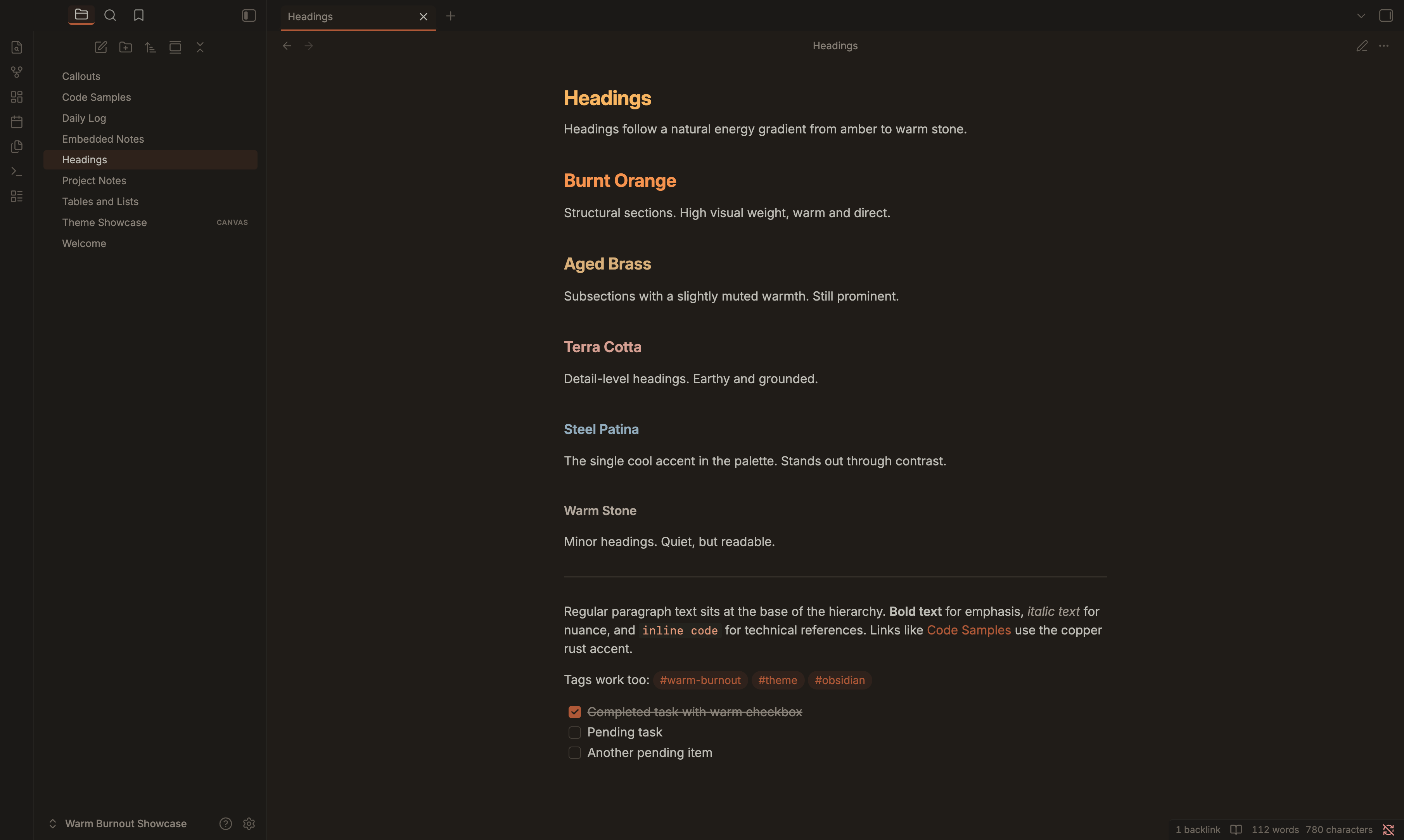
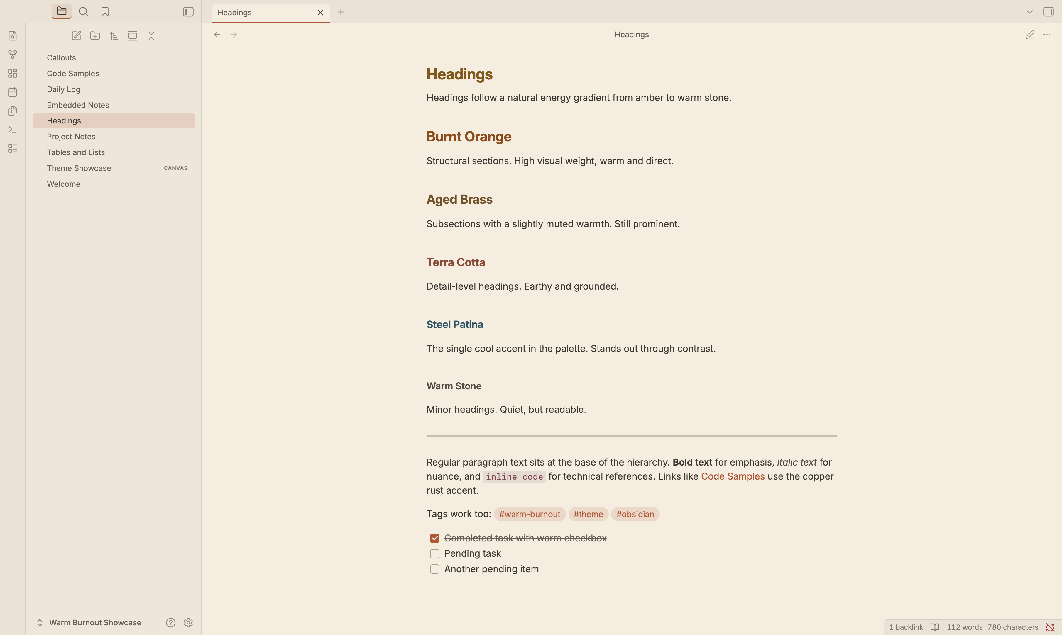
Headings follow a natural energy gradient from amber down to warm stone. Visual weight decreases with each level, so your note structure is readable at a glance.
| Level | Color | Name |
|---|---|---|
| H1 | #ffb454 |
Amber |
| H2 | #ff8f40 |
Burnt Orange |
| H3 | #deb074 |
Aged Brass |
| H4 | #dc9e92 |
Terra Cotta |
| H5 | #90aec0 |
Steel Patina |
| H6 | #b4a89c |
Warm Stone |
Callouts
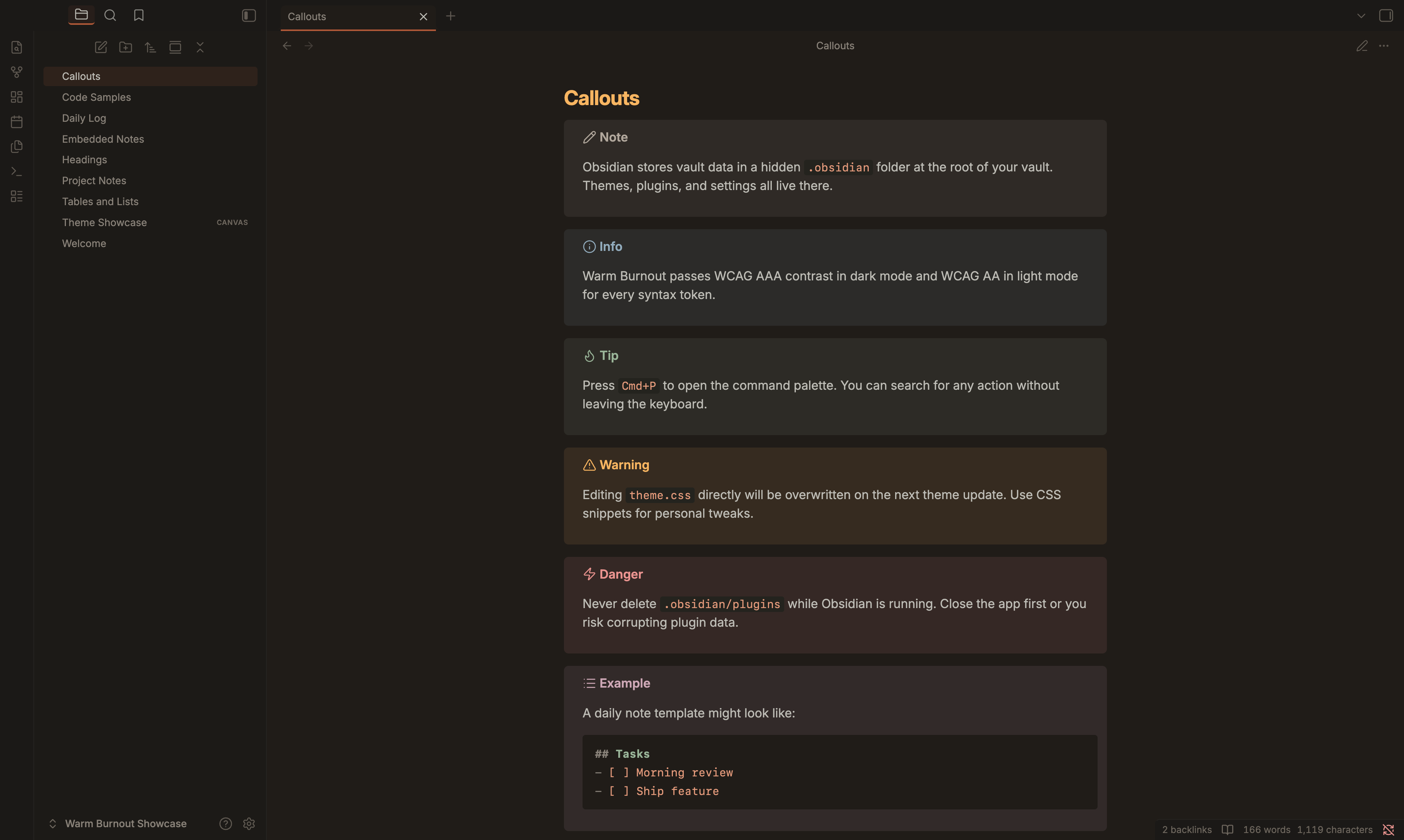
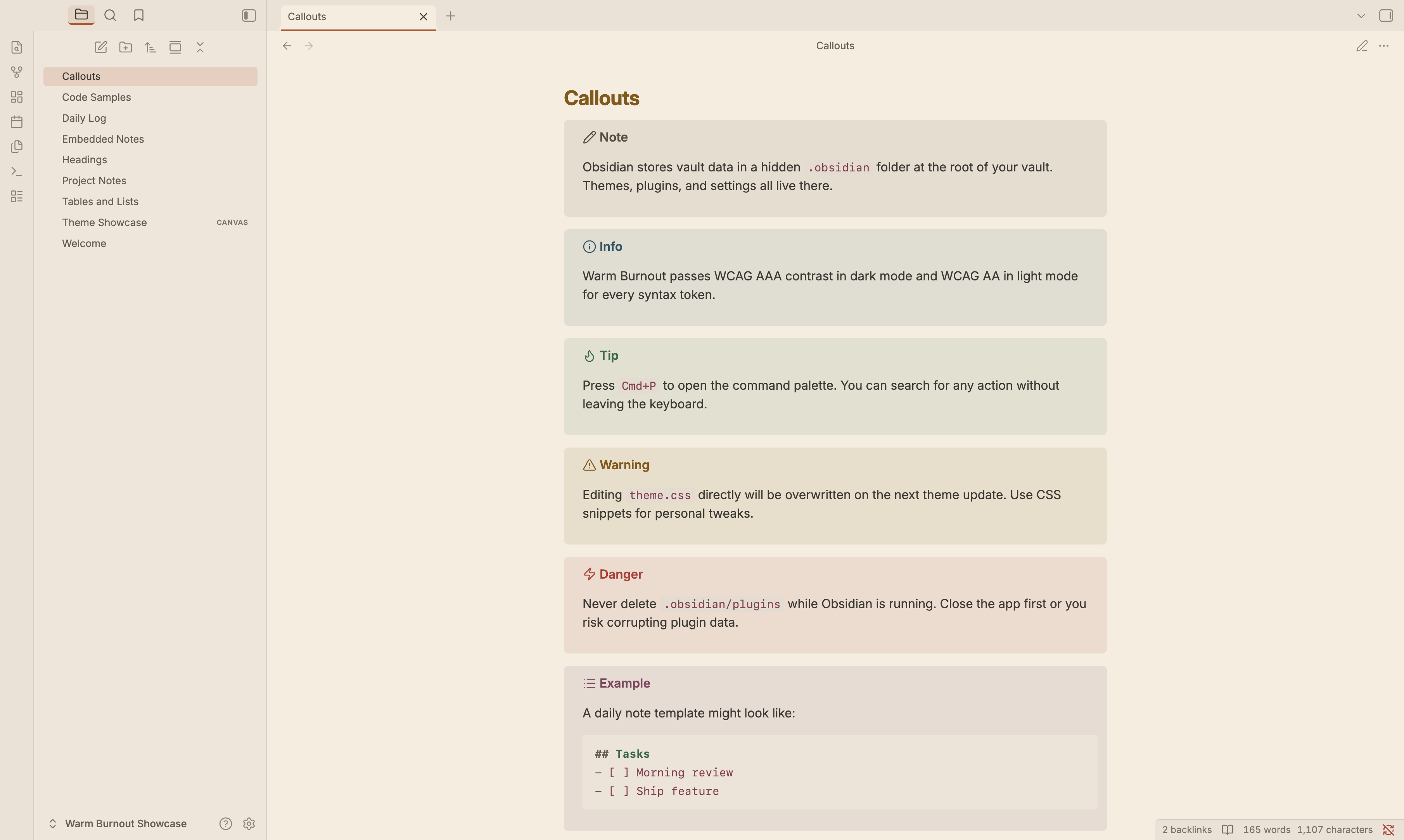
All 12 callout types are themed with warm palette colors. Info, tip, warning, error, example, question, success, quote, summary, todo, bug, and fail all map to distinct palette entries so they stay distinguishable without fighting the warm aesthetic.
Syntax highlighting
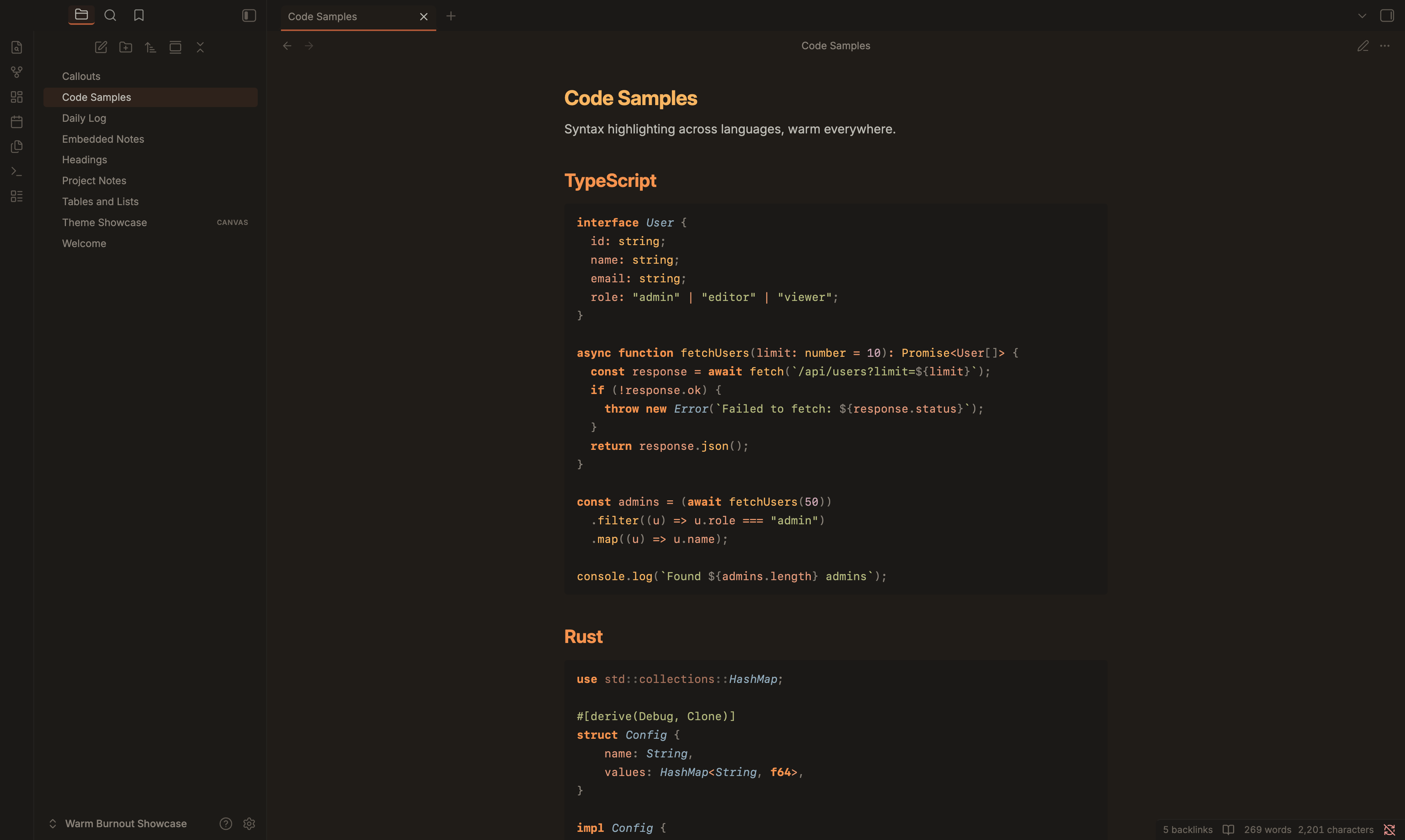
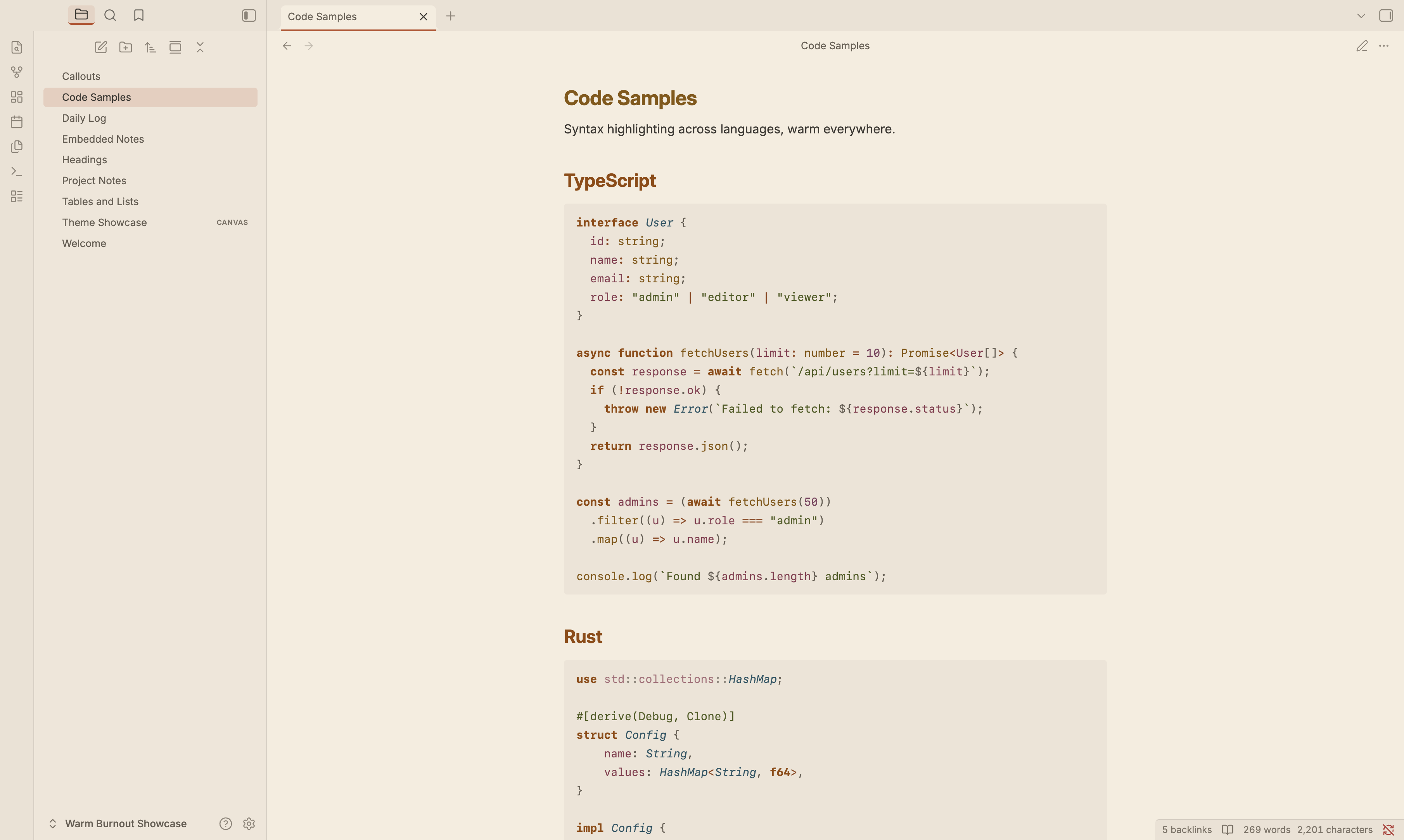
Full syntax palette in both editing and reading views. Functions = amber, keywords = burnt orange, strings = dried sage, types = steel patina. Both Prism.js (reading view) and CodeMirror 6 (editing view) token systems are covered.
Graph view
Graph nodes use the copper rust accent. Focused nodes glow amber. Tags get dried sage, attachments get dusty mauve. Lines and text stay muted so the structure reads clearly against the warm background.
Canvas
Six card colors mapped to palette entries: copper rust, amber, dried sage, steel patina, dusty mauve, and coral. The dot pattern uses the surface ramp so it stays warm.
Surface hierarchy
13-step warm ramp from deep brown-black to warm cream. No neutral grays anywhere. Every intermediate carries a warm undertone.
Dark background: #1a1510. Light background: #F5EDE0. Accent: #b8522e (copper rust).
Warm chrome
Tinted shadows, warm scrollbar tracks, soft selection highlights, warm cursor (gold, not red). Tags, checkboxes, metadata, blockquotes, embeds, tooltips, modals, and prompts stay warm.
Fonts
The theme ships with two bundled fonts so your vault looks consistent without installing anything:
- Inter (interface and body text): clean geometric sans-serif, closest open-source match to SF Pro. Designed for screens.
- Geist Mono (code blocks): clean monospace by Vercel, closest open-source match to SF Mono.
Both are variable fonts (single file, all weights) in woff2 format. Licensed under the SIL Open Font License.
You can override these in Settings > Appearance > Font at any time. The bundled fonts are defaults, not locked in.
Palette
Both variants derive from the canonical Warm Burnout palette defined in the main repository.
| Material | Dark | Light | Used for |
|---|---|---|---|
| Amber | #ffb454 |
#855700 |
Functions, H1 |
| Burnt Orange | #ff8f40 |
#924800 |
Keywords, H2 |
| Aged Brass | #deb074 |
#74501c |
CSS properties, H3 |
| Terra Cotta | #dc9e92 |
#8e4632 |
HTML tags, H4 |
| Steel Patina | #90aec0 |
#285464 |
Types/classes, H5 |
| Warm Stone | #b4a89c |
#544c40 |
Comments, H6 |
| Dried Sage | #b4bc78 |
#4d5c1a |
Strings |
| Verdigris | #96b898 |
#286a48 |
Regex, escapes |
| Dusty Mauve | #d4a8b8 |
#7e4060 |
Numbers, constants |
| Coral | #ec9878 |
#883850 |
Member variables |
| Gold | #e6c08a |
#7a5a1c |
Decorators |
| Copper Rust | #b8522e |
#b8522e |
Accent, links, interactive |
Requirements
Obsidian 1.0.0 or later.
License
MIT. Part of the Warm Burnout theme suite.