
- Overview
- Scorecard
- Updates2
A calm, focused color theme for your notes.
Warm gruvbox colors, in dark and light, for long-form reading and writing in Obsidian: notes, journals, study material, documentation, and knowledge bases.
Benefits
- Easy on long sessions. Backgrounds are
#282828(dark) and#fbf1c7(light) and text is#ebdbb2and#3c3836. The theme never uses pure black or pure white for backgrounds or text. - Structure you can see at a glance. Headings are green and bold, links are blue and underlined, list markers are orange, quotes are gray. Color does the work, so hierarchy reads without extra decoration.
- Consistent meaning. The same color means the same thing throughout your notes, so you learn the look once.
- Stays out of the way. Nothing moves, so your layout, plugins, and snippets keep working the way they did.
Preview
Dark:
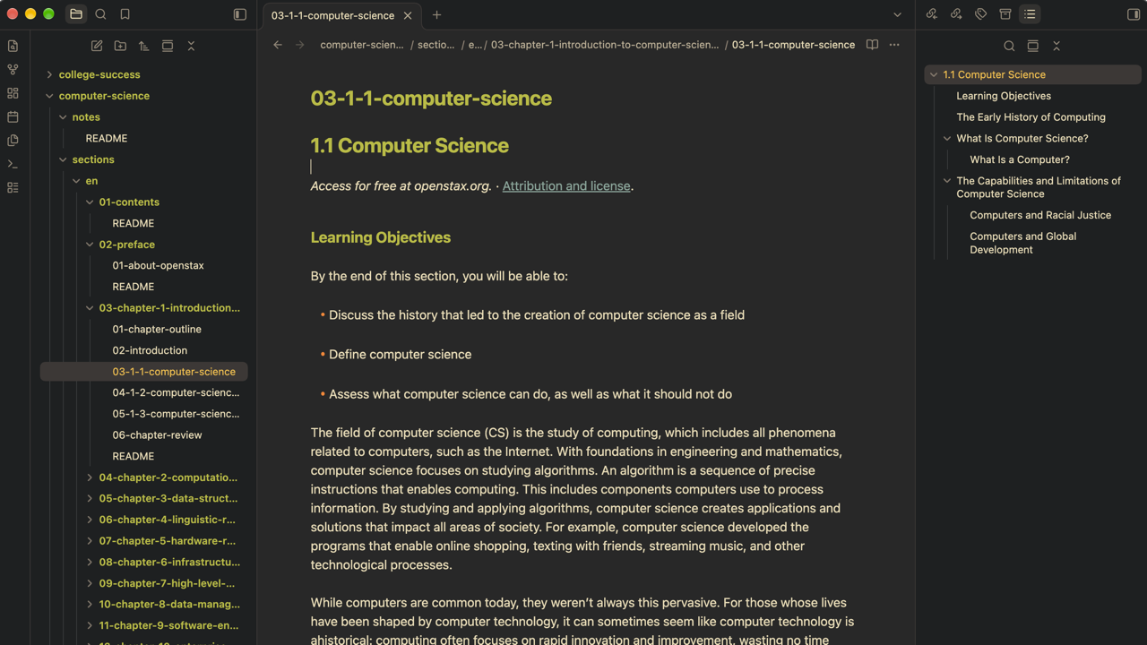
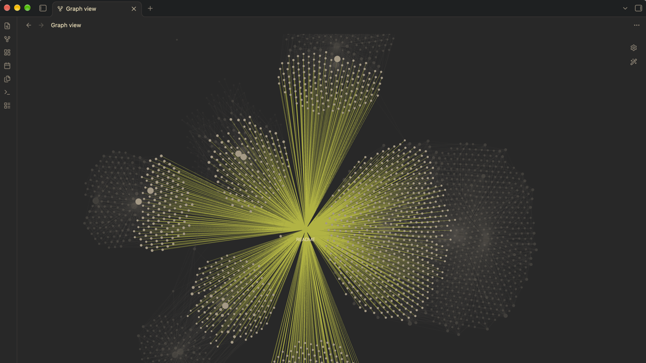
Light:
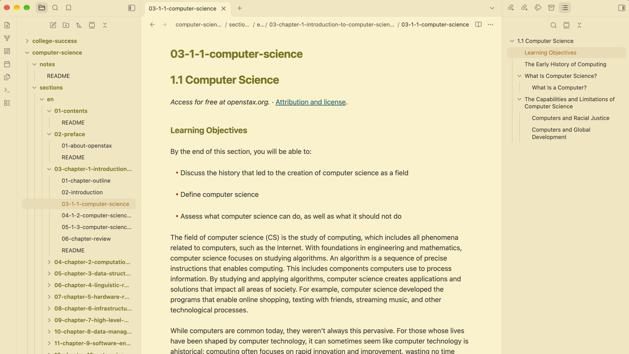
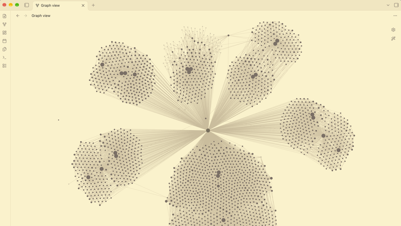
Colors
| Obsidian | Dark | Light |
|---|---|---|
| Editor background | #282828 |
#fbf1c7 |
| Text | #ebdbb2 |
#3c3836 |
| Sidebars, ribbon, tab bar | #1d2021 |
#f2e5bc |
| Headings, folder names, accent (bold) | #b8bb26 |
#79740e |
| Links (underlined) | #83a598 |
#076678 |
Inline code (italic) on a panel color |
#b8bb26 on #3c3836 |
#79740e on #ebdbb2 |
==Highlight== background |
#fabd2f |
#b57614 |
List markers, heading #, code punctuation |
#fe8019 |
#af3a03 |
| Faint text, unchecked box, code comments | #928374 |
#928374 |
| Text selection | #665c54 |
#bdae93 |
| Code: keywords | #fb4934 |
#9d0006 |
| Code: strings and functions | #b8bb26 |
#79740e |
| Code: numbers and constants | #d3869b |
#8f3f71 |
| Code: types | #fabd2f |
#b57614 |
Install
From the community directory (once the theme is listed):
- Open Settings.
- Under Appearance → Themes, select Manage.
- Select Gruvbox Calm, then select Install and use.
Manually:
- Download
theme.cssandmanifest.jsonfrom the latest release on this repository's Releases page. - Copy both files into
<your vault>/.obsidian/themes/Gruvbox Calm/. The folder name must match the theme name exactly. - In Obsidian, open Settings → Appearance and select Gruvbox Calm from the dropdown next to Themes.
Requires Obsidian 1.4.5 or newer, the first version that has every CSS variable the theme sets.
Customize
You can change the theme's colors without editing it by adding a CSS snippet, which is Obsidian's way of layering small changes on top of a theme. Obsidian's CSS snippets guide covers it in full, including mobile. On desktop:
- Open Settings.
- Under Appearance → CSS snippets, select Open snippets folder. This is
<your vault>/.obsidian/snippets/, inside the vault's configuration folder. - Create a CSS file there, for example
gruvbox-calm.css, and paste your CSS into it. - Back in Obsidian, select Reload snippets, then turn the snippet on with its toggle.
Once a snippet is enabled, Obsidian applies later edits when you save the file.
Start selectors with body.theme-dark or body.theme-light. They are more specific
than the theme's own .theme-dark and .theme-light, so your values win whatever
order the files load in. Obsidian's own variables are listed in its
CSS variables reference.
Palette variables
The palette lives in --gb-* variables at the top of theme.css.
- Neutrals:
--gb-bg0..--gb-bg4(backgrounds and borders),--gb-fg0..--gb-fg4(text), and--gb-side(sidebars, ribbon, tab bar). - Accent colors: each one has companion variables that must change with it.
| Color | Variables to set together | Used for |
|---|---|---|
| Green | --gb-green, --gb-green-rgb, --gb-green-hover, --gb-accent-hsl |
Headings, folder names, the accent (buttons, toggles, checkboxes), inline code, code strings and functions, table headers |
| Yellow | --gb-yellow, --gb-yellow-rgb |
==Highlights==, warnings, the active file in the sidebar, code types |
| Orange | --gb-orange, --gb-orange-rgb |
List markers, heading #, code punctuation and operators |
| Red | --gb-red, --gb-red-rgb |
Code keywords, unresolved links, errors |
| Blue | --gb-blue, --gb-blue-rgb |
Links, code properties |
| Purple | --gb-purple, --gb-purple-rgb, --gb-pink-rgb |
Code numbers and constants |
| Aqua | --gb-aqua, --gb-aqua-rgb |
Tags, tag nodes in the graph |
| Gray | --gb-gray, --gb-gray-rgb |
Faint text, code comments, unchecked boxes, the quote bar, hover backgrounds |
- A
-rgbvariable is the same color as a comma-separated triplet, like254, 128, 25. Callouts and translucent backgrounds (hover, tags) use it, so changing only the hex value leaves them on the old color. --gb-accent-hslis the green ashue, saturation%, lightness%, for example61, 66%, 44%in dark mode.--gb-green-hoveris the accent's hover color.- The theme sets the accent itself, so Settings → Appearance → Accent color has no
effect while it is active. Green is also the heading and code color, so changing
--gb-greenmoves all of them together.
/* Sidebars use the editor background */
body.theme-dark  { --gb-side: #282828; }
body.theme-light { --gb-side: #fbf1c7; }

/* Quieter list markers */
body.theme-dark,
body.theme-light { --list-marker-color: var(--gb-fg4); }

/* Change an accent: set the color and its -rgb companion together */
body.theme-dark {
  --gb-orange: #d65d0e;
  --gb-orange-rgb: 214, 93, 14;
}
Credits
- Palette: Gruvbox by morhetz, through the community edition (MIT, Copyright (c) 2018 Pavel Pertsev).
- Color values, and the choice of which color goes where, follow gruvbox.nvim (MIT, Copyright (c) 2021 NpX).
- This theme is original CSS and does not copy code from other Obsidian themes.