
- Overview
- Scorecard
- Updates5
Praxis is a warm, focused Obsidian theme built from Minimal's proven foundation and shaped around a compact Praxis design system. It supports light and dark mode, but it is intentionally designed as a dark-first theme. It includes an Obsidian Publish companion stylesheet and keeps the Minimal-style helper classes that make notes, tables, image galleries, dashboards, and Dataview views easier to compose.
About Praxis
Features
- Dark-first warm palette with a light mode fallback and a true black dark variant
- Compact interface spacing based on a Fibonacci scale
- Minimal-compatible helper classes for tables, images, iframes, maps, charts, cards, and page width
- Card layouts for tables, Dataview-style tables, and list-based galleries
- Image grids and image filters for visual notes
- Custom task icons for extended checkbox states
- Soft, outlined, and minimal callout styles
- Custom
[!author]callout and|noiconcallout metadata support - Polished Properties styling for a quieter metadata panel
- Lightweight
publish.cssfor Obsidian Publish
Install
- Create a folder named
Praxisin your vault at.obsidian/themes/Praxis. - Add
theme.cssandmanifest.jsonto that folder. - Open Obsidian Settings -> Appearance -> Themes and select
Praxis.
Install with BRAT
BRAT can install Praxis directly from GitHub while the theme is in beta or before it is listed in the community theme catalog.
- Install and enable the
BRATcommunity plugin. - Open BRAT settings and add this repository as a beta theme:
https://github.com/voi-tech/obsidian-praxis. - Open Obsidian Settings -> Appearance -> Themes and select
Praxis.
Praxis targets Obsidian 1.13.0 or newer and works on desktop and mobile. It uses modern CSS selectors, including :has(), for Minimal-compatible media and table helpers.
Style Settings
Praxis works without plugins. If you install the optional Style Settings community plugin, Praxis exposes a small set of body-class controls:
- background contrast
- callout style
- Properties heading and Add property visibility
- active line highlighting
- title and H1 underline
- link underlines
- colorful headings
- custom task icons
Praxis intentionally does not mirror the full Minimal Style Settings surface. Broader typography, color, and layout preferences should be managed through Obsidian's built-in Appearance settings or custom snippets.
Helper Classes
Add helper classes with the cssclasses property in your note:
---
cssclasses:
  - cards
  - table-wide
---
Page Width
wideexpands the readable line widthmaxexpands content to the maximum available width
Tables
- Width:
table-100,table-full,table-wide,table-max - Text:
table-small,table-tiny,table-nowrap,table-wrap,table-tabular - Layout:
table-center,table-lines,table-numbers - Rows and columns:
row-hover,row-alt,row-lines,row-lines-off,col-alt,col-lines - Fixed first column helpers:
table-col-1-150,table-col-1-200
Cards
cardsturns compatible tables into card gridslist-cardsturns top-level lists into card gridscards-covercrops images to fill their card image areacards-align-bottompushes the last card field to the bottomcards-16-9,cards-1-1,cards-2-1,cards-2-3set image aspect ratioscards-cols-1throughcards-cols-8force a specific number of columns
Media
- Images:
img-100,img-wide,img-max,img-grid,img-grid-ratio - Iframes:
iframe-100,iframe-wide,iframe-max - Maps:
map-100,map-wide,map-max - Charts:
chart-100,chart-wide,chart-max
Image Filters
Add these suffixes to image embeds:
#outlineadds a subtle border#interfaceadds a framed interface treatment#invertinverts images in dark mode#invertWinverts images in light mode#circlecrops the image into a circle
Titles
hide-titlehides the inline titlealt-titlehides the inline title for notes that provide their own first headingh1-bordersadds a divider treatment to H1 headings
Tasks And Callouts
Praxis includes custom task icons for /, -, >, <, ?, !, *, quote, l, b, i, S, I, p, c, f, k, w, u, d, +, B, a, n, R, t, P, and L.
It also supports [0] through [9] task states as horizontal progress bars, from 0% ([0]) to 90% ([9]).
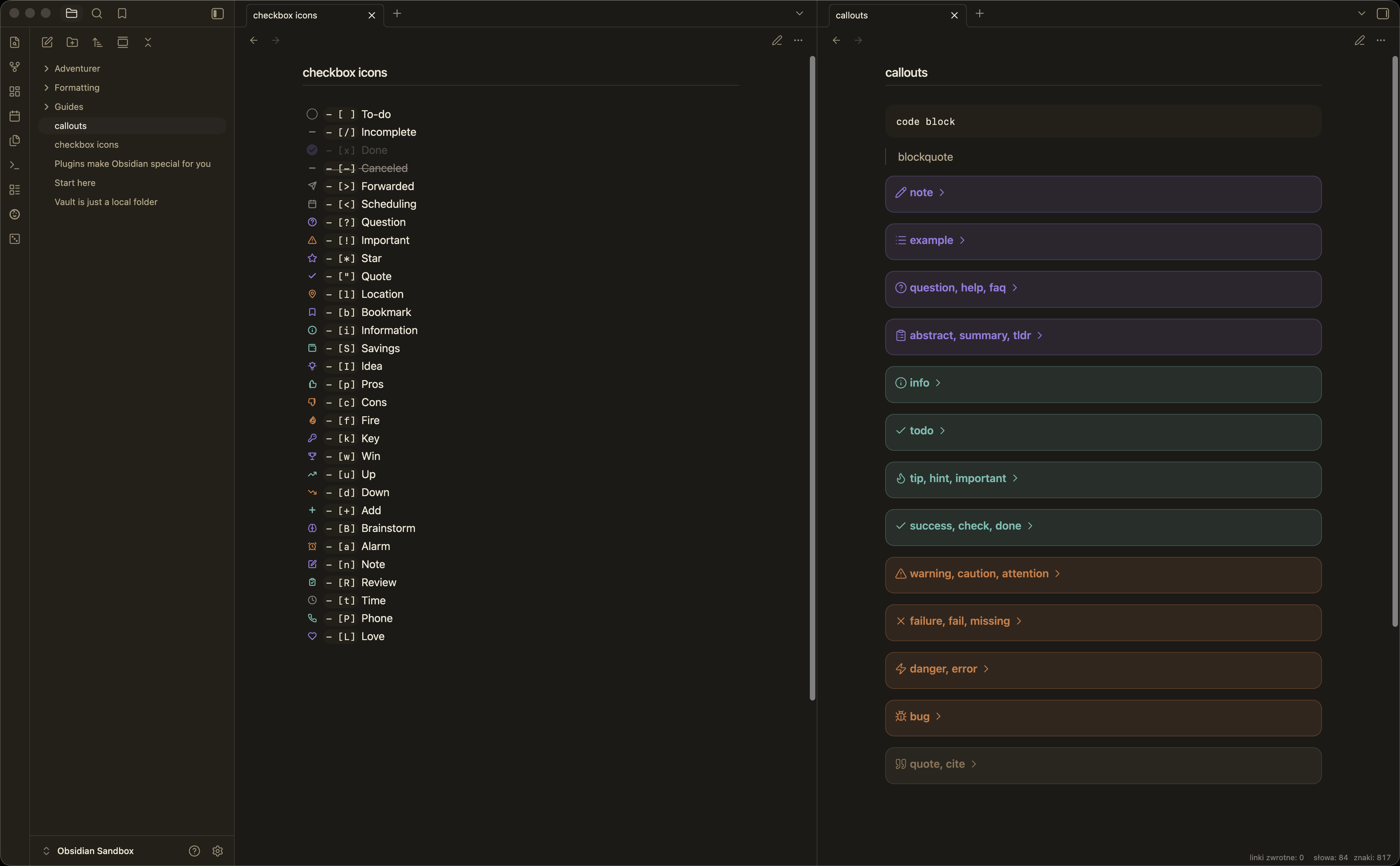
Callouts use Lucide-based icons. The custom [!author] callout is styled for quotes and attributions. Add |noicon metadata to a callout to hide its icon.
The callout color semantics follow the voitech.lol design system:
| Color | Callout types |
|---|---|
| Violet | [!note] [!info] [!todo] [!abstract] [!important] |
| Mint | [!tip] [!success] [!check] |
| Orange | [!warning] [!caution] [!attention] |
| Red | [!danger] [!error] [!bug] [!fail] |
| Brown | [!quote] [!author] [!example] |
Advanced
Font Selection
Praxis does not set a typeface. Select your preferred font in Obsidian Settings → Appearance → Font (Interface font, Text font, Monospace font). Praxis is designed with Geist in mind, but works well with any modern sans-serif at the text size.
Animation Speed Helpers
Praxis exposes two undocumented body-class helpers for controlling animation speed across the theme. They are not configurable through Style Settings — apply them via a CSS snippet or a plugin like Body Class:
| Class | Effect |
|---|---|
body.disable-animations |
Sets all Praxis ribbon and focus transitions to 0ms |
body.fast-animations |
Halves all Praxis ribbon and focus transition durations |
Note: If your operating system has Reduce Motion enabled (macOS: System Settings → Accessibility → Display → Reduce Motion), Praxis already suppresses all transitions and animations via
@media (prefers-reduced-motion: reduce). That system setting takes precedence over these helper classes.
Graph View
Praxis does not override Graph View node, edge, or label colors. Graph View uses Obsidian's default color scheme. To add branded colors, create a CSS snippet targeting .graph-view.color-fill, .graph-view.color-line, and related selectors.
Obsidian Publish
publish.css is a companion stylesheet for Obsidian Publish. It shares Praxis colors, typography, callouts, cards, table helpers, image helpers, and media width helpers while staying separate from the app theme.
To use it, publish publish.css at the root of your Publish vault. Keep theme.css for the Obsidian app and publish.css for Publish; the files intentionally target different DOMs.
Style Settings does not run on Obsidian Publish, so Publish customization should be done directly through CSS variables in publish.css. The Publish stylesheet keeps the same callout color semantics as the app theme and avoids app-only Properties, CodeMirror, and workspace selectors.
Credits And License
Praxis is a fork and substantial adaptation of Minimal by Steph Ango. It uses Minimal as its foundation for Obsidian app structure, helper classes, compatibility patterns, and Publish-oriented thinking, then adds the Praxis design layer: warm palettes, compact spacing, task treatments, callout styling, Properties refinements, and a companion publish.css.
Minimal is released under the MIT License. Praxis preserves the copyright and license notice in theme.css and is also released under the MIT License.
If Praxis is useful to you, please also support the original Minimal project.