
- Overview
- Scorecard
- Updates5
A minimalist newspaper theme for Obsidian.
Editorial typography in the spirit of the finer papers — warm ivory paper, a quiet interface, and serifs that are a pleasure to read and to write with. Think the article pages of the Financial Times or Anthropic's essays, not an industrial dashboard.
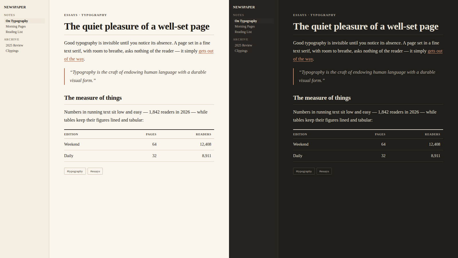
Typography first
- Notes are set in a classic text serif — Charter, Iowan Old Style, or Georgia, whichever your system has — with generous 1.7 leading and a comfortable ~42 em column. No font files are bundled and no network is used: the theme works offline, on desktop and mobile, out of the box.
- The interface is set in Georgia — the classic screen serif — at small, quiet sizes, so the whole app reads like one printed page.
- Old-style figures in running text; lining tabular figures in tables and code, where numbers must line up.
- A restrained heading scale with tightened tracking on the display sizes.
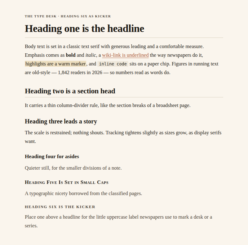
The note title acts as a masthead with a hairline rule;
H2section heads carry thin column-divider rules;H5is set in small caps; andH6works as a kicker — the little uppercase label newspapers place above a headline.
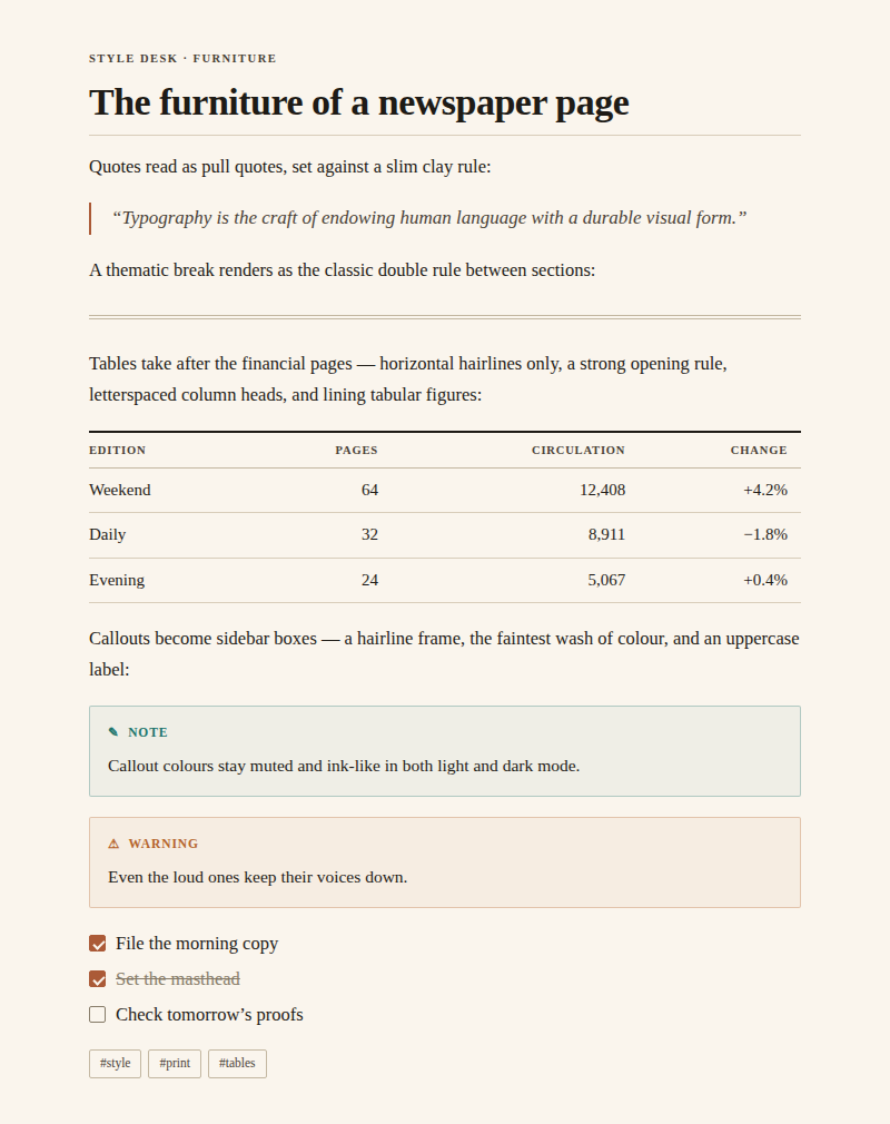
Newspaper furniture
- Blockquotes read as pull quotes: italic serif against a slim clay rule.
---renders as the classic double rule between sections.- Tables are financial-page tables: horizontal hairlines only, a strong opening rule, and letterspaced uppercase column heads.
- Callouts become sidebar boxes — hairline frame, the faintest wash of colour, uppercase sans label.
- Links are underlined the way newspapers do it: a hairline underline that darkens on hover.
Warm, not industrial
- Light mode is warm ivory paper with near-black warm ink and a clay/claret accent.
- Dark mode is a warm charcoal — newsprint under a reading lamp, never pure black.
- Every grey is mixed with a little brown; the palette of section colours (used by callouts and highlights) is muted and ink-like in both modes.
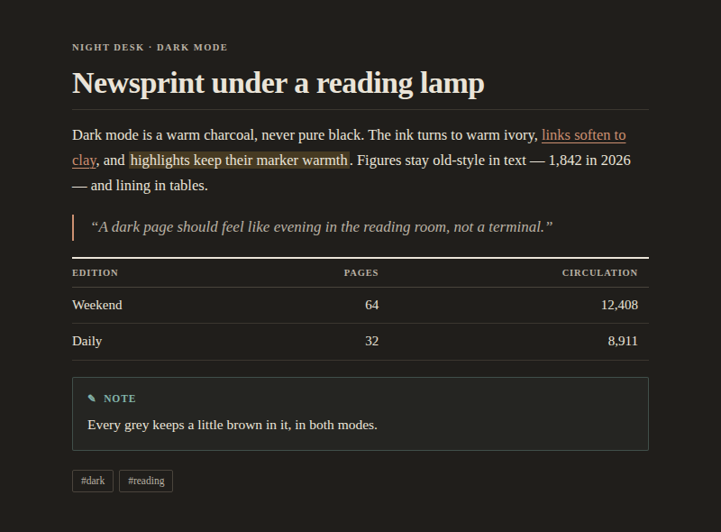
The images above are previews rendered from the theme's palette and type styles; exact appearance in Obsidian depends on your platform's fonts and settings.
Installation
From the community themes
In Obsidian, open Settings → Appearance → Themes → Manage, search for Newspaper, and select Use. If the theme is not listed yet — the directory submission may still be under review — install it manually or via BRAT below.
Manual
- In your vault, create the folder
.obsidian/themes/Newspaper/. - Copy
manifest.jsonandtheme.cssfrom this repository into it. - In Obsidian, open Settings → Appearance → Themes and select Newspaper.
Via BRAT
If you use the BRAT plugin,
add mladenpr/Newspaper as a beta theme.
Recommended fonts (optional)
Newspaper looks right out of the box on macOS, Windows, iOS and Android. If you want to get even closer to the FT / Anthropic article feel, install one of these free text serifs — the theme picks Charter up automatically, or set the others under Settings → Appearance → Font:
- Charter — bundled with macOS/iOS already; a superb, screen-tuned text serif.
- Source Serif 4 — warm, contemporary, excellent at text sizes.
- Newsreader — designed specifically for on-screen news text.
Tips
- The accent colour follows your own choice in Settings → Appearance → Accent color; leave it untouched to keep the theme's clay/claret default.
- Turn on Readable line length for the proper single-column measure.
- Write
###### like thisabove a heading for a newspaper-style kicker. - The interface defaults to Georgia; your own choice under Settings → Appearance → Font always wins, so set a sans there if you prefer quieter chrome (or flip Sans-serif interface in Style Settings). Note text is controlled separately under Text font.
- The theme keeps the window frame opaque paper even when Settings → Appearance → Translucent window is on — no grey glass. If you still see system material anywhere (macOS Liquid Glass), turn that setting off.
Settings
Newspaper works out of the box with no plugins. Install the free Style Settings community plugin and a Newspaper section appears under Settings → Style Settings with:
- Layout — text width slider; focus mode (hides the ribbon and status bar and fades the tab bar until hovered; also a command).
- Typography — line height; sans-serif interface; justified text with hyphenation; a drop cap on the lead paragraph; hide the masthead and section rules.
- Headings — colour preset: Ink / Accent / Muted / Claret (H1–H3 and the note title) / Custom, with per-level light-and-dark colour pickers for all six levels when Custom is selected.
- Paper & ink — light paper tone (Ivory / Bright / Sepia) and dark ink tone (Charcoal / True black for OLED screens).
- Elements — link underlines (hairline / on hover / none); blockquote
style (left rule / centered pull quote); table style (hairlines / zebra
rows); highlight colour (marker yellow / rose / sage / sky); alternate
checkboxes (
[-]cancelled,[>]forwarded,[<]scheduled,[?]question,[!]important,[i]info,[*]star).
Without Style Settings
Per-note width: add
narrow,wideorfullto a note'scssclassesproperty — no plugin needed.Global width or line height: a one-line CSS snippet (Settings → Appearance → CSS snippets):
body { --newsprint-line-width: 55em; --newsprint-line-height: 1.6; }The remaining options are switched by a class on
body, which only the plugin can add; their rules live under "15 · SETTINGS" intheme.cssif you want to copy one into a snippet permanently.
Versioning and releases
Newspaper uses Semantic Versioning; the rules for what counts as a patch, minor, or major change — and the release procedure — are documented in VERSIONING.md. Every notable change is recorded in the CHANGELOG. Releases are published automatically by a GitHub Actions workflow when a version tag is pushed.