Kanagawa Tide

A clean and refined Obsidian theme with carefully crafted light and dark palettes, designed for a calm and focused writing experience.
- Overview
- Scorecard
- Updates2
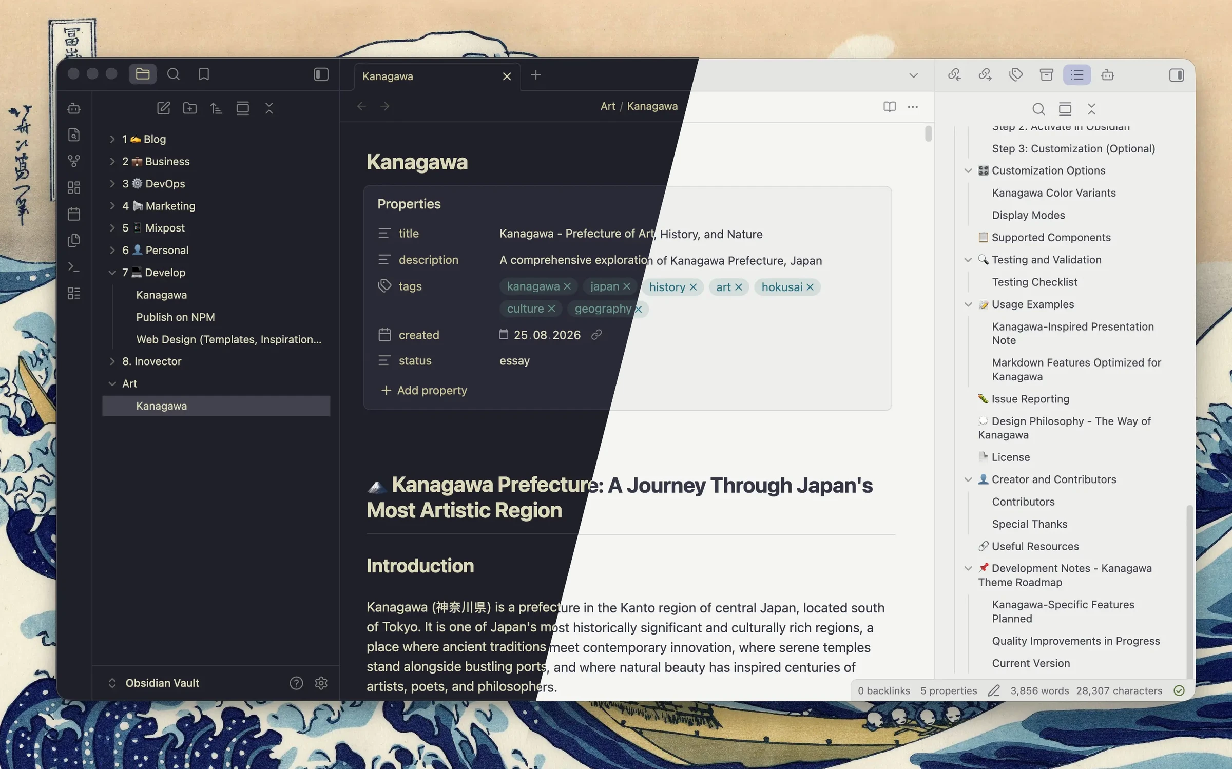
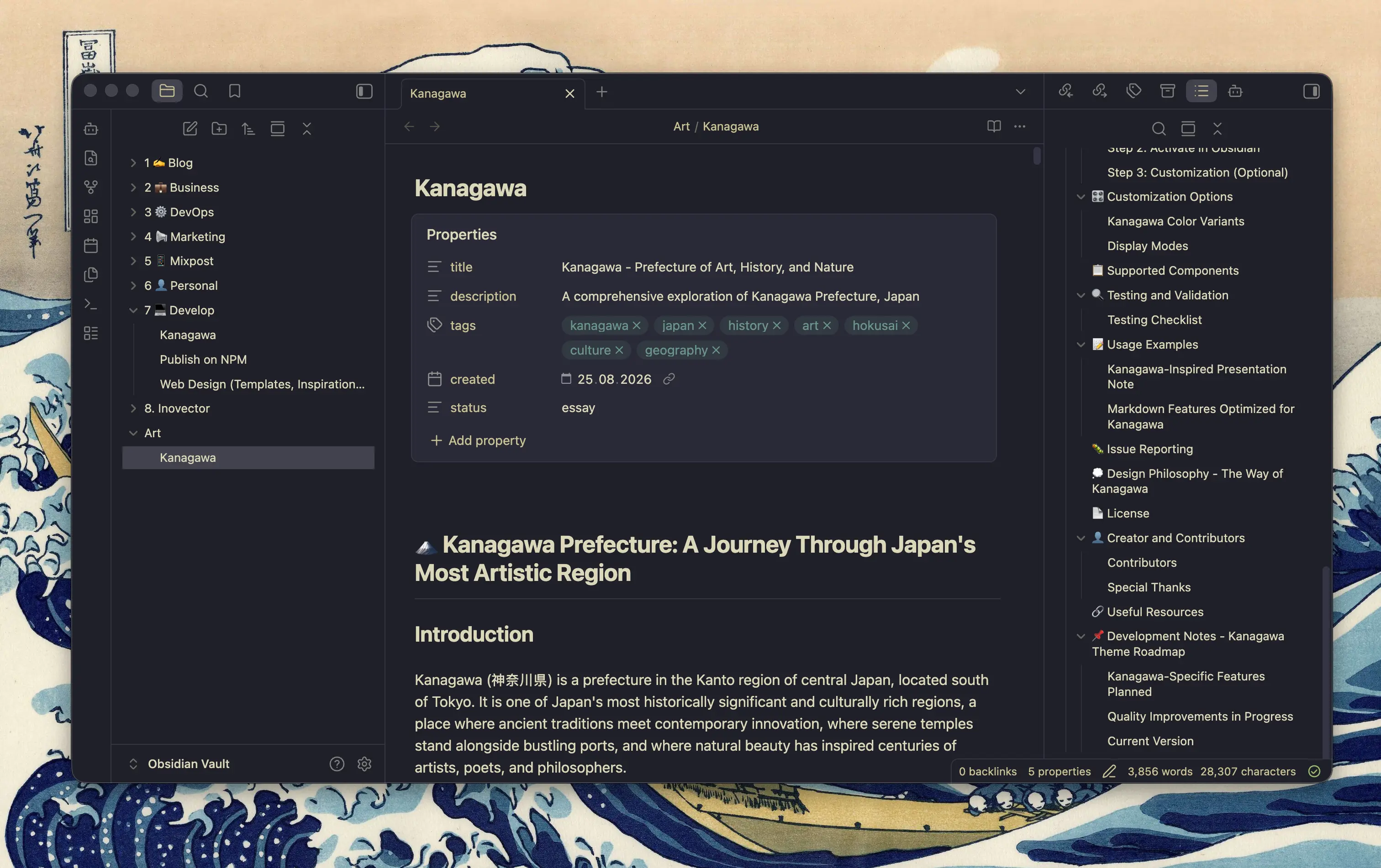
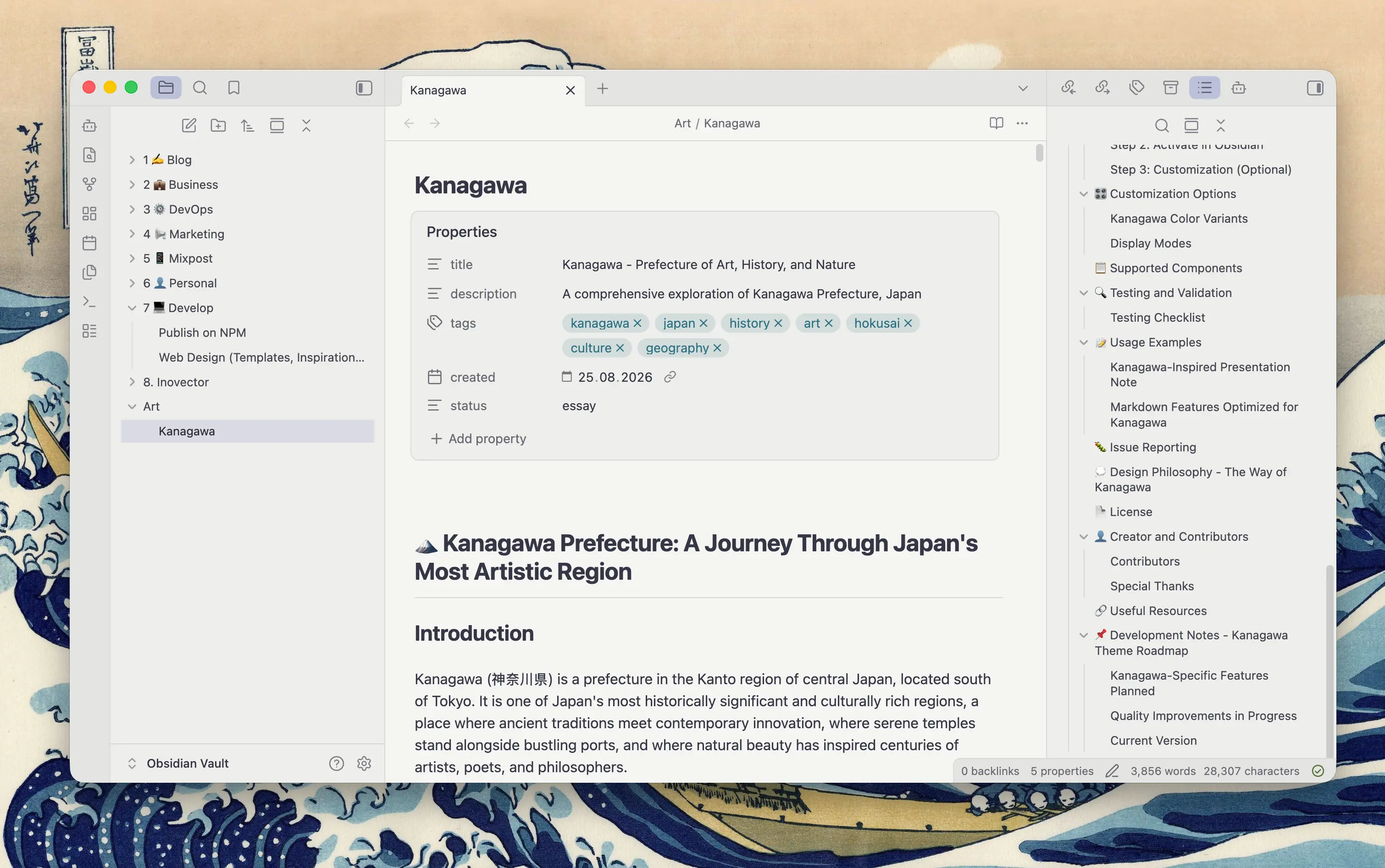
An Obsidian theme built on two Kanagawa palettes: Wave for the deep sumi-ink night of dark mode, Neutral Light for the warm neutral paper of light mode. Both descend from rebelot/kanagawa.nvim, inspired by Katsushika Hokusai's The Great Wave off Kanagawa.
Every colour is picked deliberately in each mode, contrast checked and tuned for long writing sessions rather than screenshots. Spacing gets the same treatment: margins, padding and rhythm are revised throughout so the whole thing feels calm to work in.
Preview
Dark mode: Wave
Light mode: Neutral Light
Install
Manually
- Copy this folder into
<your vault>/.obsidian/themes/Kanagawa Tide/(the folder name must match thenameinmanifest.json). - Obsidian → Settings → Appearance → Themes → Kanagawa Tide.
With BRAT
Add the repository through Add beta theme.
Dark and light mode both come from this one theme. Switch with Settings → Appearance → Base color scheme.
Style Settings
Optional, via the Style Settings plugin.
| Option | What it does |
|---|---|
| Heading colours | Monochrome (default), the single colour each palette defines for headings, or a Kanagawa hue scale across H1–H6 |
| Extra bold H1–H3 | Heavier weight for the top three levels |
| Plain bold and italic | Removes the tint on **bold** and *italic* |
| Highlight the active line | Subtle background behind the cursor's line |
| Hide the accent bar on the active tab | Removes the 2px accent underline |
| Chrome depth | Flat in dark and layered in light (default), flat in both, or layered in both |
Accent colour
Leaving Settings → Appearance → Accent color on Default is the recommended setting: the theme then picks a hue per mode, crystalBlue #7E9CD8 in dark and #8692CB in light, instead of forcing one value onto two very different backgrounds. Against its own background the dark accent measures 5.9:1 and the light one 2.8:1, a quieter periwinkle that keeps the chrome calm on paper.
Obsidian's picker is a single global value shared by both modes, so a custom accent is always a compromise: no hue clears AA on both #1F1F28 and #F5F5F2. If you want one anyway, these are the balanced Kanagawa choices:
| Accent | Hex | On dark | On light |
|---|---|---|---|
| dragonBlue | #658594 |
4.2:1 | 3.6:1 |
| waveAqua1 | #6A9589 |
4.9:1 | 3.1:1 |
| oniViolet | #957FB8 |
4.7:1 | 3.2:1 |
All three clear the 3:1 threshold for non-text UI in both modes, which is what the accent is mostly used for here: tab bar, cursor, checkboxes, focus rings, buttons. In light mode all three also read stronger than the default periwinkle, so this is the route to take if you want the accent to carry more weight on paper. Anything lighter (carpYellow, surimiOrange, springGreen) is dark-mode only; anything darker (#345E9D, #2A7081) is light-mode only.
Whatever you pick drives every accented surface, and label text on accented buttons and badges flips between black and white automatically based on the accent's perceptual lightness. Links keep their palette colour on purpose (crystalBlue in dark, #345E9D in light, matching the source themes), so they stay readable regardless of the accent. Only their hover state follows it. To make the resting colour follow it too, add .theme-dark, .theme-light { --kt-link: var(--kt-accent); } to a CSS snippet. The selector matters: --kt-link is defined on .theme-dark and .theme-light, so a snippet targeting :root or bare body loses to it.
License
MIT. See LICENSE.