Composer
 vran-dev20k downloads
simple and pretty theme for obsidian & components plugin
- Overview
- Scorecard
- Updates15
中文 | English
Brief
an out-of-box theme for Obsidian, which is designed for reading and writing comfortably.
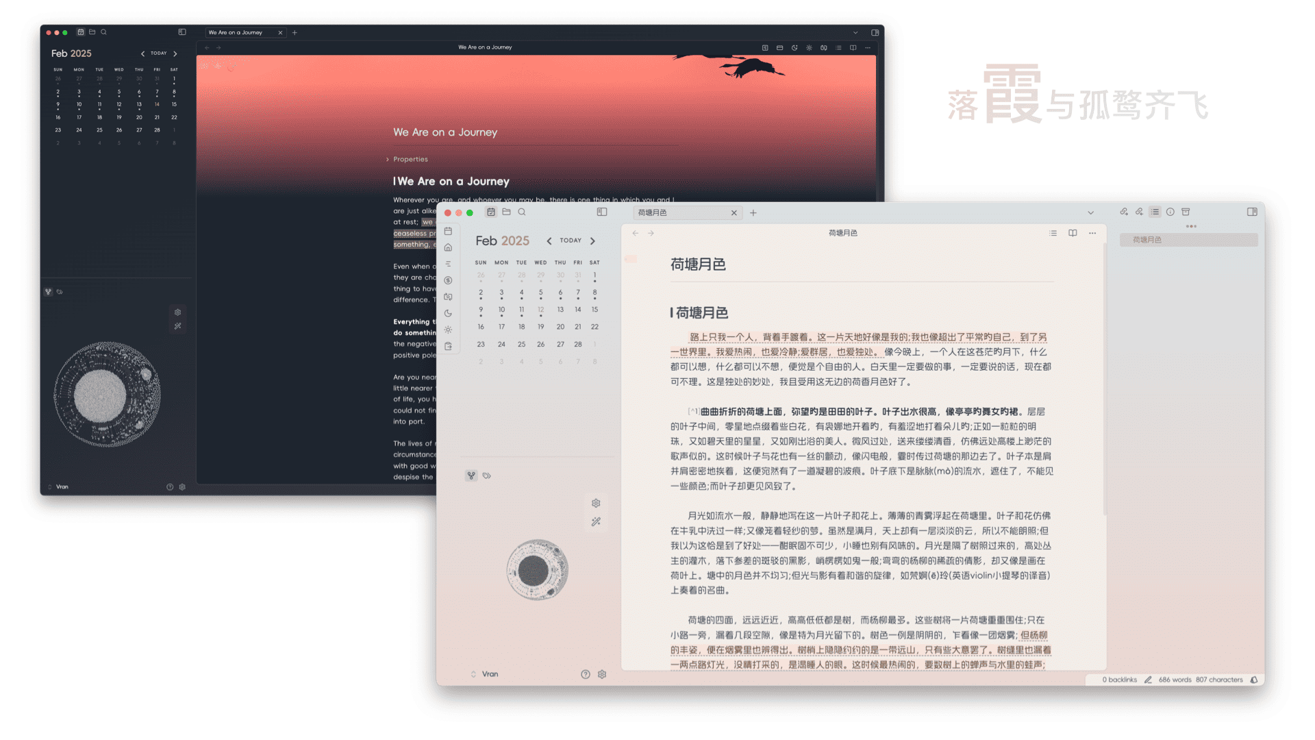
Screenshots
You can install style settings plugin and change the theme color in the plugin setting.
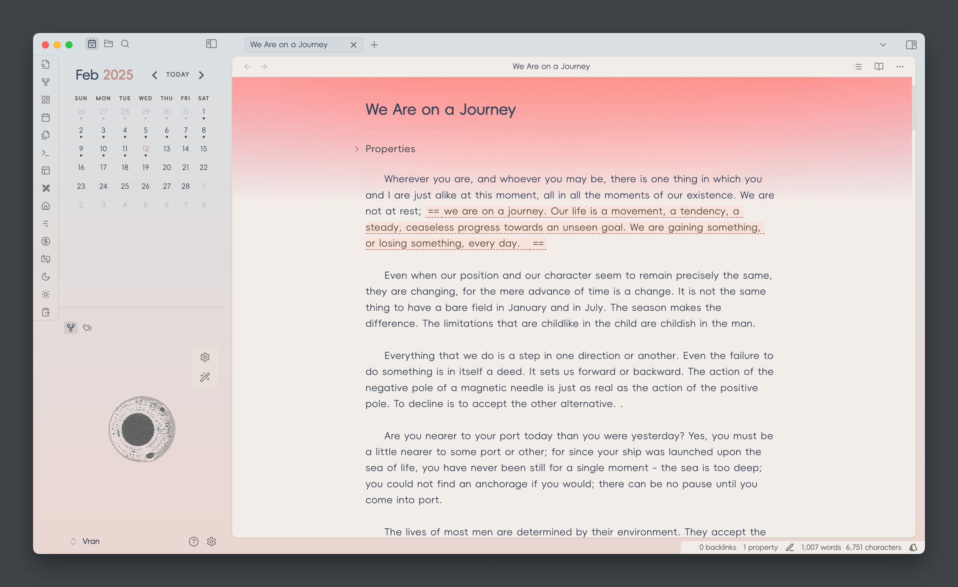
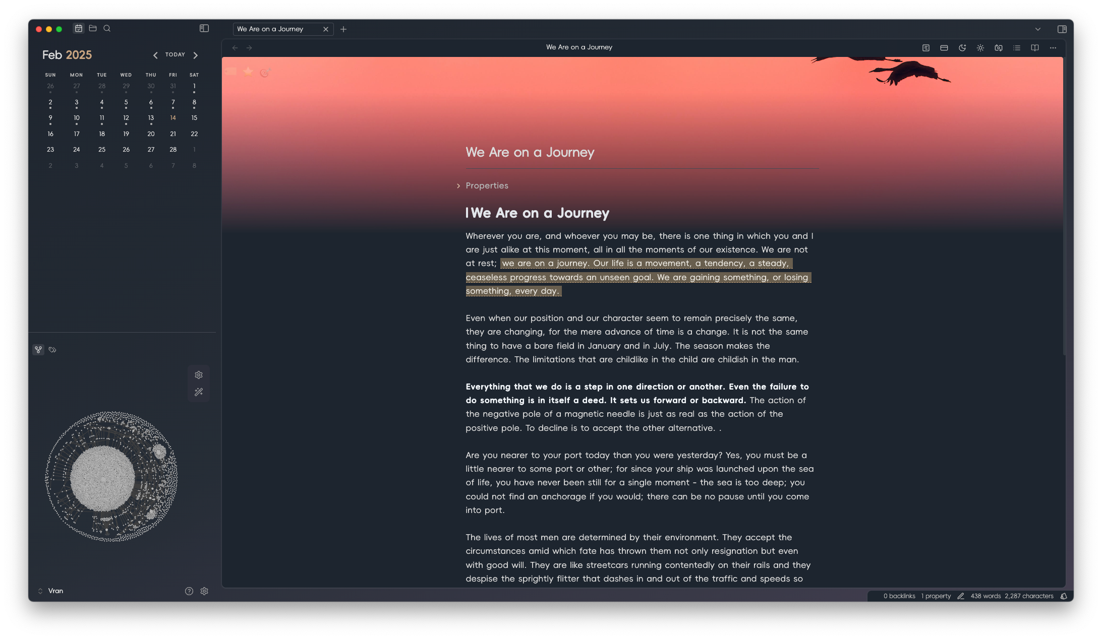
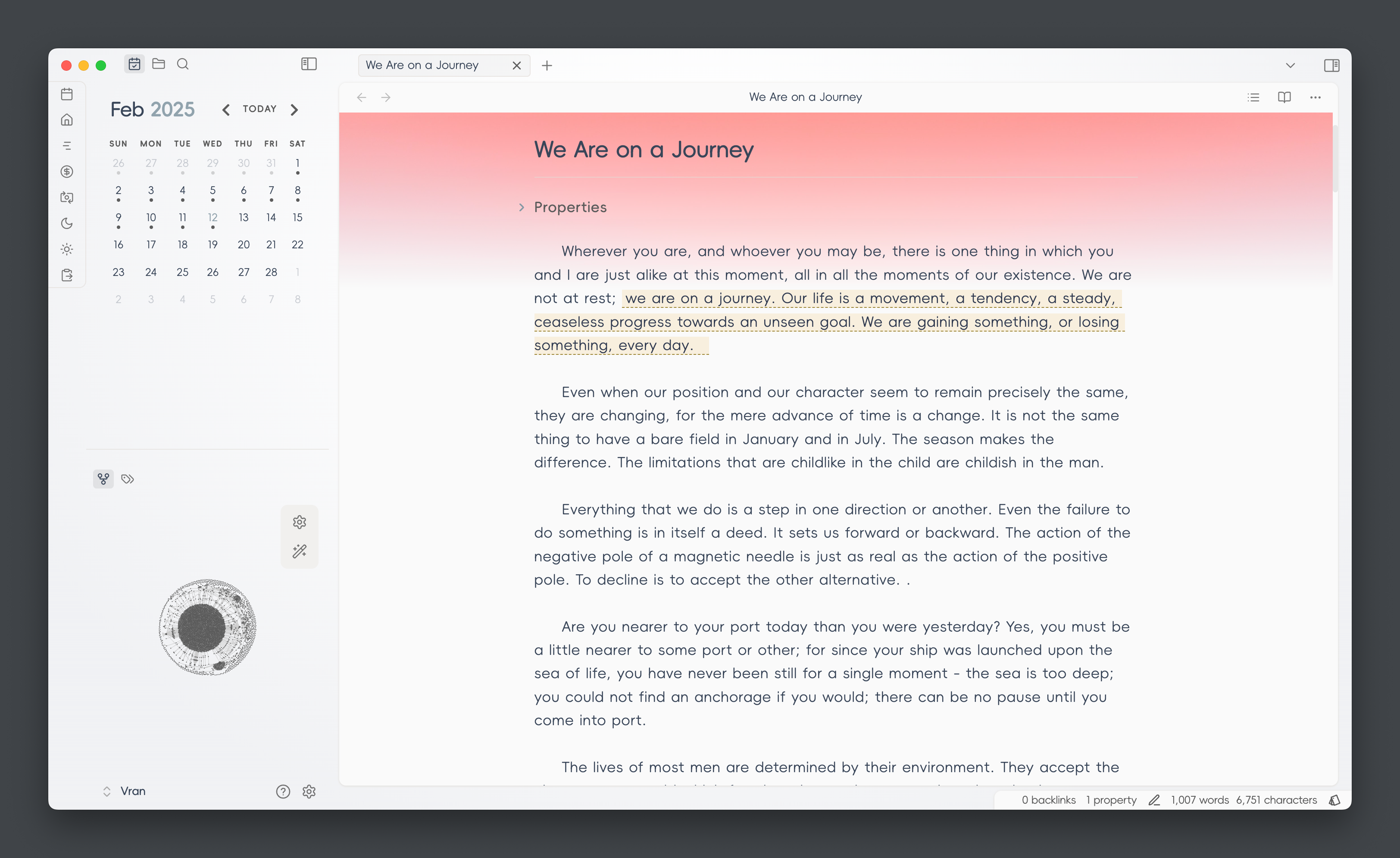
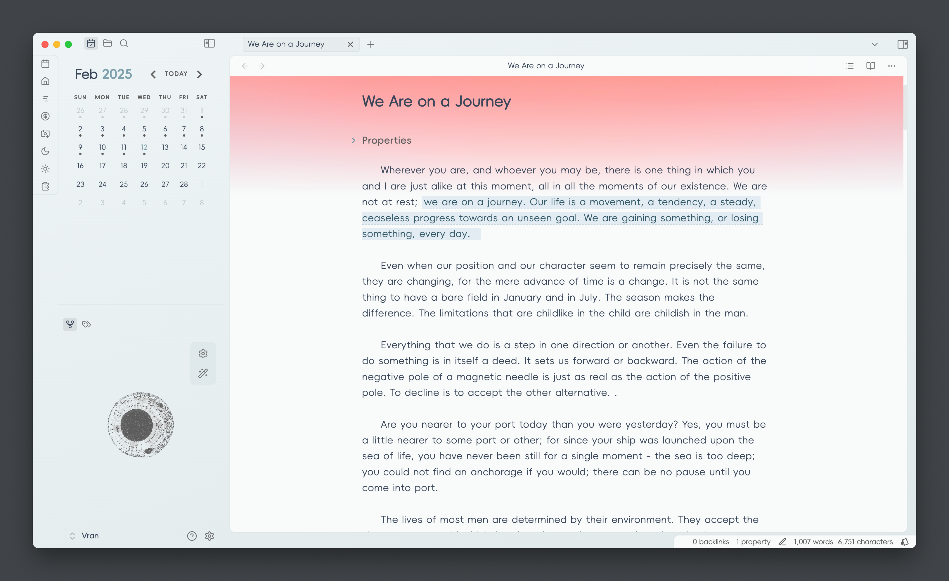
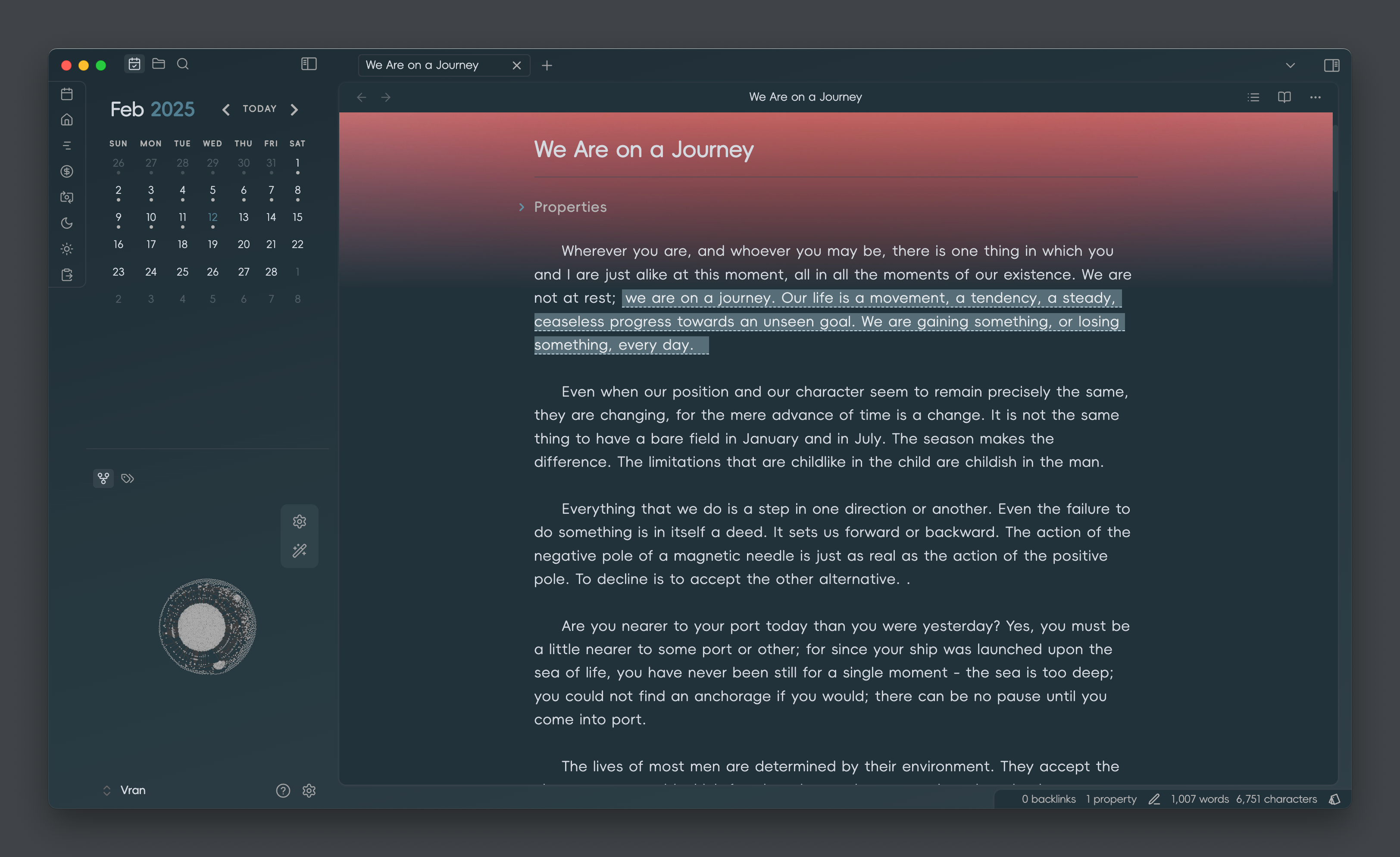
Color Scheme
[!NOTE] color scheme change needs to install
style settingsplugin
- Xiá 霞
- Sù 素
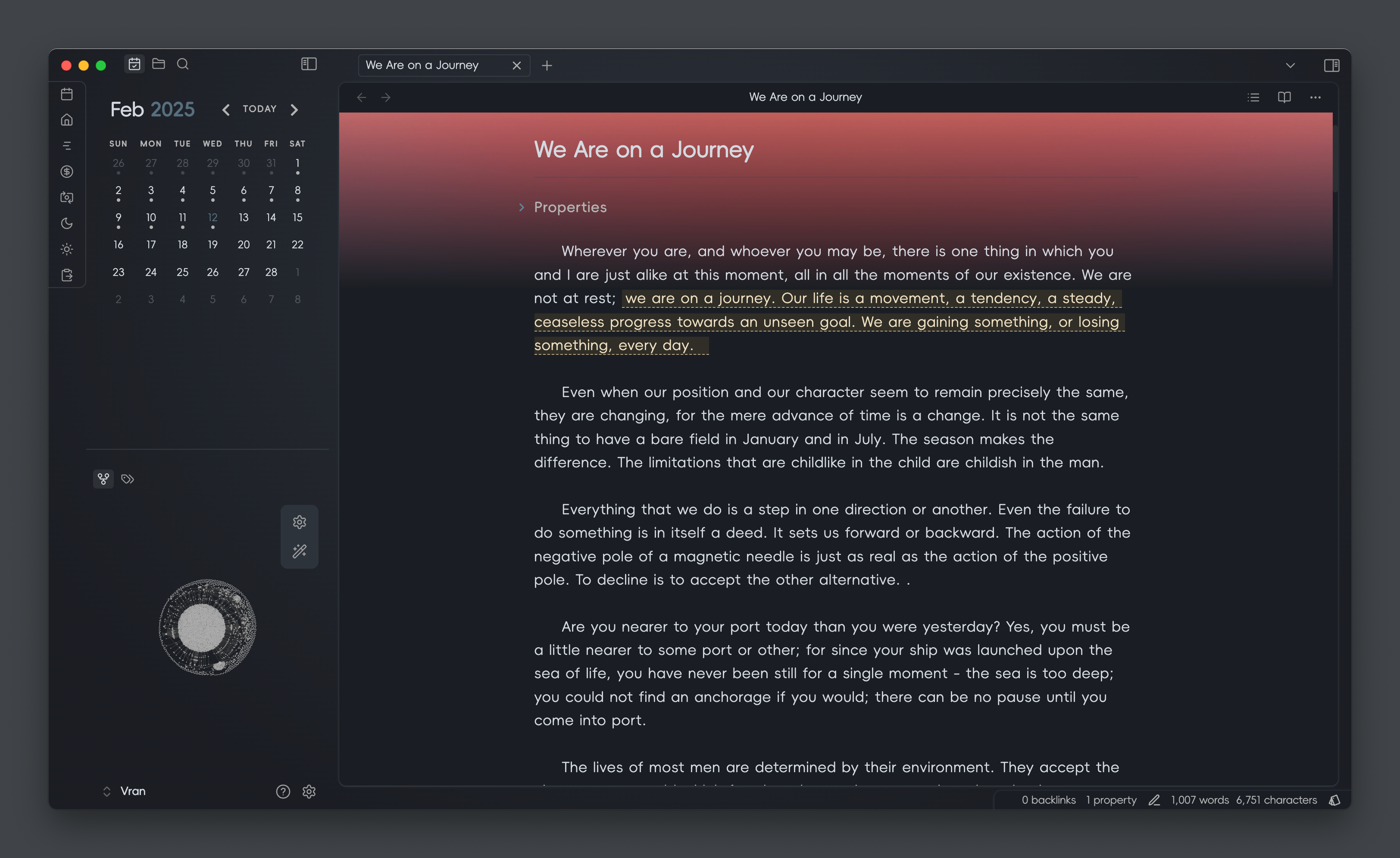
- Qīng 青
Text Formatting
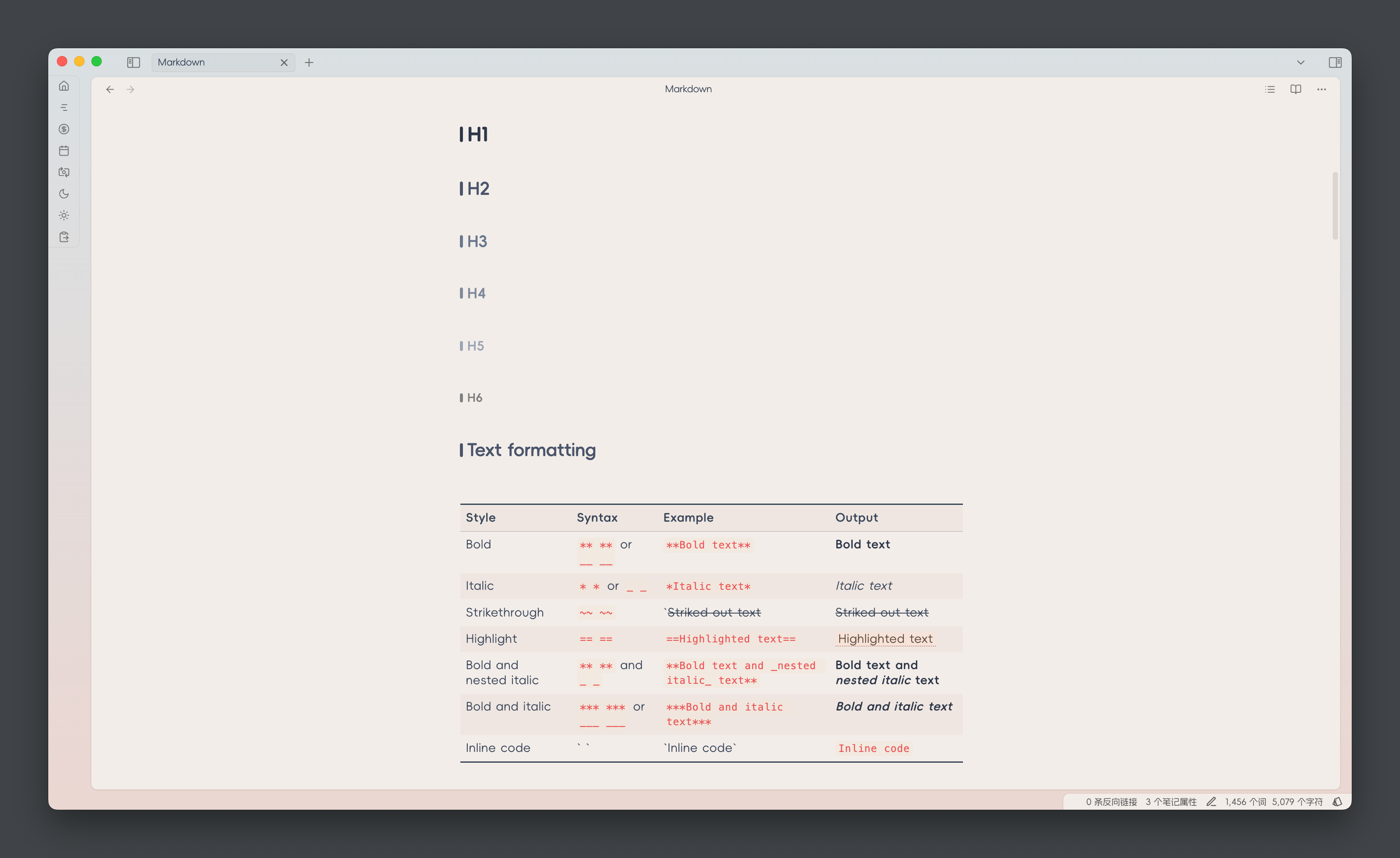
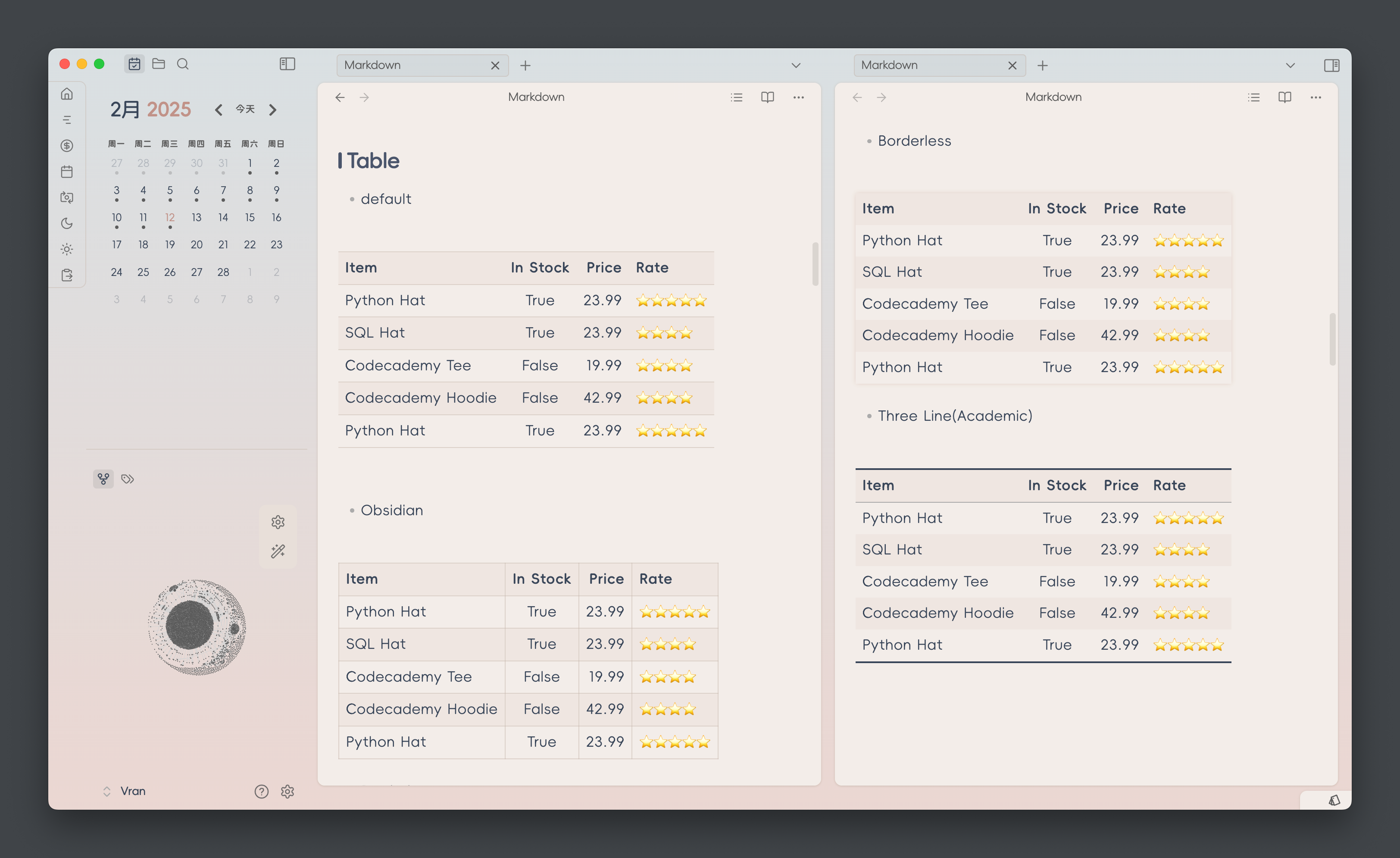
Table Style
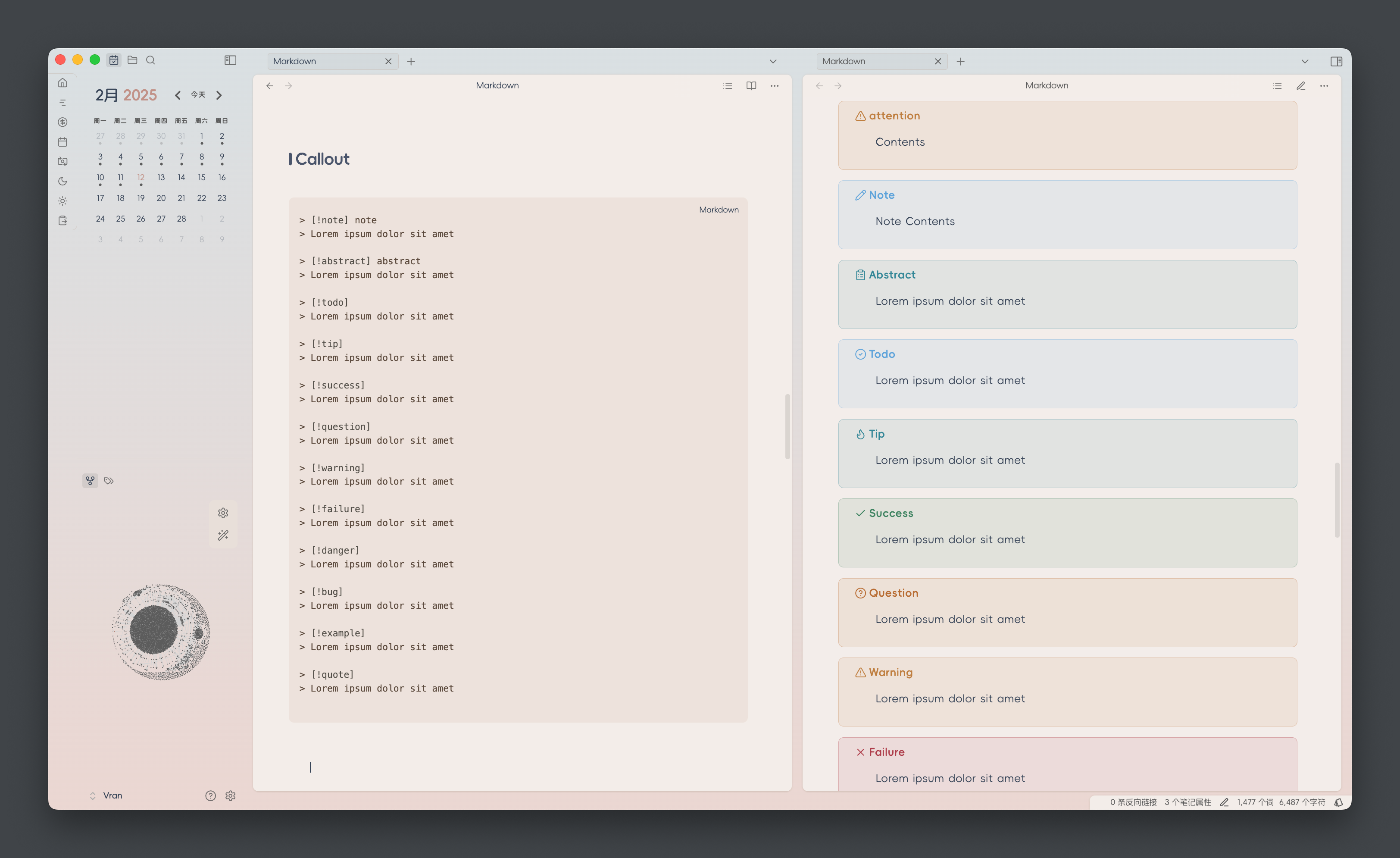
Callout Style
Thanks
- Task checkbox is referenced from Minimal Theme which is a great theme for Obsidian build by @Kepano
Development Workflow (settings.yml + composer.css Split)
This theme now separates the Style Settings YAML header from the CSS for better editor support.
Files:
settings.yml– Pure YAML (no wrapping comment). Edit Style Settings options here.composer.css– Pure CSS body (without the initial/* @settings ... */block).build.mjs– Build script that merges the two intotheme.css.
Usage:
- Edit style settings in
settings.yml. - Edit styles in
composer.css. - Run
npm run buildto generatetheme.css. - Load or distribute
theme.cssas the final theme file.
Release Flow:
npm version patch|minor|major will automatically:
- Run
preversion(which triggersnpm run build). - Bump version and stage
manifest.json,versions.json, andtheme.css.
Notes:
- Do NOT manually edit the YAML inside
theme.css; it will be regenerated. - Only add/change settings in
settings.yml. - The build script strips an optional leading comment block from
composer.cssbefore concatenation.
Future Enhancements (Optional):
- YAML schema validation (e.g. with
js-yaml) to catch structural errors. - Skip rewriting
theme.csswhen no changes occur (quieter diffs). - Support multiple YAML fragments under a
settings/directory auto-merged at build time.
Rollback to single file (if desired):
- Run
npm run build. - Keep resulting
theme.css. - Remove
settings.yml,composer.css, andbuild.mjs.
Feel free to open an issue if you’d like these enhancements implemented.
HealthExcellent
ReviewSatisfactory
About
Read and write comfortably with a clean, readable layout tuned for long-form notes. Switch color schemes and tweak typography, table and callout styles, and task checkbox visuals with the Style Settings plugin.Details
Current version
0.7.0
Last updated
3 weeks ago
Created
2 years ago
Updates
15 releases
Downloads
20k
License
MIT
Sponsor